Round 1 | Option 2
About the Brand
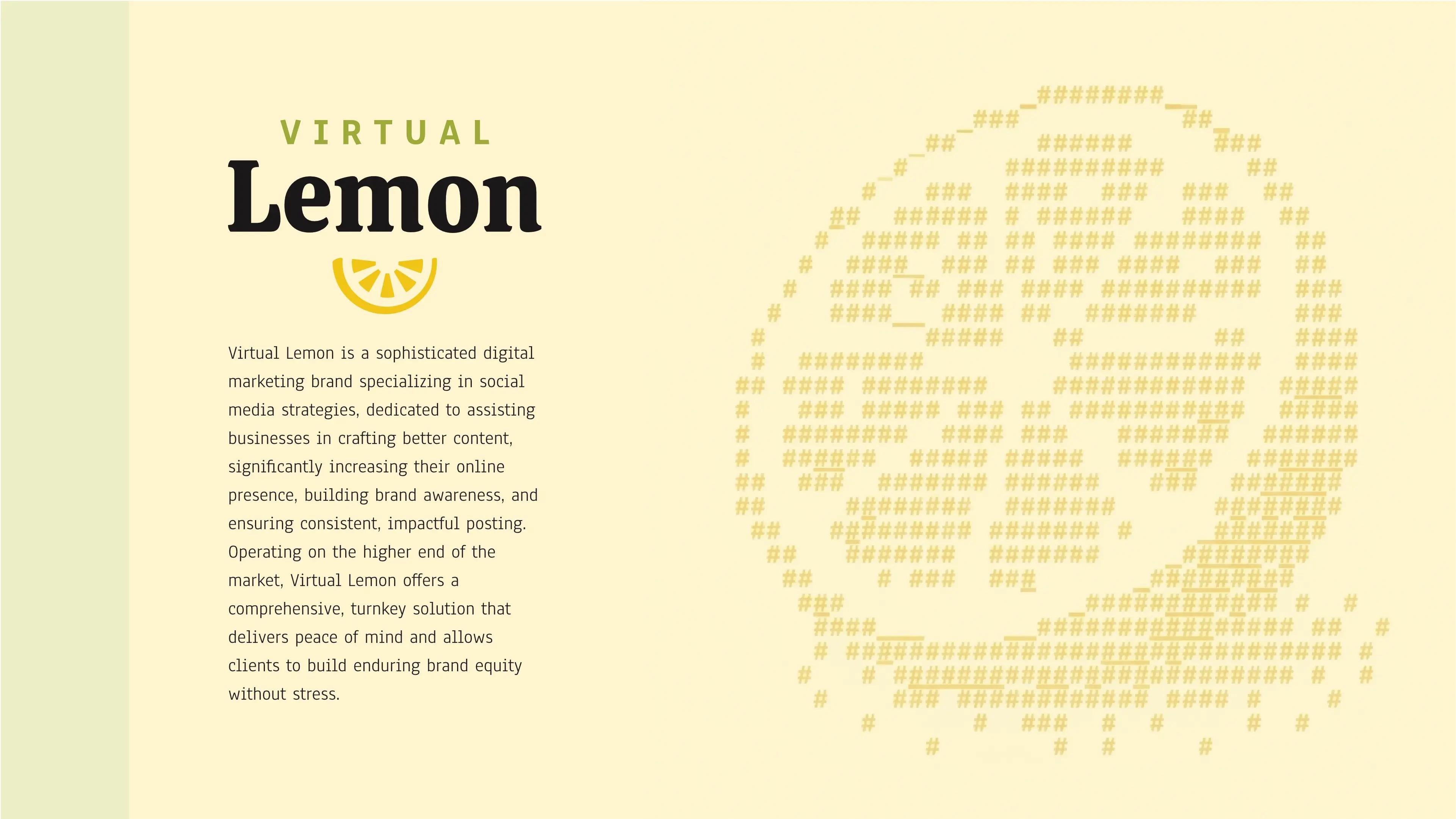
This digital marketing brand recently underwent a rebrand to offer clients consistent, long-lasting online presence. They specialize in social media marketing, enhancing content, and building brand awareness, giving clients peace of mind and a stress-free path to brand equity. With an eye for detail and high standards, they fix common marketing mistakes, ensuring playful yet effective strategies. Their process involves a thorough discovery and timeline to deliver results, positioning them as a high-end solution in the market.
Target Audience
Their target audience is comprised of medium to corporate businesses, typically aged 25-50, who prefer outsourcing to an agency. These clients, both male and female from middle to upper income classes, are driven by the pain of inconsistent, unengaging, or irrelevant content. They seek a reliable and creative partner that inspires excitement and a sense of growth, making them feel supported and noticed.
The Goal
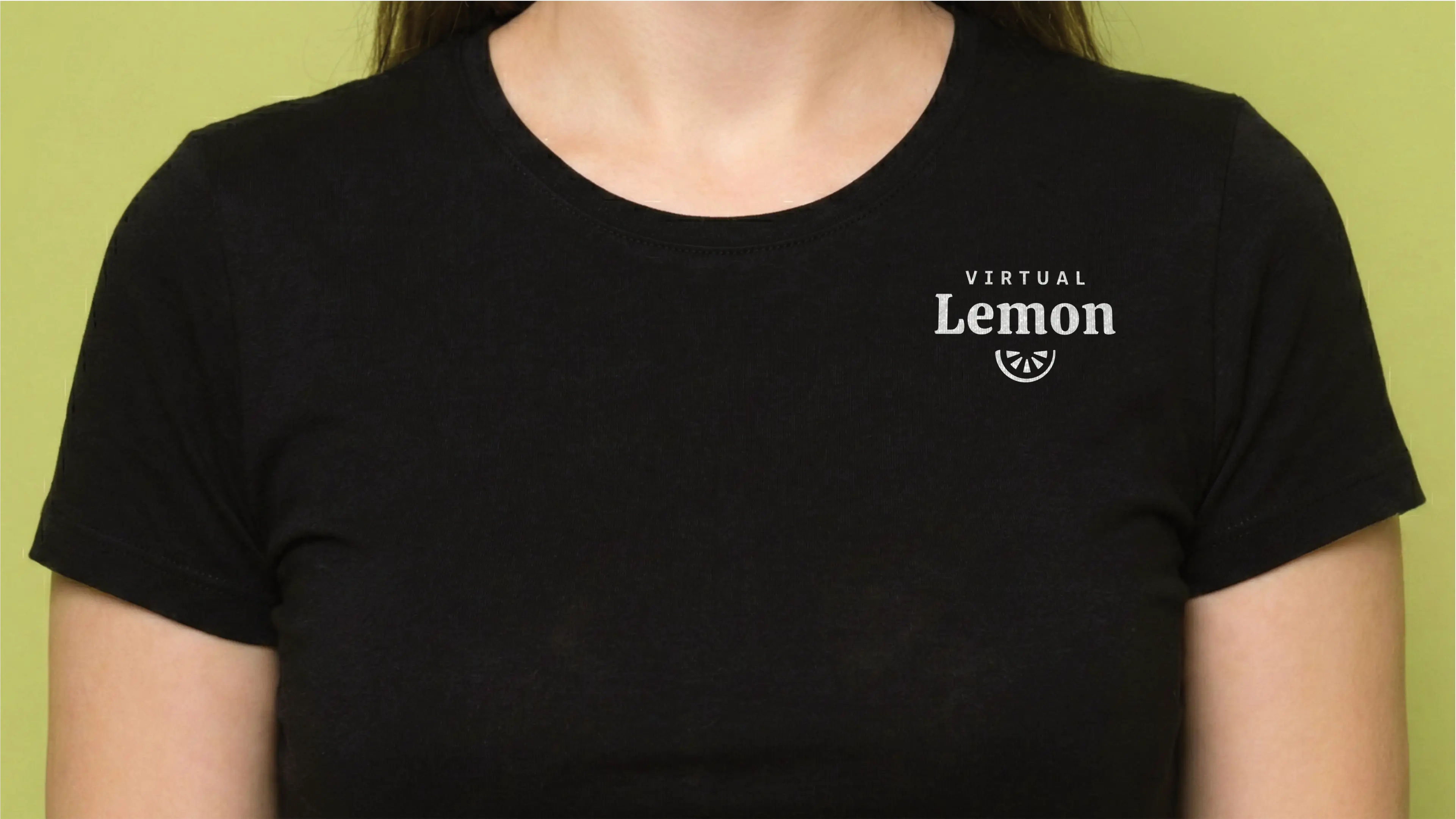
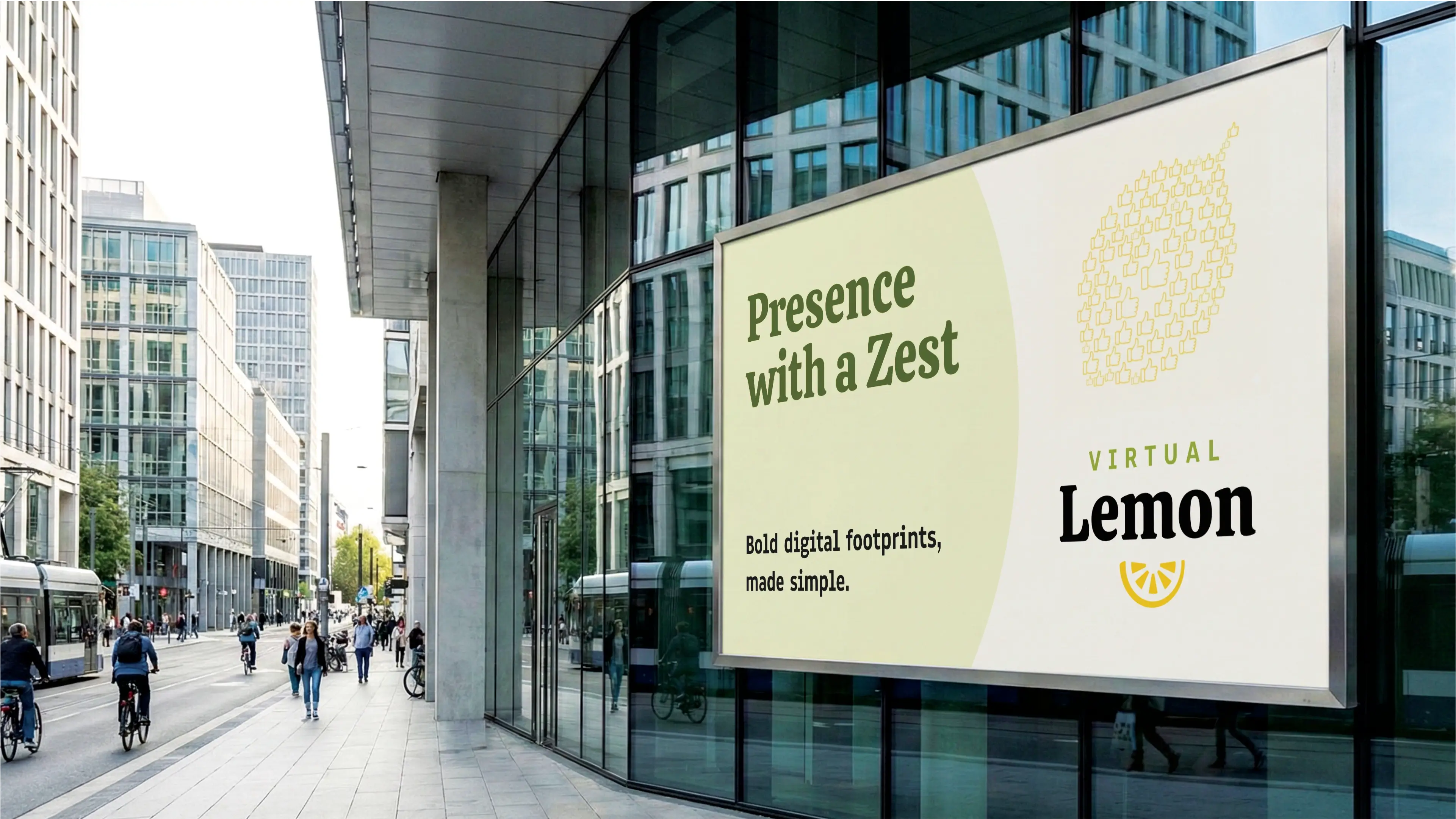
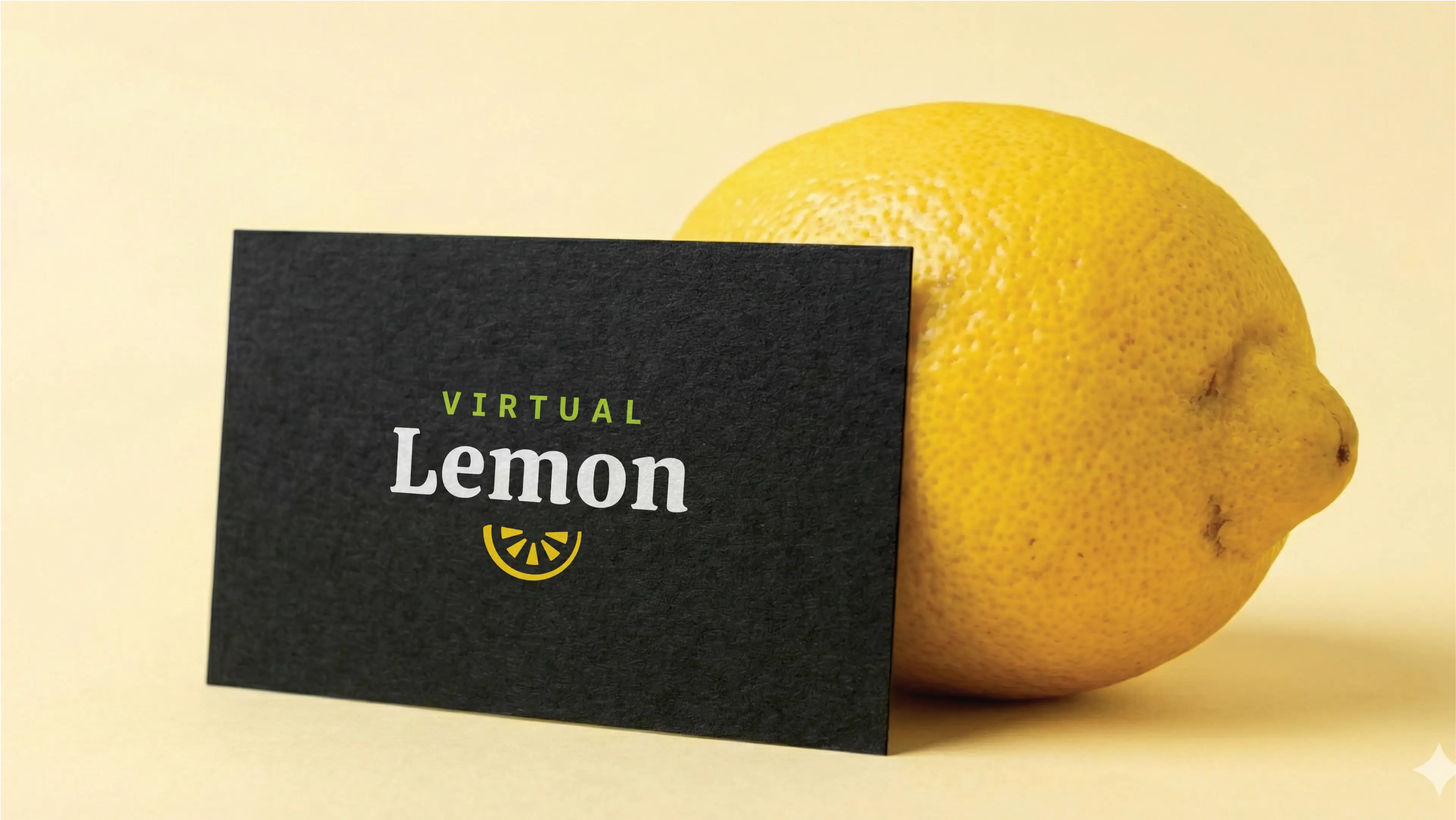
The requirements for the logo design is to solidify brand direction and enhance identification. It will be seen on the website, branding stationery, social media, apparel, and signage. The client favors styles like Plato Coffee, Jo Public's stick figure, and Flume, aiming for abstract, fun, and engaging designs, specifically avoiding boringness and emojis. The logo must cleverly incorporate a lemon theme, using yellow, black, and potentially green, ensuring a super fun yet non-tacky aesthetic. Slogan suggestions are welcomed.
Let's Break It Down
The Strategy
Monochrome Variations
Colour Palette
Colour Variations
Typography
Web & Social Icons

Strategy
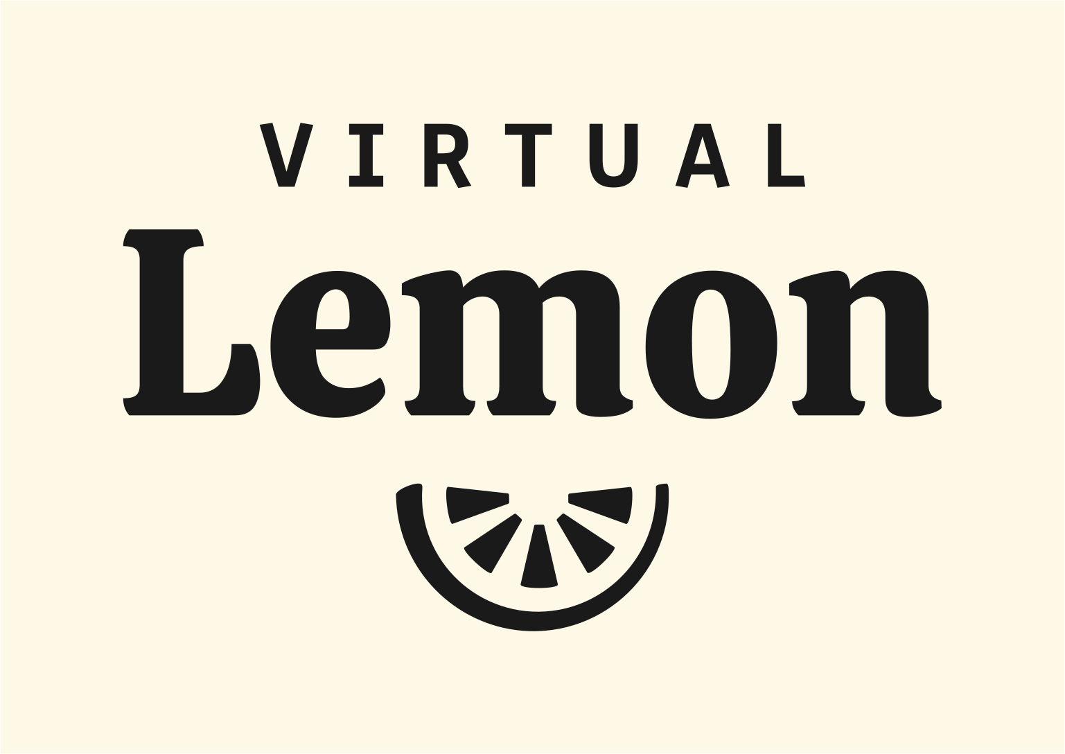
The logo features a combination mark that consists of a word mark that has Virtual written in a condensed sans-serif typeface reminiscent of early publishing days. The word Lemon is written in a Serif typeface that has a beautiful balance between playful and serious. Below the Word mark is a lemon wedge that is comprised of a half circle (the skin) and 5 carpels/segments. The shape of the logo mark is designed in a way that complements the typeface. The logo mark is placed below the word mark so that the half-moon shape can also double as a smile, which is fitting for a brand that wants to be playful.
Vertical
The logo functions perfectly well in a vertical or stacked layout. This means that the logo will work well on vertical applications like smartphones, tablets and roll-up banners.
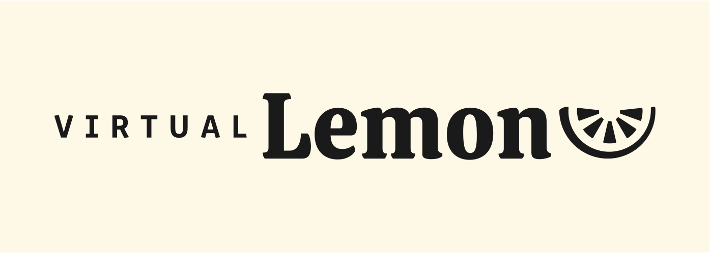
Horizontal
The logo is designed to be functional in a horizontal layout. This allows you to use the logo on horizontal applications like building signage, websites and stationery.
Colour Palette
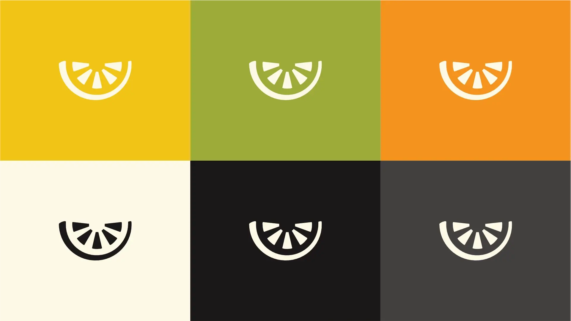
The Digital Ascent Palette embodies the brand's dynamic and results-driven approach with vibrant yellows and oranges, symbolizing innovation and energy. These energetic hues are grounded by sophisticated neutrals and deep obsidian, reflecting the brand's commitment to high standards and long-lasting strategies. This palette communicates a playful yet professional presence, offering clients a stress-free path to enhanced brand equity and a consistent online presence, truly a high-end solution.
Digital Glow
Yellow signifies optimism, energy, creativity, and attention-grabbing, perfectly aligning with the brand's playful yet effective strategies and ability to enhance content.
Strategy Green
Green represents growth, harmony, freshness, and stability, connecting to the brand's promise of a long-lasting online presence and peace of mind for clients.
Impact Orange
Orange signifies enthusiasm, creativity, determination, and success, reinforcing the brand's focus on enhancing content, building brand awareness, and delivering results.
Clean Slate
Off-white/cream represents purity, simplicity, fresh starts, and reliability, aligning with the brand's stress-free path and ability to fix common marketing mistakes.
Deep Foundation
Dark grey/near black conveys sophistication, strength, professionalism, and exclusivity, reflecting the brand's high-end solutions, eye for detail, and thorough discovery process.
Clarity Grey
Grey represents balance, neutrality, sophistication, and practicality, supporting the brand's consistent, professional approach and providing clients with peace of mind.
Vertical Colour
The primary colour version of the logo functions perfectly in a vertical layout, designed for maximum brand impact on light and dark digital surfaces.
Horizontal Colour
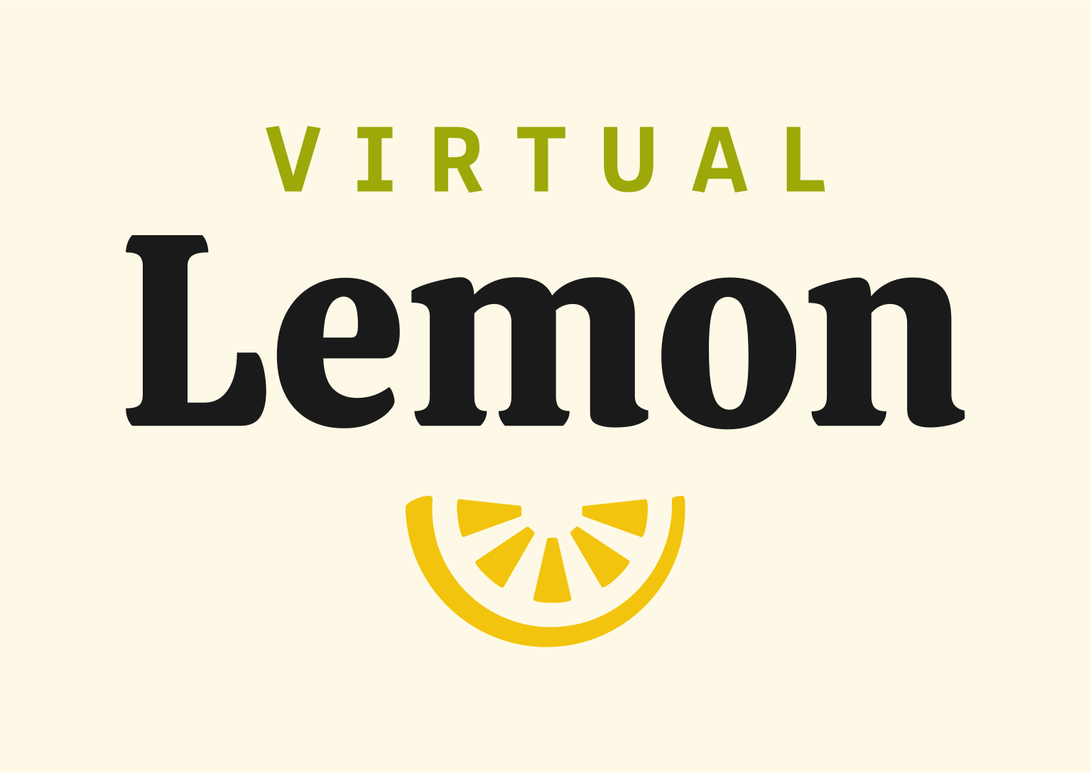
For wider applications like navigation bars, signage, and stationery, the horizontal colour variations ensure the brand remains legible and professional.
Typography
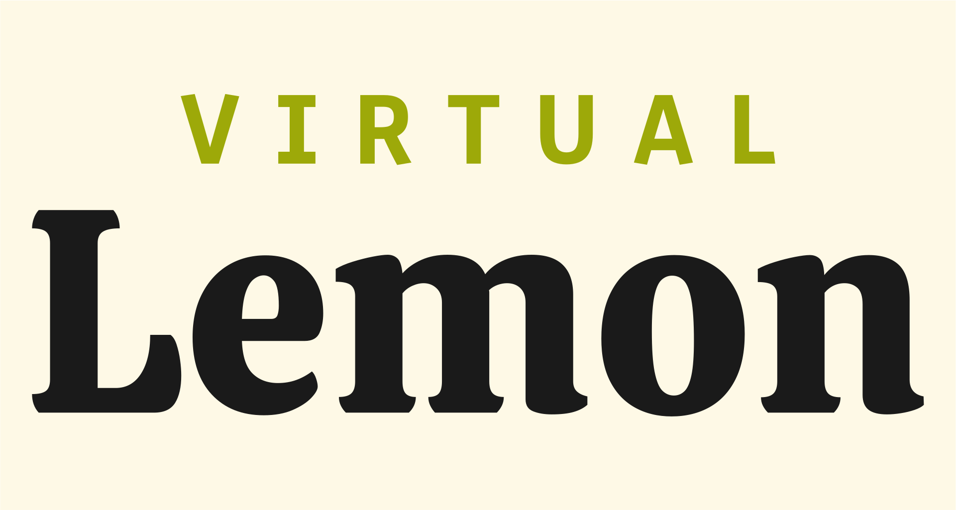
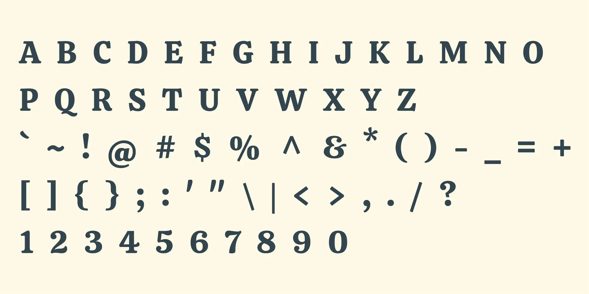
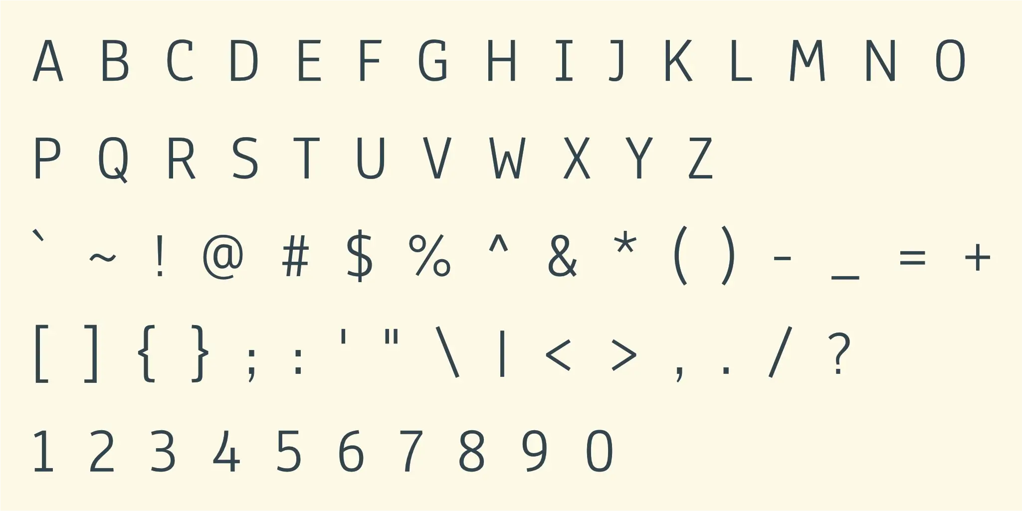
The pairing of Calistoga and Anaheim effectively balances playfulness with professionalism, reflecting the brand's unique approach to digital marketing. Calistoga's distinctive elegance for headings grabs attention and conveys creative flair, while Anaheim's clean legibility ensures clarity and trust in body text. This duo projects a high-end, detail-oriented brand that is both innovative and dependable. Together, they create a memorable and stress-free brand experience, reinforcing consistent, effective strategies and brand equity.
Primary Typeface
Calistoga
About the typeface
Calistoga, as the primary typeface, offers a distinctive and elegant serif style that immediately conveys a sense of refined creativity. Its unique character creates an impression of high standards and meticulous detail, aligning with the brand's high-end positioning. For headings, Calistoga is highly effective, capturing attention with its playful yet sophisticated charm, signaling a brand that offers innovative and memorable marketing solutions while maintaining a professional and reliable image.
Secondary Typeface
Anaheim
About the typeface
Anaheim, serving as the secondary typeface, embodies a clean, modern sans-serif aesthetic, projecting professionalism and clarity. This typeface creates an impression of reliability, consistency, and ease, perfectly complementing the brand's promise of a stress-free experience and long-lasting online presence. For subheadings and paragraphs, Anaheim ensures excellent legibility and readability, making complex marketing concepts approachable and reinforcing the brand's commitment to transparent, effective communication and detailed strategies.
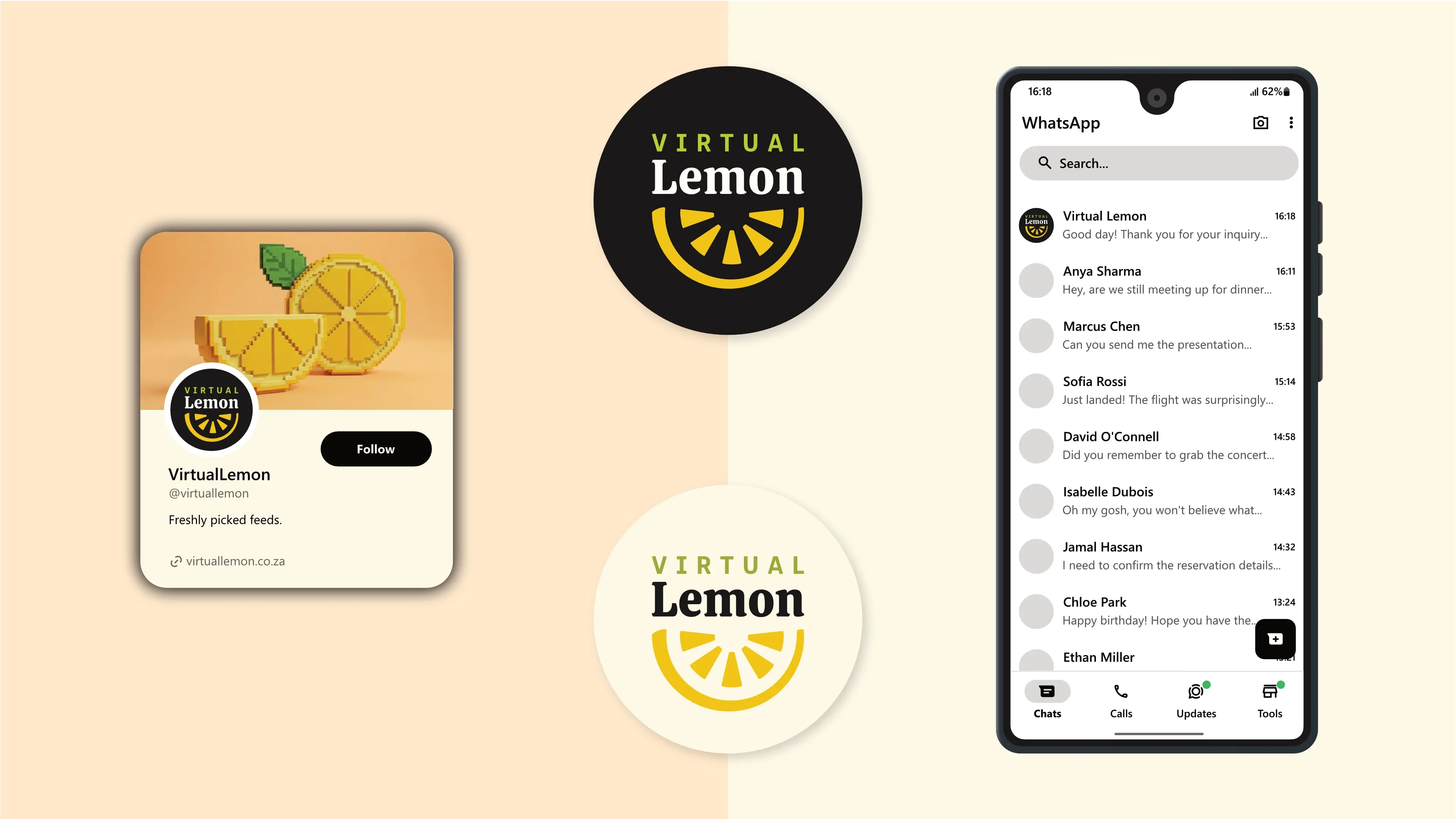
Profile Images
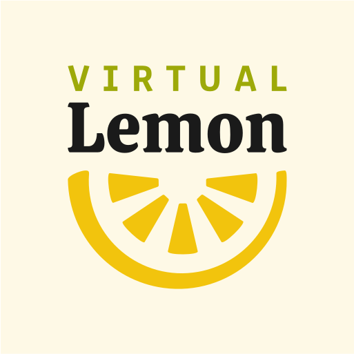
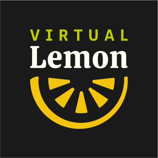
The logo is designed to fit inside a profile image that can typically be uploaded to social media platforms like Facebook, LinkedIn, and Instagram.
Favicons
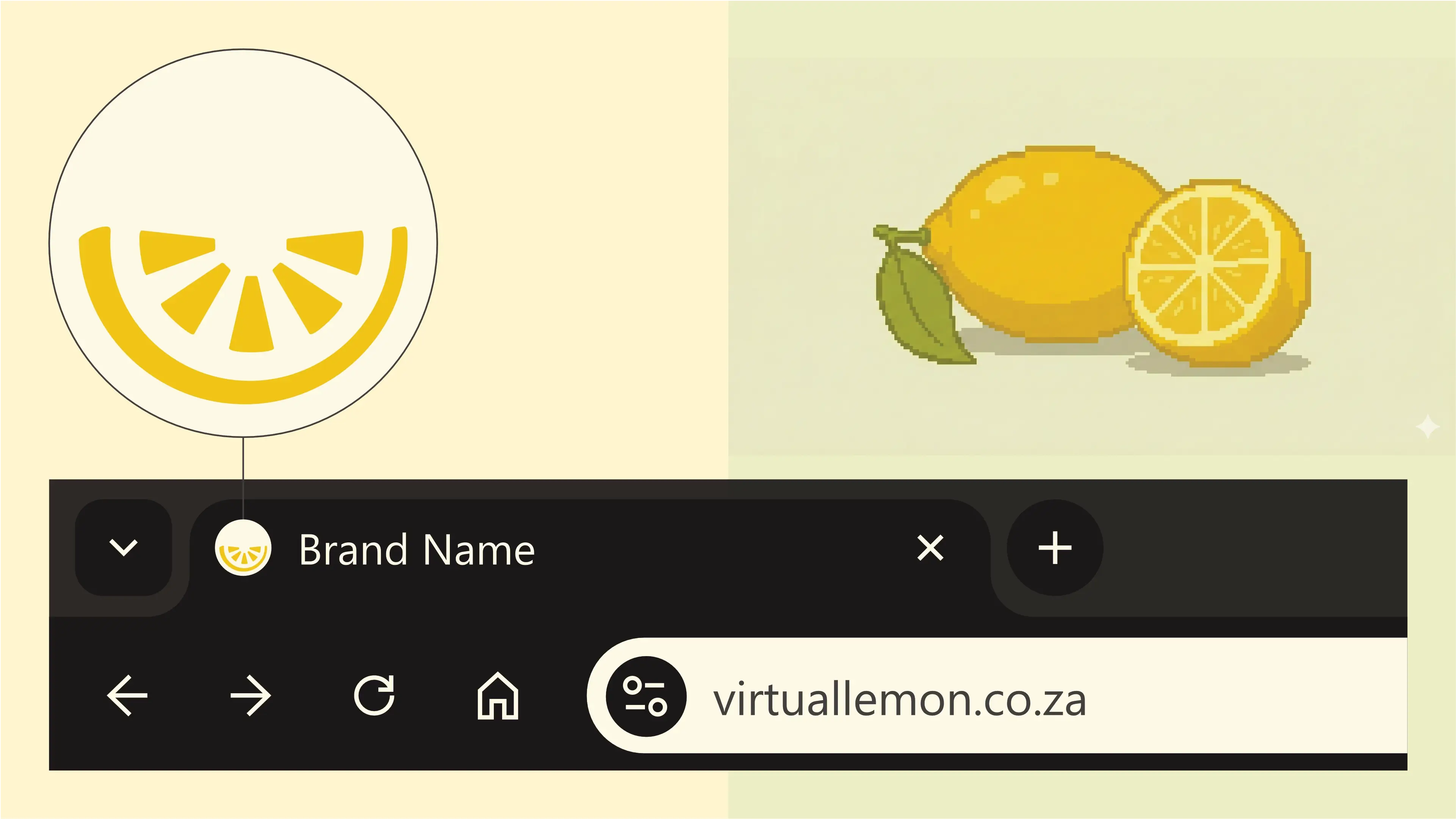
A favicon is a small icon that represents your website in browser tabs, bookmarks, and address bars, ensuring brand recognition at a glance.