Round 2 | Option 1
About the Brand
Meet 244 is a new non-profit brand established to provide crucial support to orphans, widows, and those who help them. Its unique funding model involves selling meat from international hunters. The brand's name cleverly combines "meat" with the biblical reference Acts 2:44. A strong brand identity and website were developed for Meet 244, enabling it to effectively communicate its mission and reach its target audience within the non-profit sector.
Target Audience
Their target audience is affluent American male hunters, aged 35-60, who frequent gun ranges and travel to South Africa for game. They face the frustration of wasted meat that cannot be brought home, desiring a meaningful impact. This brand aims to evoke hope and happiness, inspiring these hunters with a caring solution that ensures their hunt benefits those in need, making a tangible difference and embodying their values.
The Goal
The requirements for the logo design is to create a visually distinct mark that ensures the brand is easily identified and remembered by its target audience. This versatile logo will be prominently featured across multiple touchpoints, including the brand's website, social media channels, apparel, branding stationery, documents, and videos. Crucially, the design must be crafted to be highly appealing and relevant to hunters, reflecting their interests and values to establish a strong connection with this specific demographic.
Let's Break It Down
The Strategy
Monochrome Variations
Colour Palette
Colour Variations
Typography
Web & Social Icons

Strategy
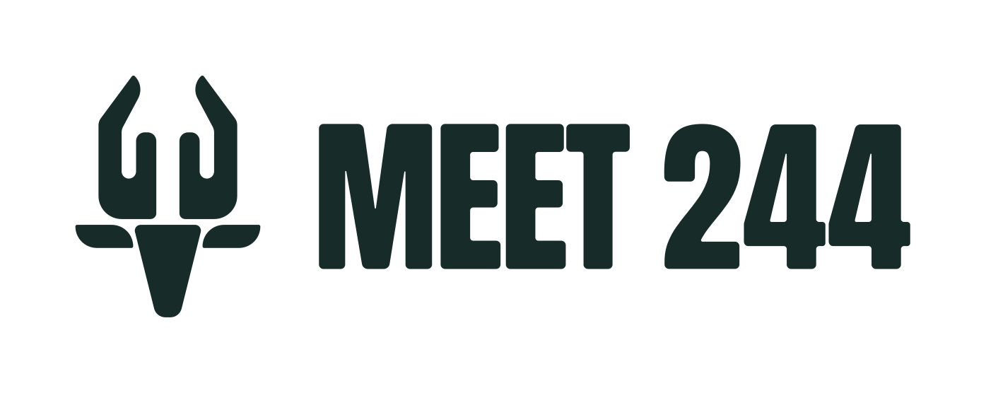
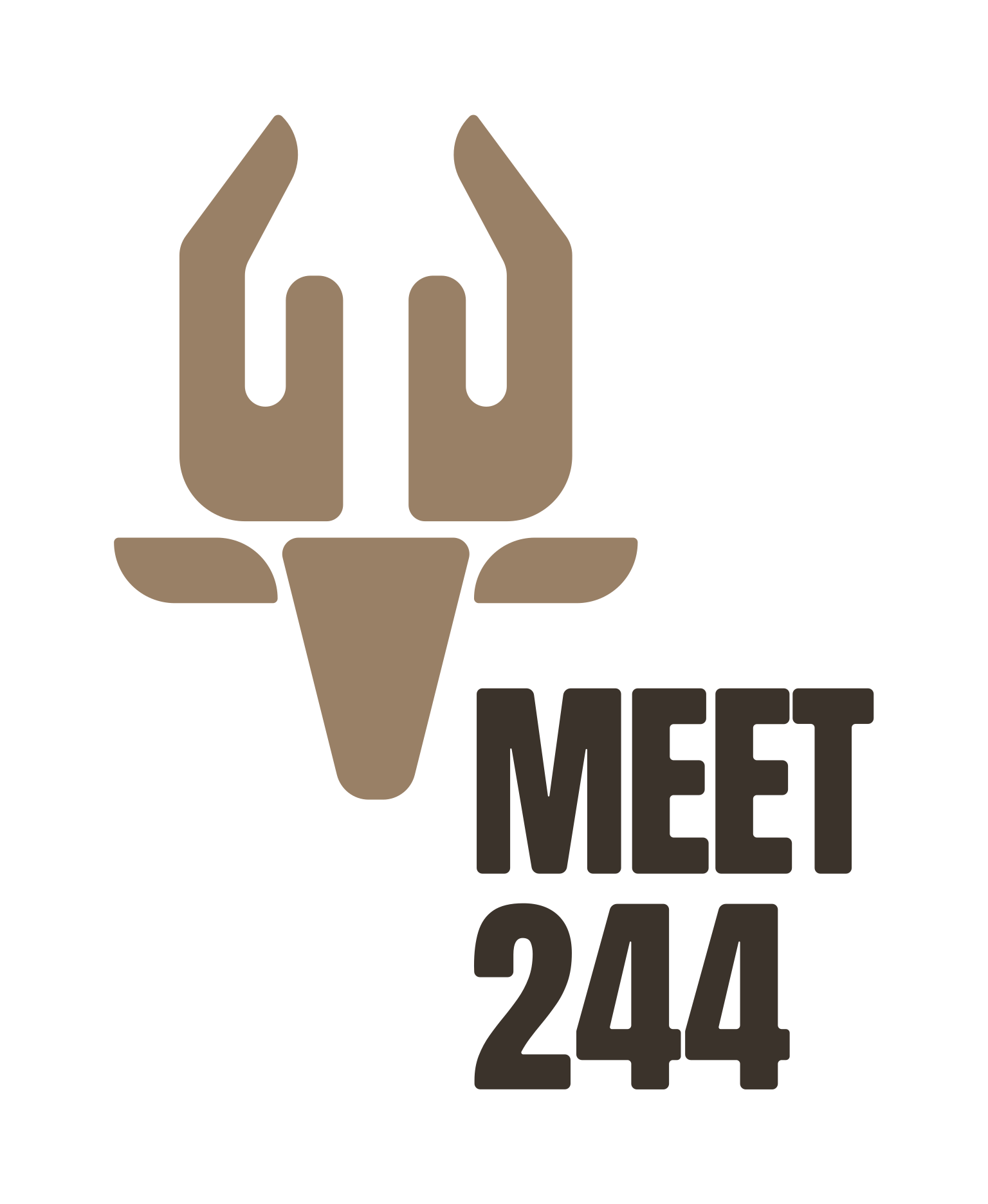
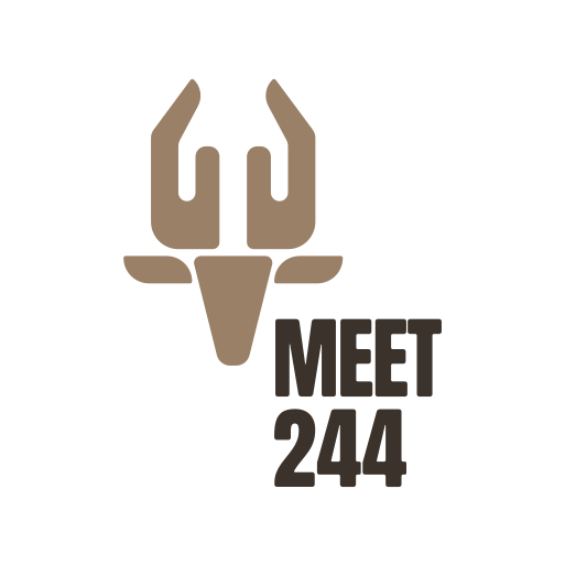
The logo features the head of a buck. The horns double as 2 hands, symbolizing the giving aspect of the brand. The typography is positioned in a way that forms the buck's body.
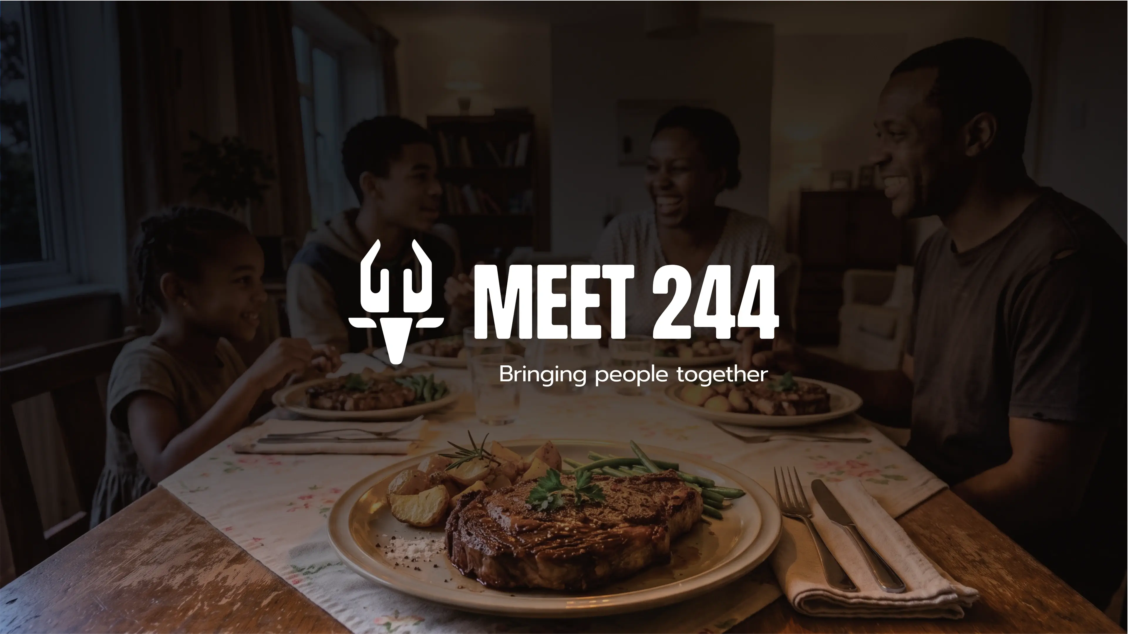
Vertical
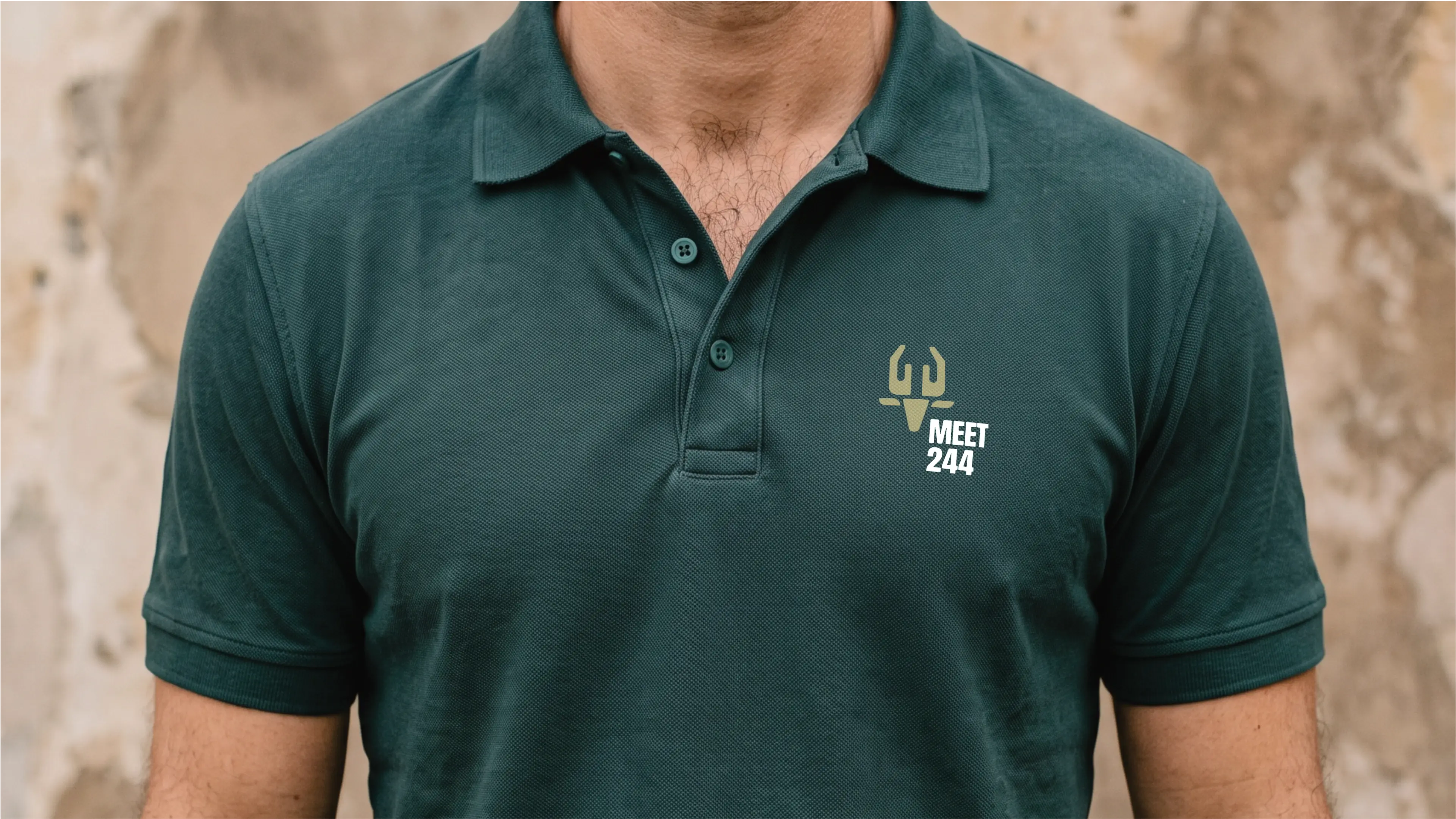
The logo functions perfectly well in a vertical or stacked layout. This means that the logo will work well on vertical applications like smartphones, tablets and roll-up banners.
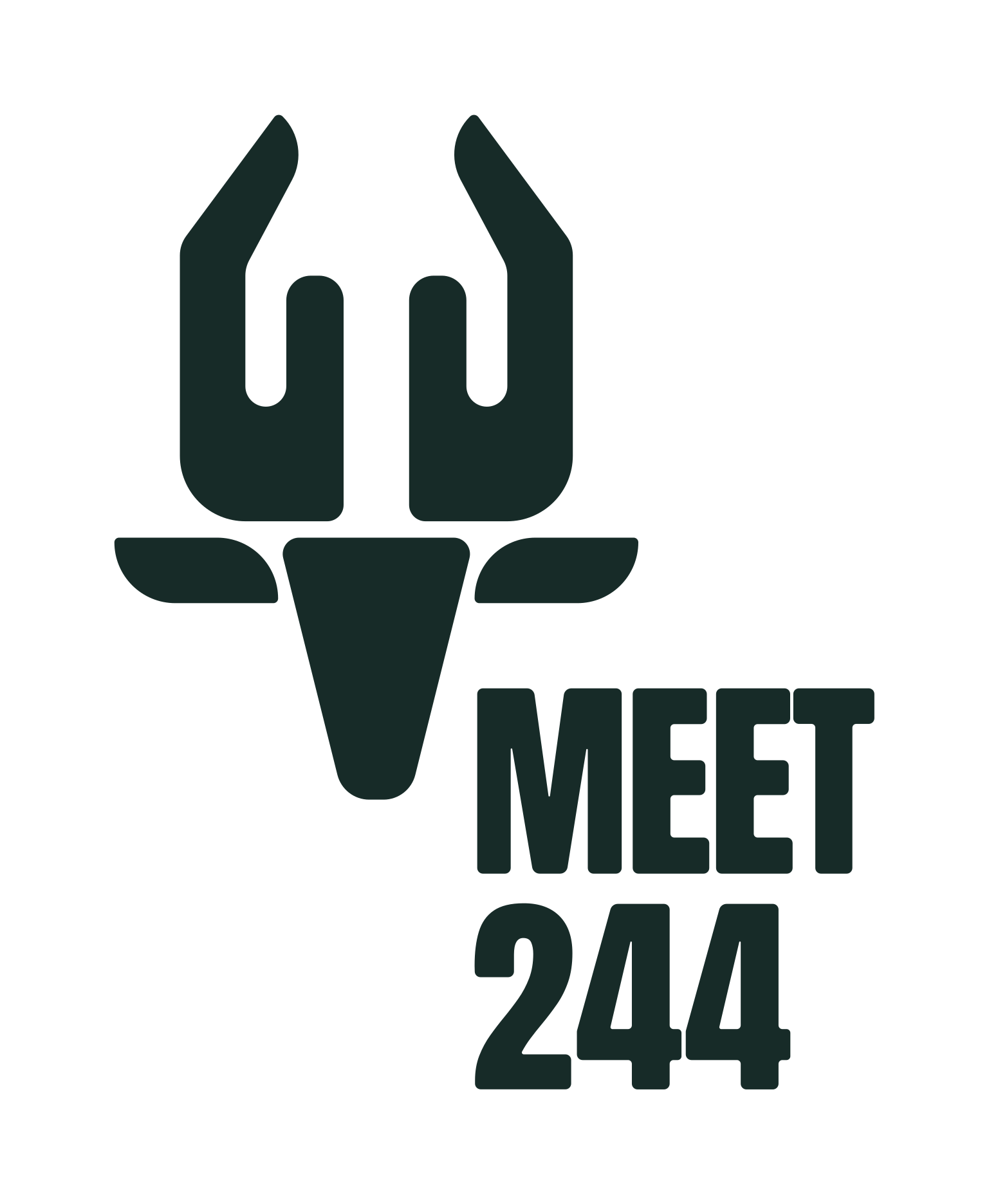

Horizontal
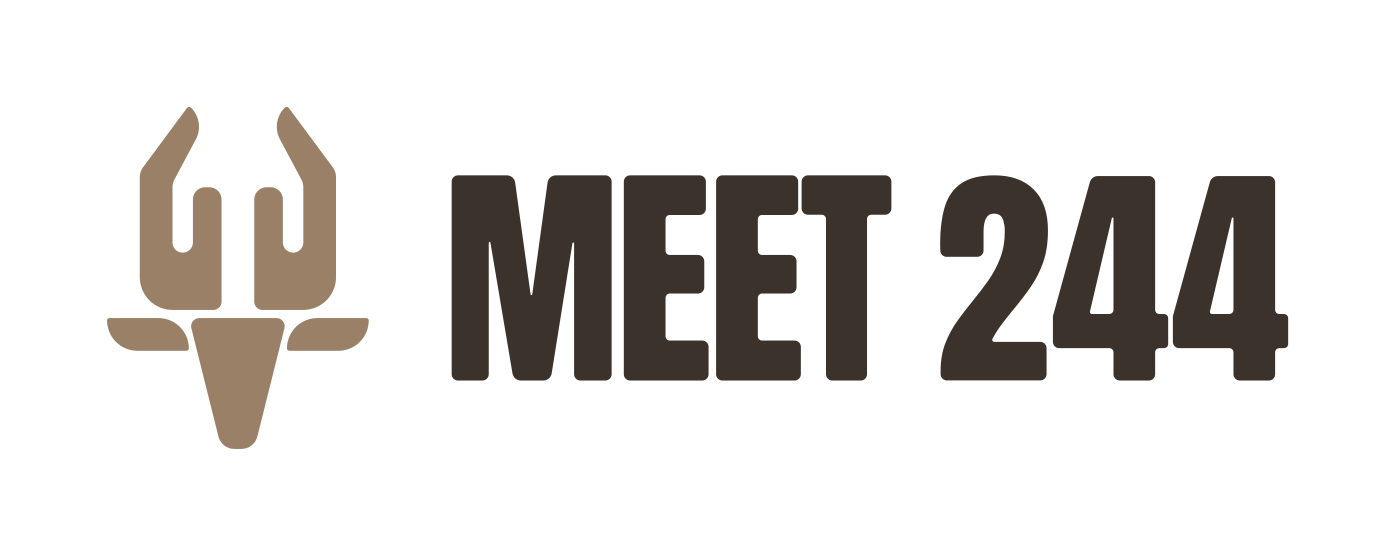
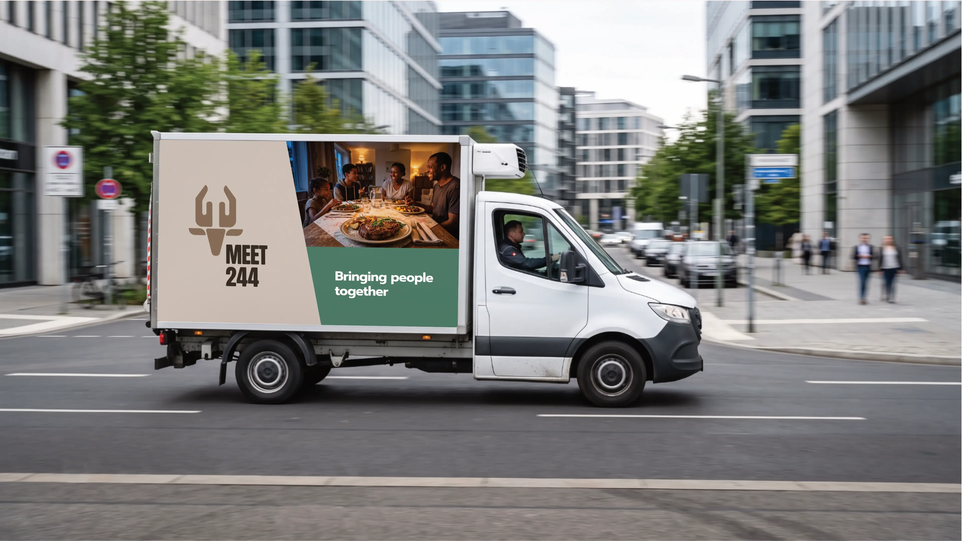
The logo is designed to be functional in a horizontal layout. This allows you to use the logo on horizontal applications like building signage, websites and stationery.

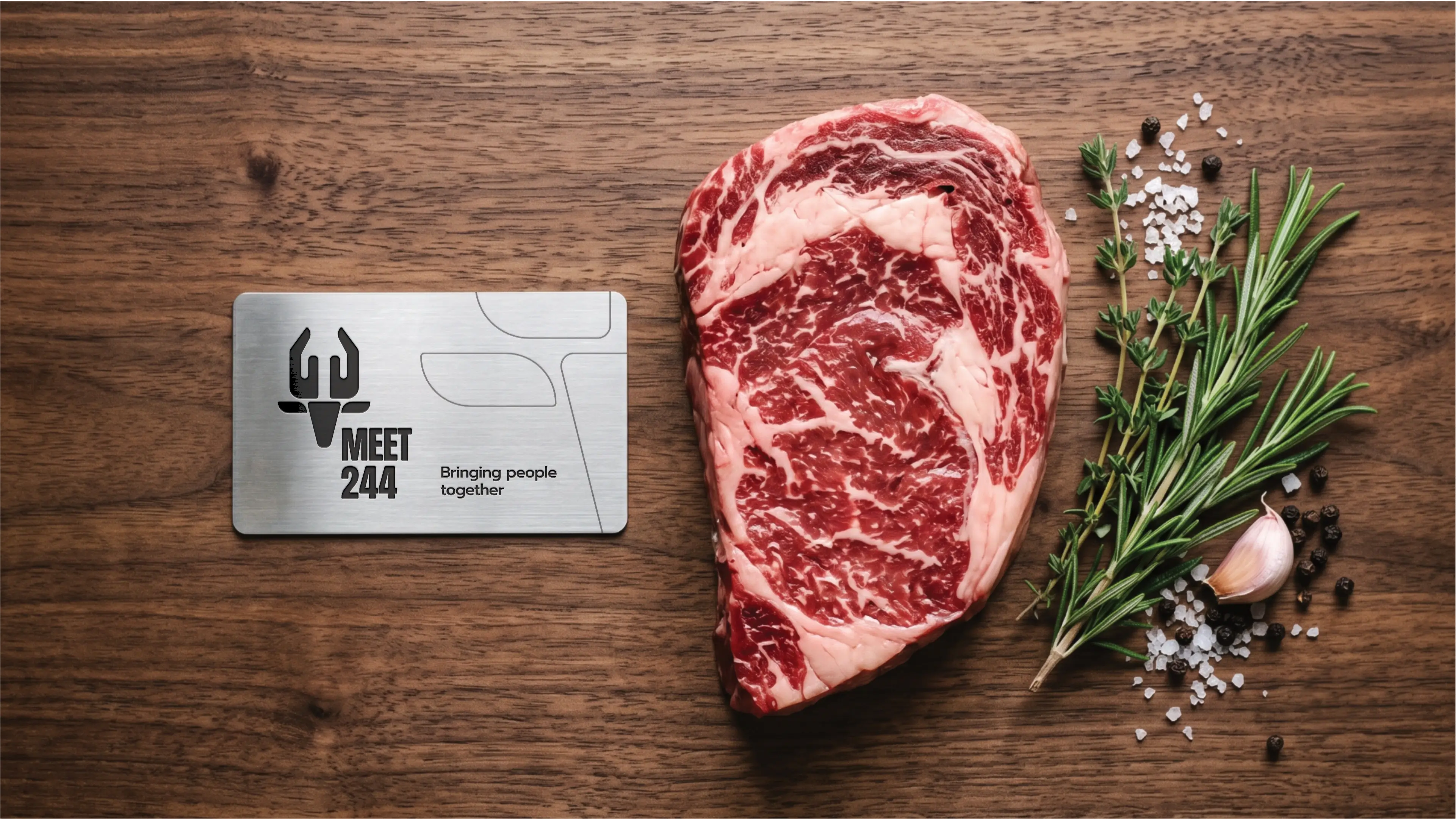
Colour Palette
The Hunter's Hearth Palette embodies Meet 244's mission with its grounding and natural tones. Reflecting the brand's unique funding model of ethical hunting, these colours evoke the strength of the wild and the warmth of a supportive community. Earthy browns, greens, and a comforting neutral signify stability, growth, and compassion. This palette creates a trustworthy and approachable identity, resonating with the biblical reference of Acts 2:44 and the brand's commitment to caring for orphans, widows, and their helpers.
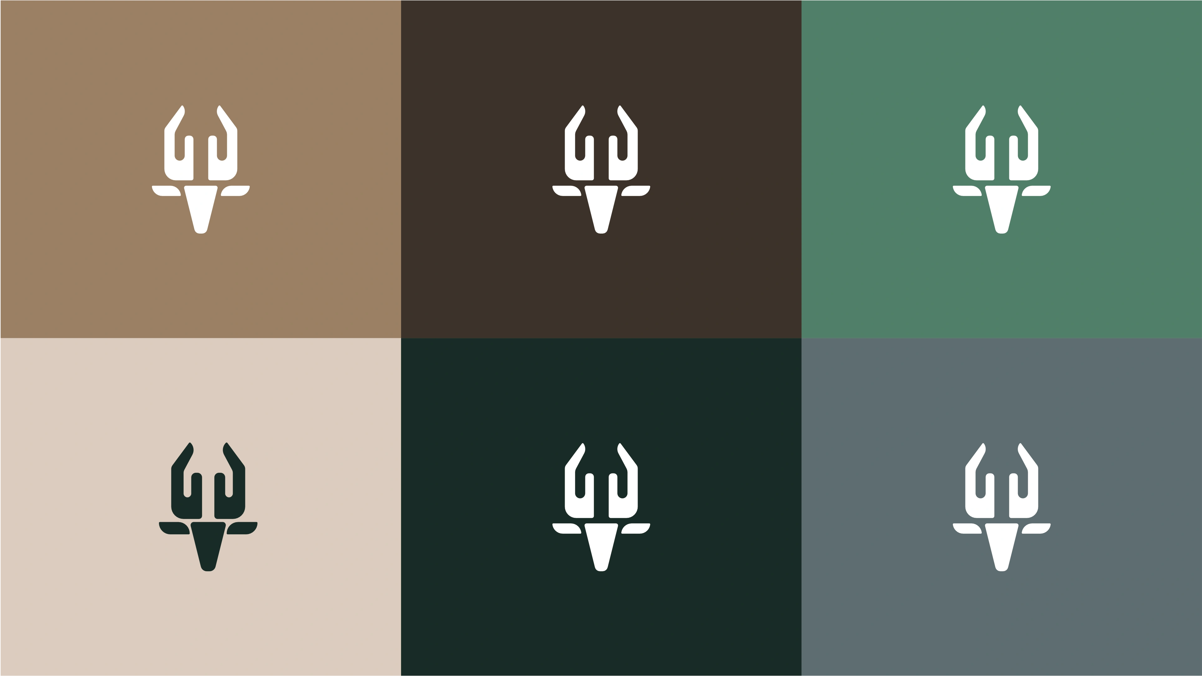
Desert Ochre
This earthy brown signifies stability, reliability, and warmth. It evokes a sense of natural strength and comfort, aligning with the brand's supportive mission.
Forest Shadow
A deep, rich brown that conveys sophistication, grounding, and protection. It represents the profound support Meet 244 offers and the depth of its commitment.
Verdant Canopy
This muted green symbolizes growth, renewal, and harmony with nature. It reflects hope, compassion, and the life-giving aspects of the brand's work.
Savanna Stone
A warm, inviting neutral that offers a sense of calm, purity, and balance. It provides a comforting backdrop, symbolizing the safe haven Meet 244 creates.
Midnight Horizon
This very dark, almost black hue imparts authority, strength, and professionalism. It signifies depth, resilience, and the serious commitment to the brand's cause.
River Stone Grey
A balanced, stable grey that conveys professionalism, reliability, and quiet strength. It ensures readability while maintaining the palette's natural and grounded feel.
Vertical Colour
The primary colour version of the logo functions perfectly in a vertical layout, designed for maximum brand impact on light and dark digital surfaces.
Horizontal Colour
For wider applications like navigation bars, signage, and stationery, the horizontal colour variations ensure the brand remains legible and professional.

Typography
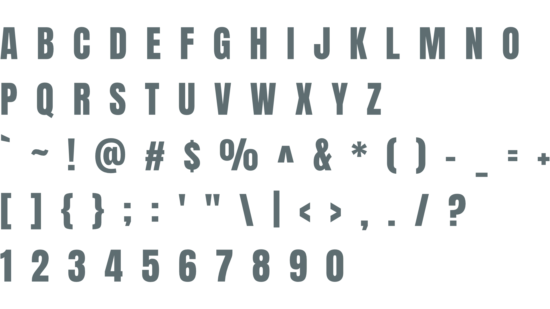
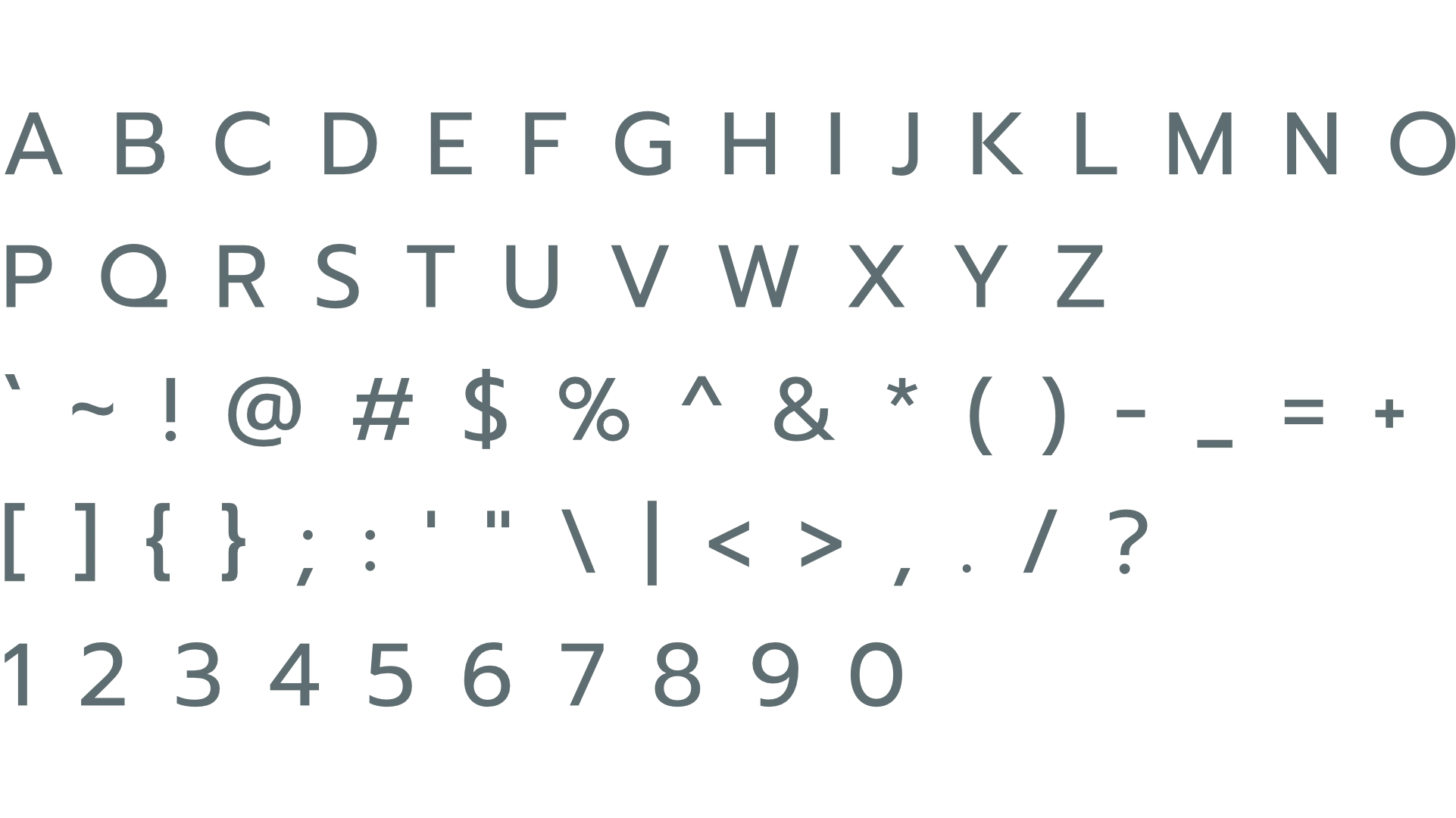
The pairing of Anton and Prompt creates a dynamic and highly effective typographic system. Anton's bold impact for headings immediately captures attention, while Prompt's clear legibility ensures the detailed mission and impact of Meet 244 are easily understood. This combination balances urgency with approachability, projecting both strength and compassion. It effectively communicates the brand's unique funding model and humanitarian goals, fostering trust and engagement with its target audience.
Primary Typeface
Anton
About the typeface
Anton, a bold and condensed sans-serif, exudes strength and directness. Its impactful presence creates an impression of urgency and power, aligning well with Meet 244's vital mission. As a primary typeface for headings, its robust character ensures immediate attention and high visibility, effectively communicating the brand's powerful message and call to action without being overly aggressive. It commands attention for a cause that truly matters.
Secondary Typeface
Prompt
About the typeface
Prompt is a clean, geometric sans-serif, offering excellent legibility and a professional yet approachable feel. It creates an impression of clarity, reliability, and trustworthiness, which is crucial for communicating Meet 244's sensitive mission. For subheadings and paragraphs, its open forms ensure comfortable reading, making complex information accessible. This versatility makes it highly effective for detailing the brand's impact and fostering donor confidence.
Profile Images
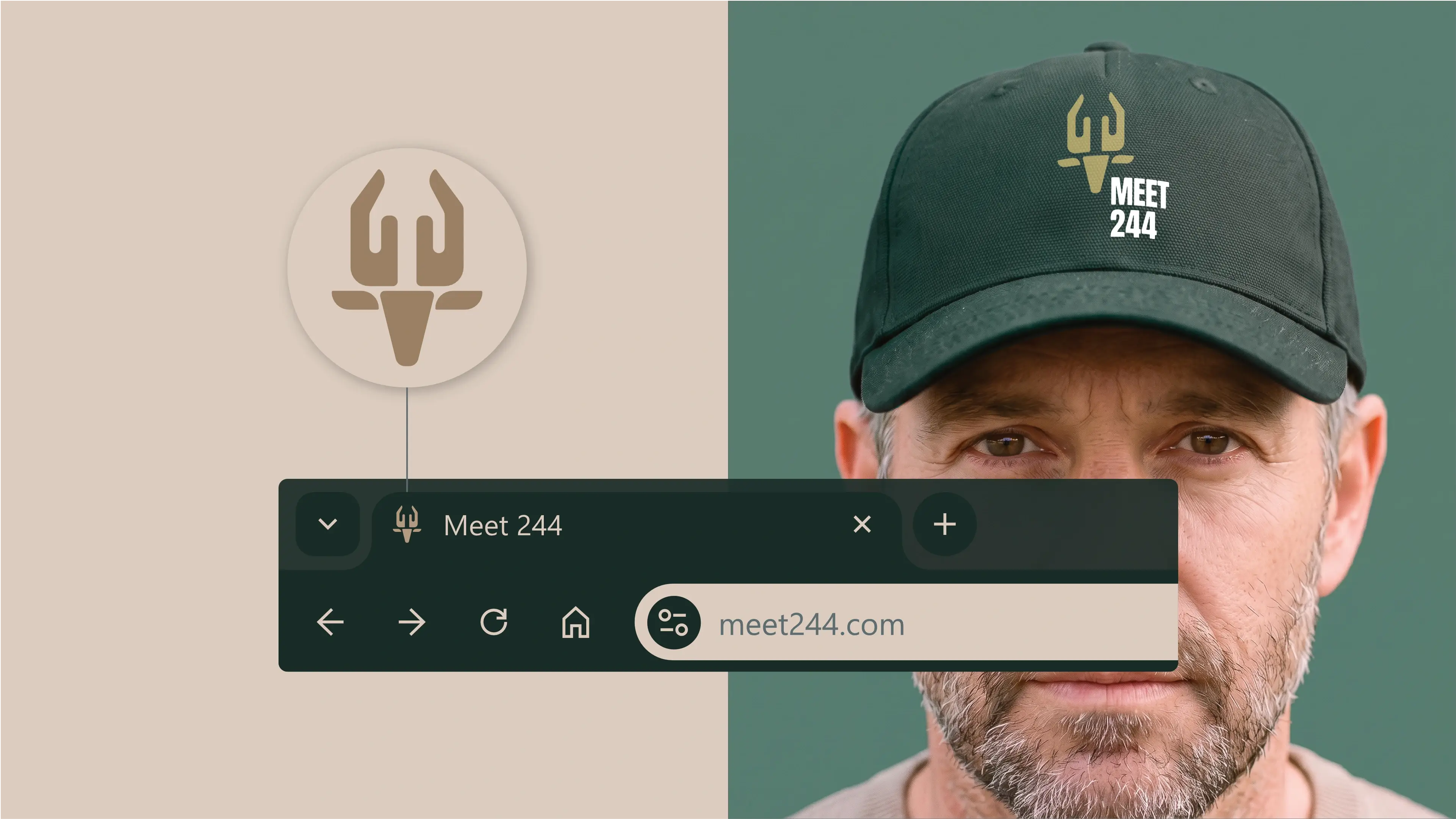
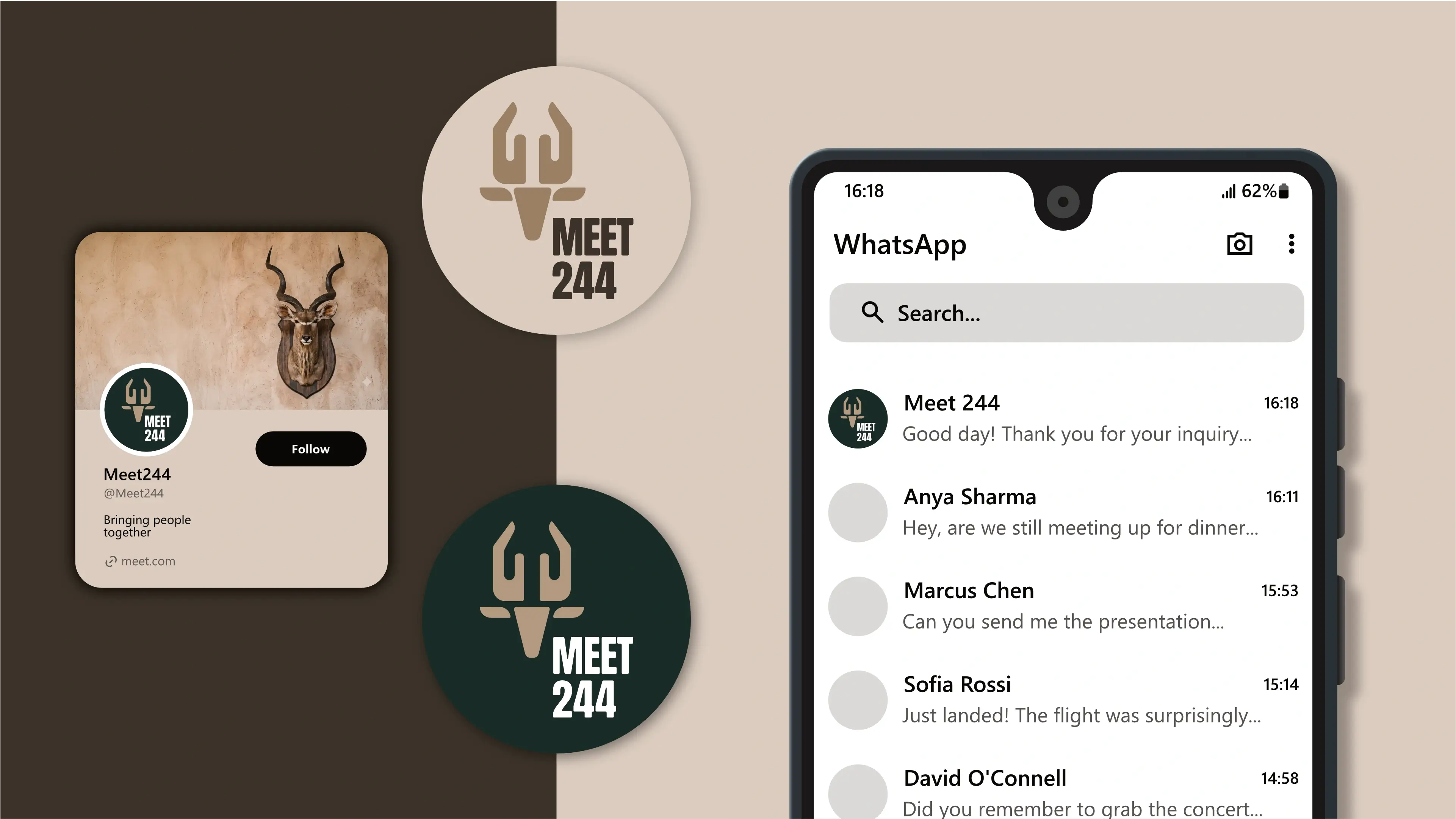
The logo is designed to fit inside a profile image that can typically be uploaded to social media platforms like Facebook, LinkedIn, and Instagram.
Favicons
A favicon is a small icon that represents your website in browser tabs, bookmarks, and address bars, ensuring brand recognition at a glance.