Round 1 | Option 3
About the Brand
Born from a lifelong passion for technology, this company was recently established as a dynamic new brand to revolutionize managed IT and cybersecurity services. By offering rapid access to high-level experts and round-the-clock proactive monitoring, they give businesses peace of mind and precious time back. Their tailored hardware procurement, personal approach, and seamless discovery process bridge critical knowledge gaps. With exceptional client retention, they are positioned as a premium, reliable partner expanding across South Africa.
Target Audience
Their target audience is male B2B directors and SME business owners aged 40 to 60 in the upper income bracket. Frequently plagued by persistent tech issues like slow computers, network failures, data loss, and inadequate IT support, these leaders seek relief from operational headaches. Outside the office, they engage with automotive content and personal hobbies. The brand transforms their frustration into peace of mind by delivering reliable, responsive, and knowledgeable IT solutions at the forefront of technology.
The Goal
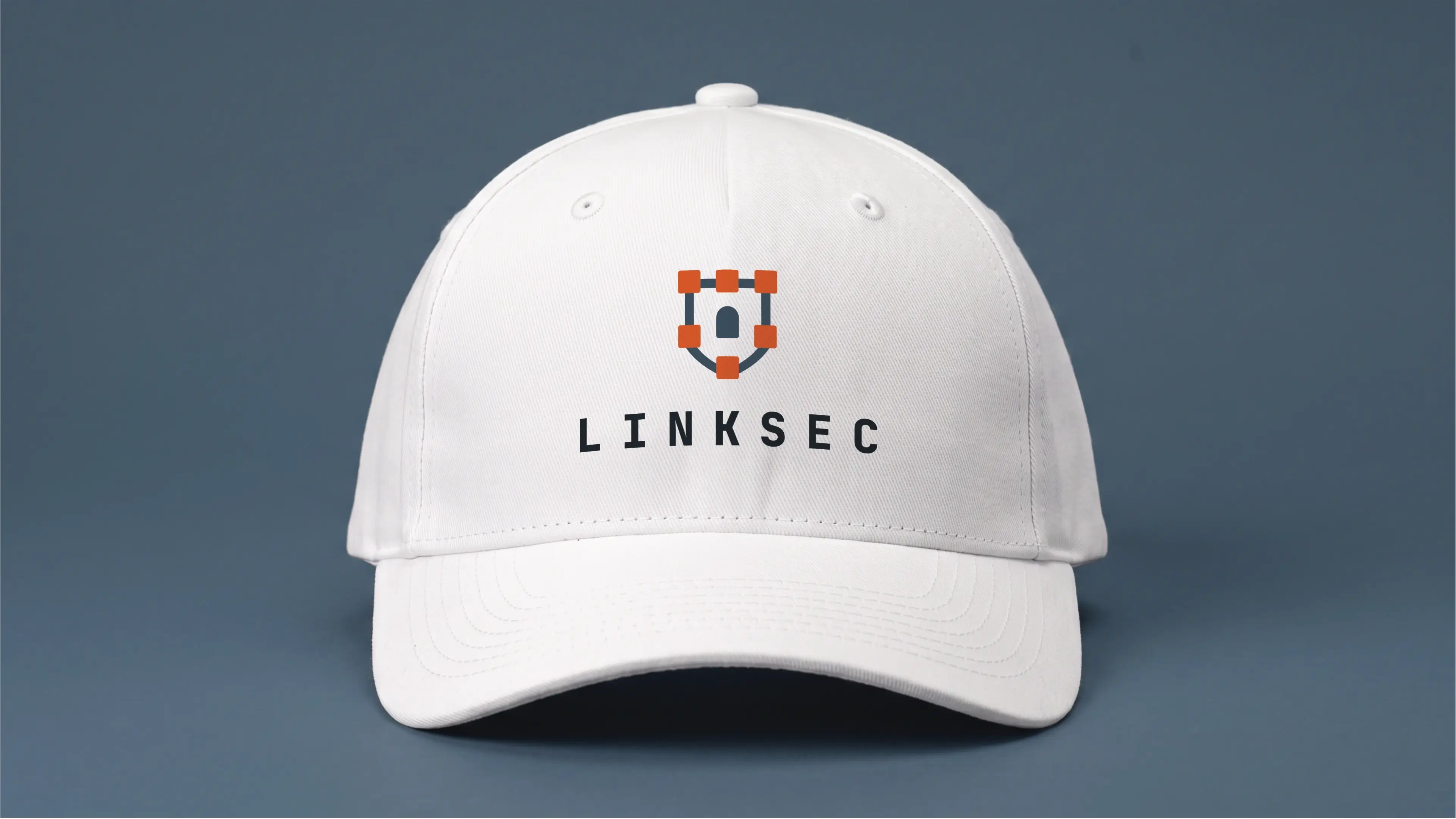
The requirements for the logo design is centered on creating a highly professional first impression across diverse touchpoints including websites, apparel, vehicles, and digital communication platforms. The client desires a bold, non-abstract visual identity with an aggressive stance while avoiding industry clichés. Color preferences explicitly exclude red and black, favor a specific teal tone inspired by Huntress, and allow green sparingly. Additionally, the design brief includes experimenting with integrated slogans to enhance brand messaging.
Let's Break It Down
The Strategy
Monochrome Variations
Colour Palette
Colour Variations
Typography
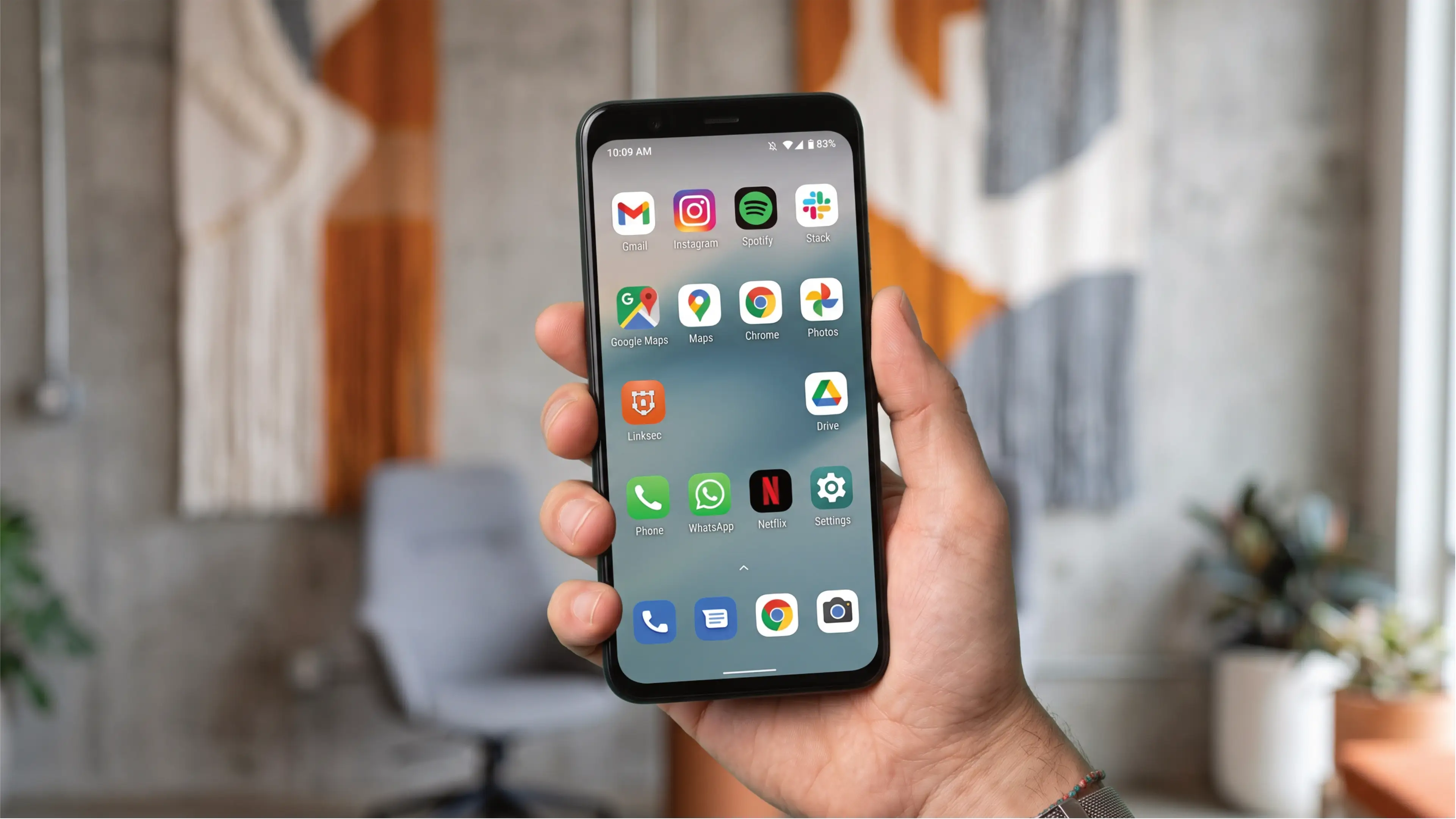
Web & Social Icons
Strategy
The logo consists of a combination mark that features a shield, also doubling as a castle tower. These two elements have withstood the test of time when it comes to symbolizing the idea of defense and security. Each block is connected with the outline of a shield to emphasize the linking aspect of the brand's name.
Vertical
The logo functions perfectly well in a vertical or stacked layout. This means that the logo will work well on vertical applications like smartphones, tablets and roll-up banners.
Horizontal
The logo is designed to be functional in a horizontal layout. This allows you to use the logo on horizontal applications like building signage, websites and stationery.
Colour Palette
This palette balances the warmth of South African landscapes with the clinical precision of high-end cybersecurity. The vibrant primary orange signals energy and proactive monitoring, while the deep blues and teals evoke a sense of professional stability and modern technological expertise. These tones work together to position the brand as a premium, reliable partner that bridges the gap between complex IT infrastructure and personal, human-centric service, ultimately providing businesses with absolute peace of mind.
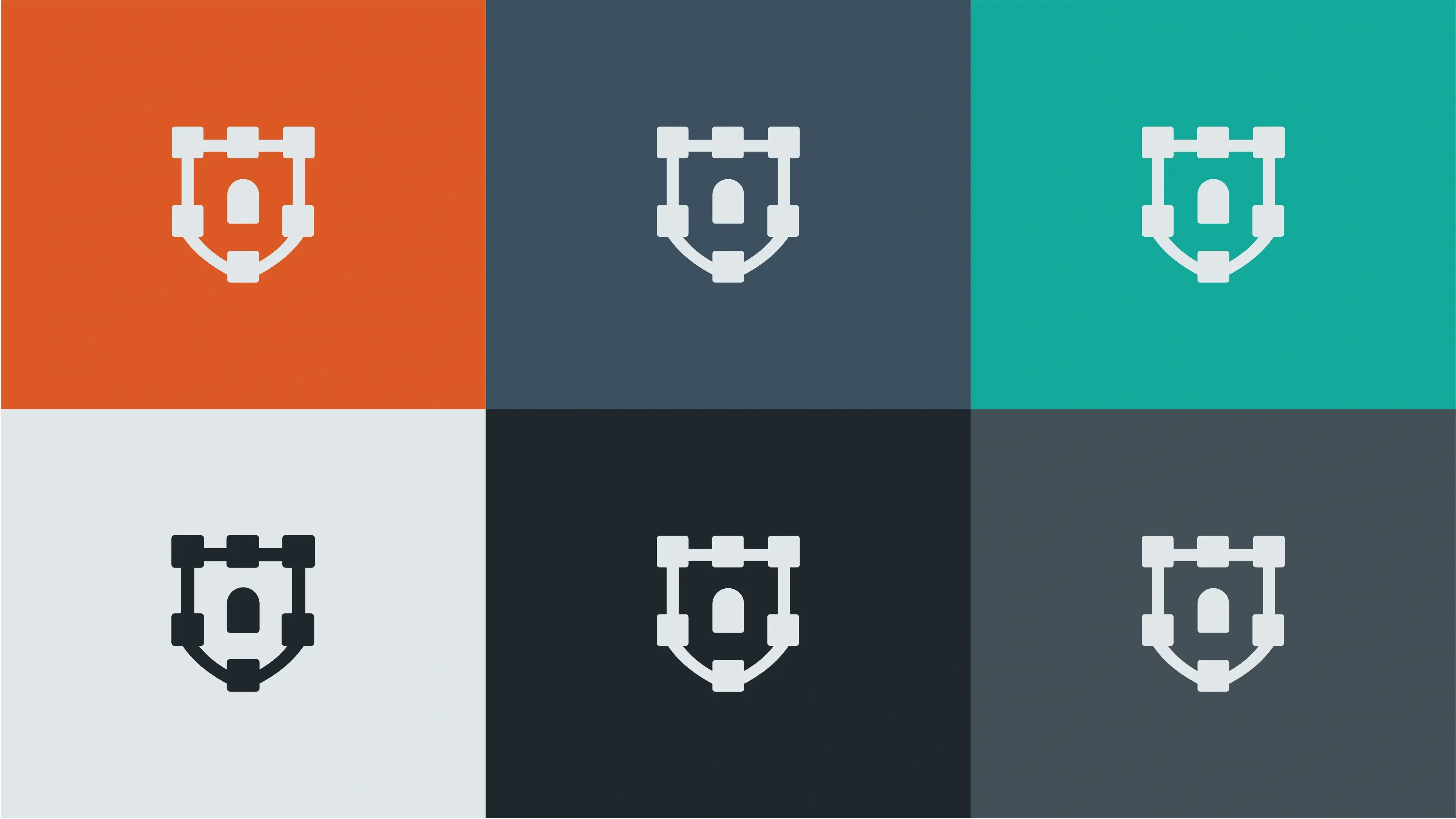
Ember Circuit
Evokes energy, innovation, and a proactive approach to problem-solving.
Deep Anchor
Represents stability, trust, and the depth of technical expertise.
Kinetic Teal
Communicates efficiency, modern technology, and refreshing clarity.
Cloud Mist
Provides a sense of calm, transparency, and organized simplicity.
Midnight Shield
Symbolizes absolute security, authority, and premium protection.
Iron Slate
Conveys professionalism, intelligence, and grounded reliability.
Vertical Colour
The primary colour version of the logo functions perfectly in a vertical layout, designed for maximum brand impact on light and dark digital surfaces.
Horizontal Colour
For wider applications like navigation bars, signage, and stationery, the horizontal colour variations ensure the brand remains legible and professional.
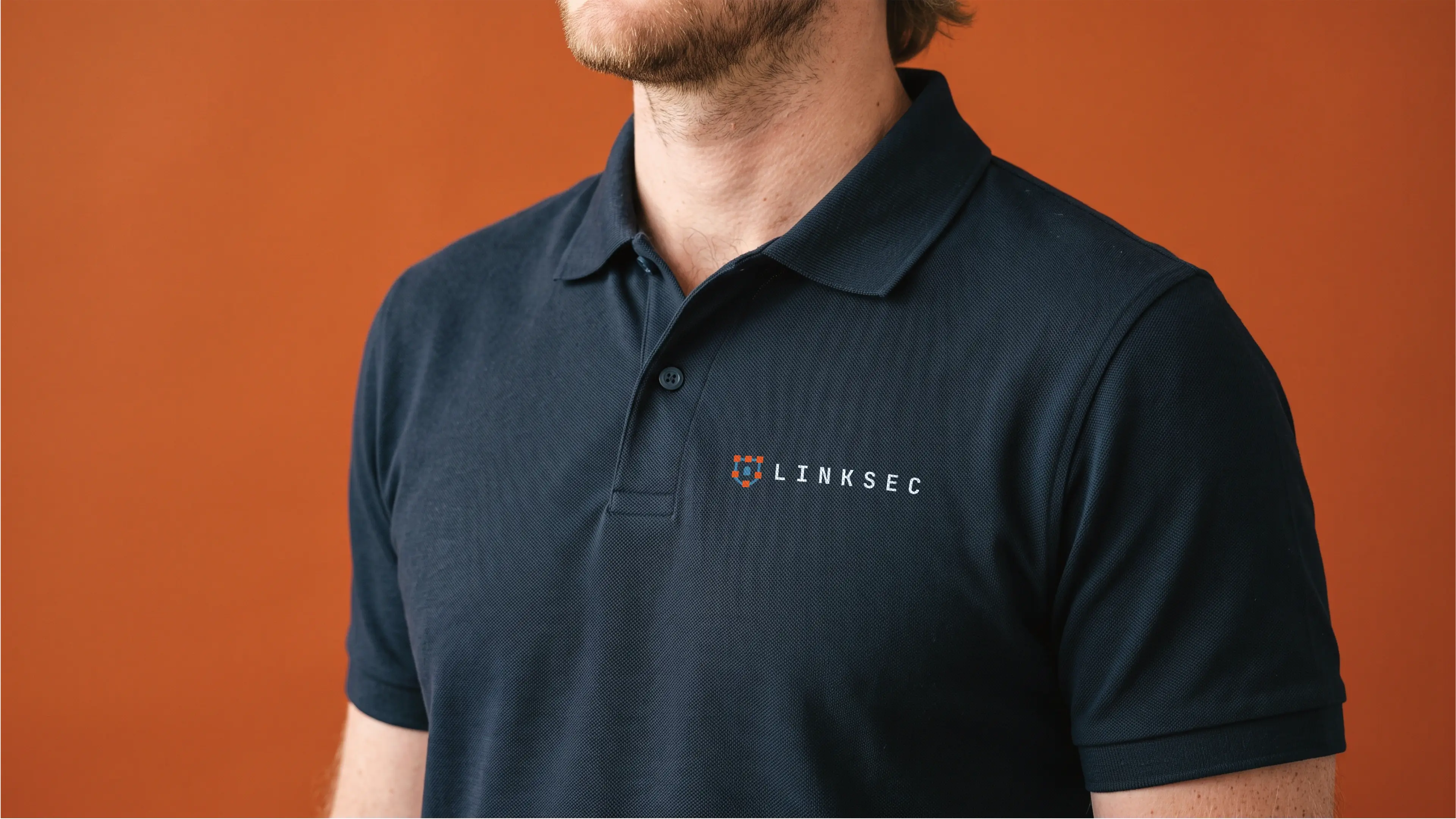
Typography
The combination of JetBrains Mono and Open Sans creates a sophisticated typographic system that balances technical precision with human accessibility. JetBrains Mono provides a sharp, modern edge for headings, while Open Sans offers a soft, legible contrast for supporting content. This pairing effectively communicates the brand's dual identity as both a premium technology leader and a reliable, personal partner. Together, these typefaces establish a cohesive visual identity that reflects the company's innovative approach to revolutionary managed IT services.
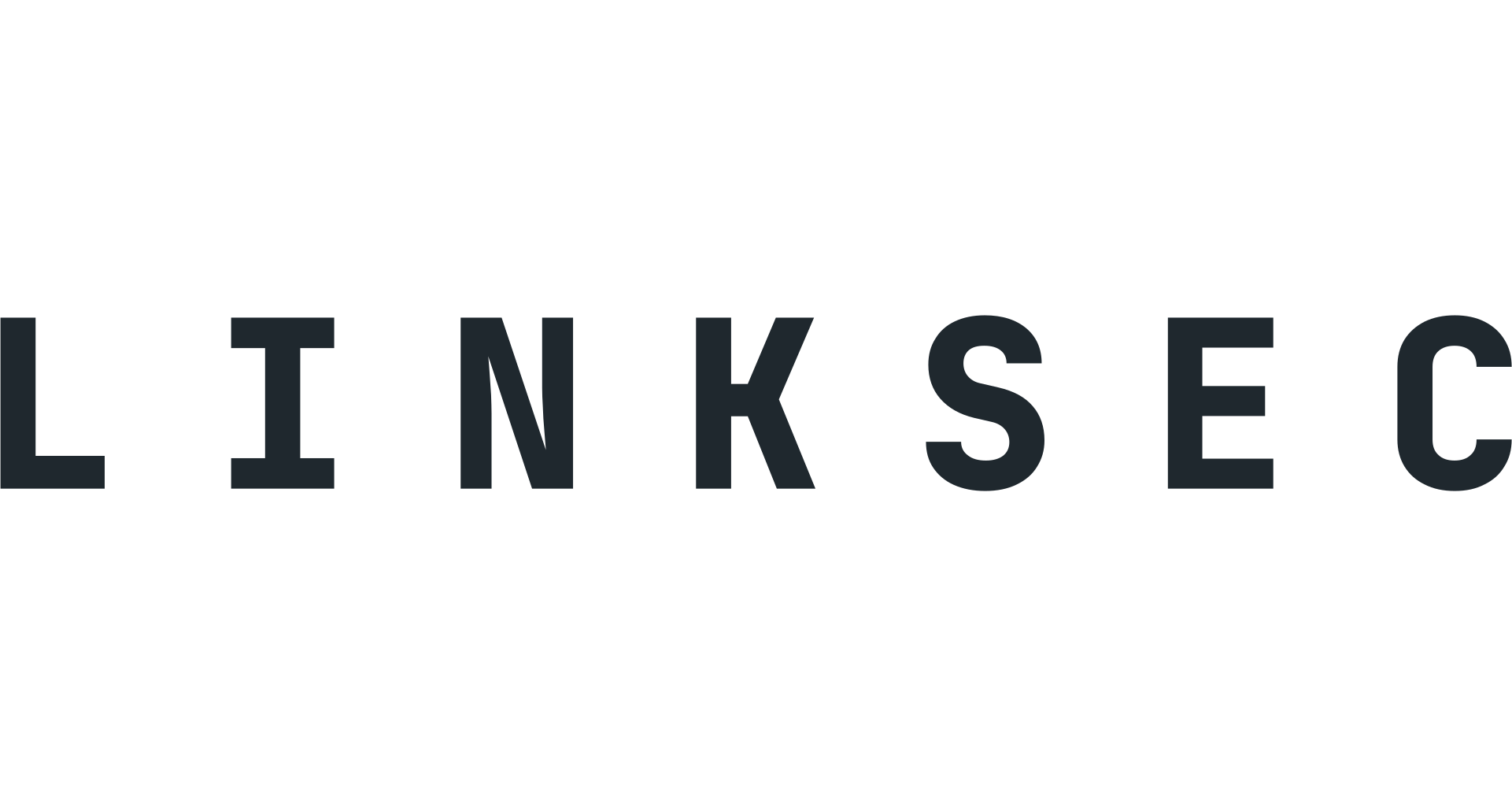
Primary Typeface
JetBrains Mono
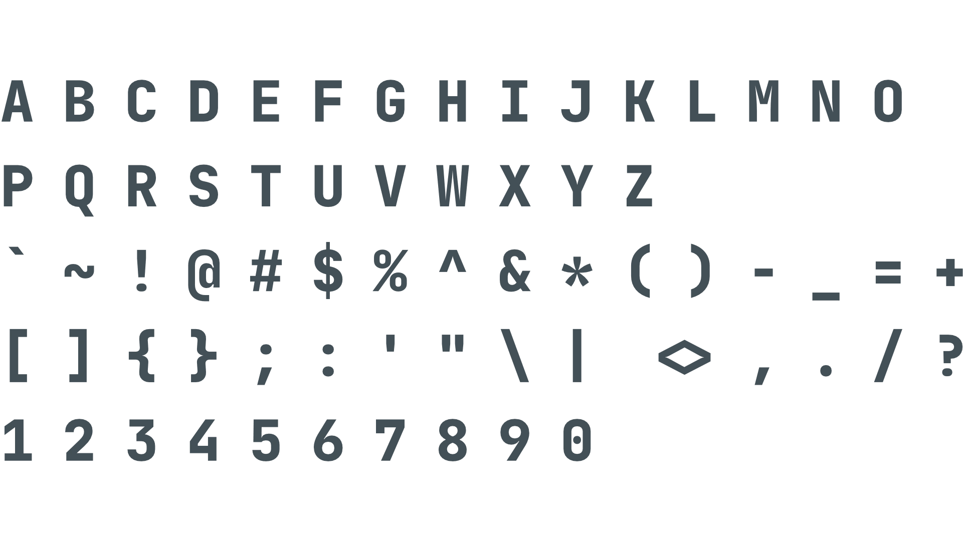
About the typeface
JetBrains Mono is a monospaced typeface designed specifically for developers, embodying the technological precision and innovative spirit of the brand. Its clean, geometric structure conveys a sense of technical expertise and modern efficiency, making it an ideal choice for high-impact headings. The font creates an impression of reliability and advanced technical capability, perfectly aligning with the company's focus on cybersecurity. Its distinct letterforms ensure that key brand messages are delivered with clarity and professional authority.
Secondary Typeface
Open Sans
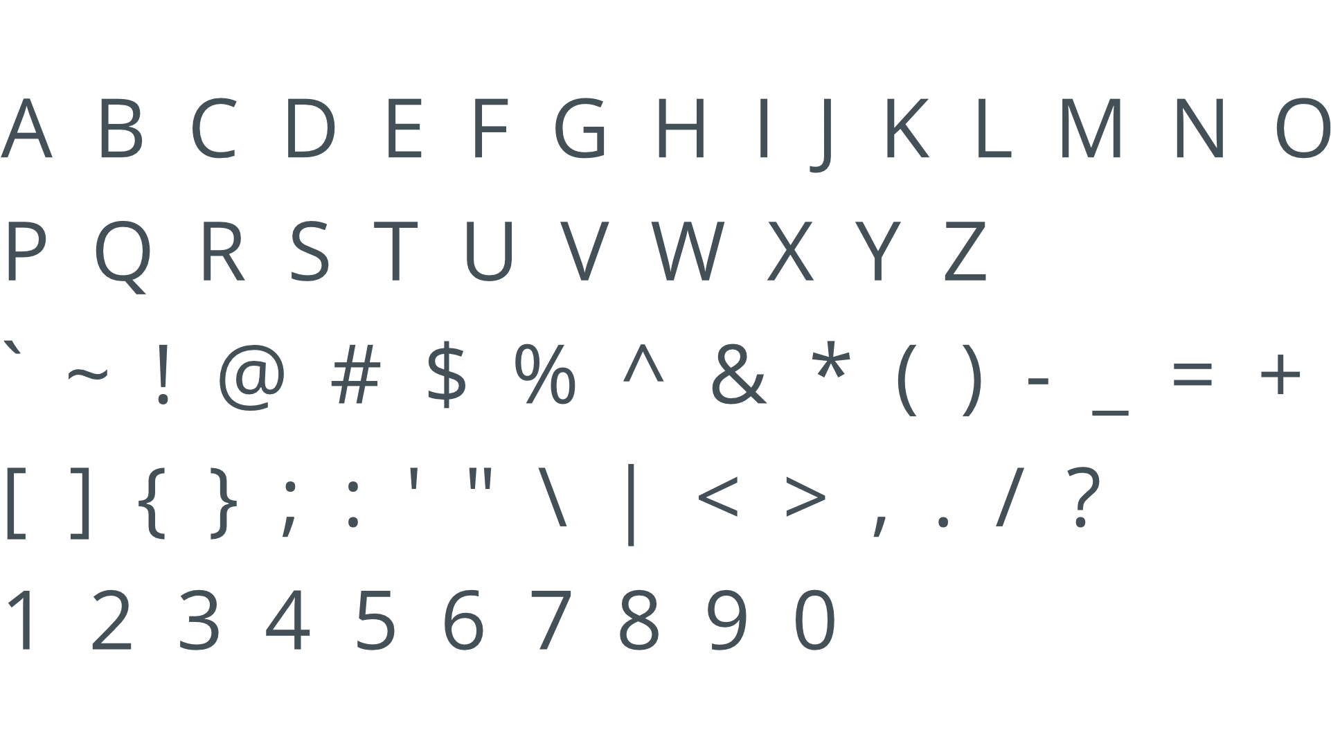
About the typeface
Open Sans is a highly versatile humanist sans-serif typeface that brings a friendly and approachable feel to the brand. Its neutral yet expressive design ensures exceptional readability across subheadings and body text, making complex technical information accessible to clients. The typeface creates an impression of transparency and reliability, bridging the gap between high-level expertise and personal service. By providing a clean and legible reading experience, Open Sans reinforces the company's commitment to seamless communication and client-focused support.
Profile Images
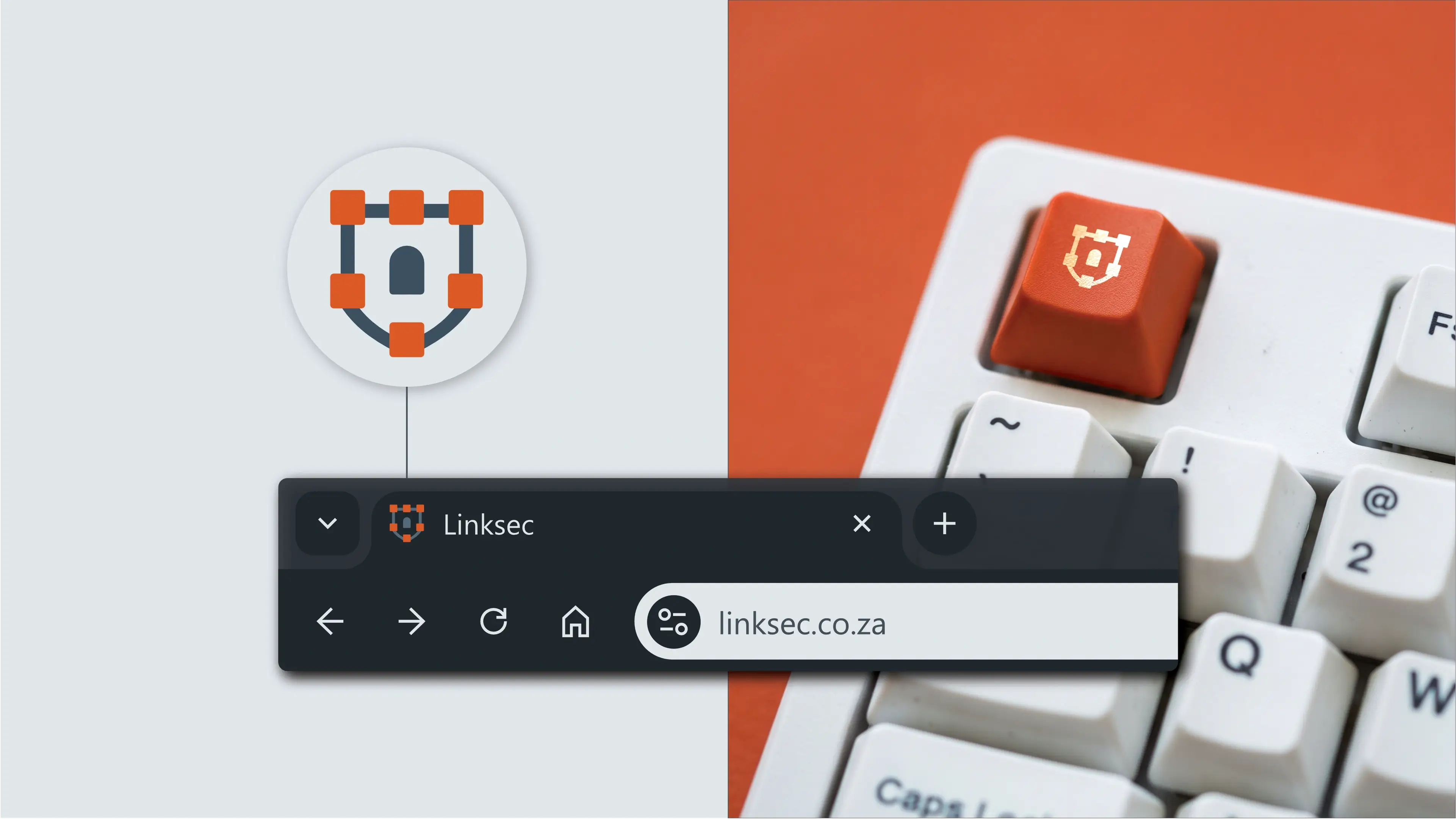
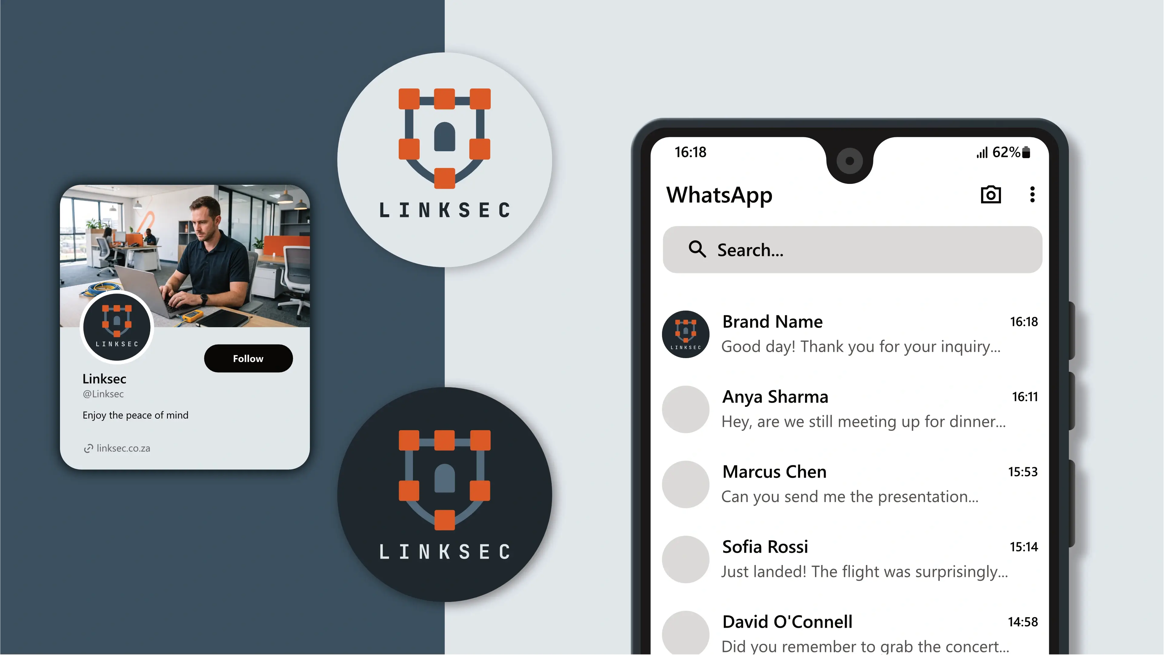
The logo is designed to fit inside a profile image that can typically be uploaded to social media platforms like Facebook, LinkedIn, and Instagram.
Favicons
A favicon is a small icon that represents your website in browser tabs, bookmarks, and address bars, ensuring brand recognition at a glance.