Round 1 | Option 2
About the Brand
Ithrive was established as a high-end wellness lifestyle brand, dedicated to guiding individuals towards optimal health. The name thoughtfully combines 'i' for the individual and 'thrive' for their ultimate state of well-being. Ithrive develops sophisticated wellness products, helping its target audience achieve confidence and longevity. Rather than simply selling products, the brand's unique mission is to cultivate a society where optimal health is the norm. Ithrive offers a formal, results-oriented journey, ensuring clients experience a profound and lasting transformation.
Target Audience
Their target audience is affluent individuals aged 30-70, both male and female, who prioritize a longer, healthier life for themselves and their families. They are often frustrated with the cycle of recurring health issues and ineffective medical solutions. Ithrive appeals to their desire for something effective, easy, and precise, aiming to evoke feelings of excitement, confidence, and trust that this is the definitive answer to their wellness goals.
The Goal
The requirements for the logo design is for Ithrive, a brand aiming to establish a strong, trustworthy identity. The logo needs to be versatile for various applications, including their website, branding stationery, apparel, and social media. Ithrive specifically requested a wordmark design that subtly incorporates the idea of modern technology, reflecting their forward-thinking nature. The final design must visually communicate trust and innovation across all touchpoints without relying on a slogan.
Let's Break It Down
The Strategy
Monochrome Variations
Colour Palette
Colour Variations
Typography
Web & Social Icons
Strategy
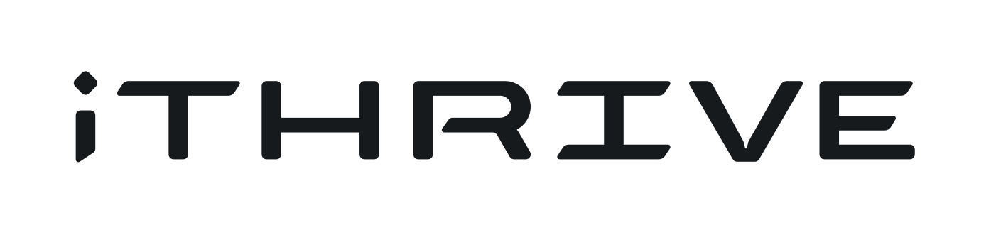
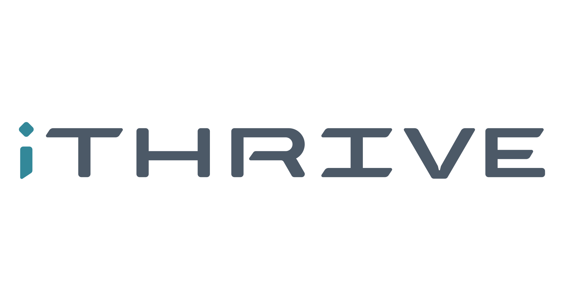
The logo features a wordmark with wide geometric shapes to add a futuristic and technological character to the logo. To emphasise the idea of improvement, the end caps were designed with a diagonal slant. The dot on the "i" has been rotated by 45 degrees to add more diagonal lines to the "i" in the case where it might be isolated.
Horizontal
The logo is designed to be functional in a horizontal layout. This allows you to use the logo on horizontal applications like building signage, websites and stationery.

Colour Palette
The Meridian Ascent palette embodies Ithrive's commitment to optimal health and lasting transformation. Its sophisticated blend of deep blues, serene greens, and strong greys reflects the brand's high-end wellness ethos, guiding individuals towards confidence and longevity. This formal yet inviting palette underscores the methodical, results-oriented journey Ithrive offers, establishing a sense of trust and profound well-being crucial for cultivating a society where optimal health is the norm.
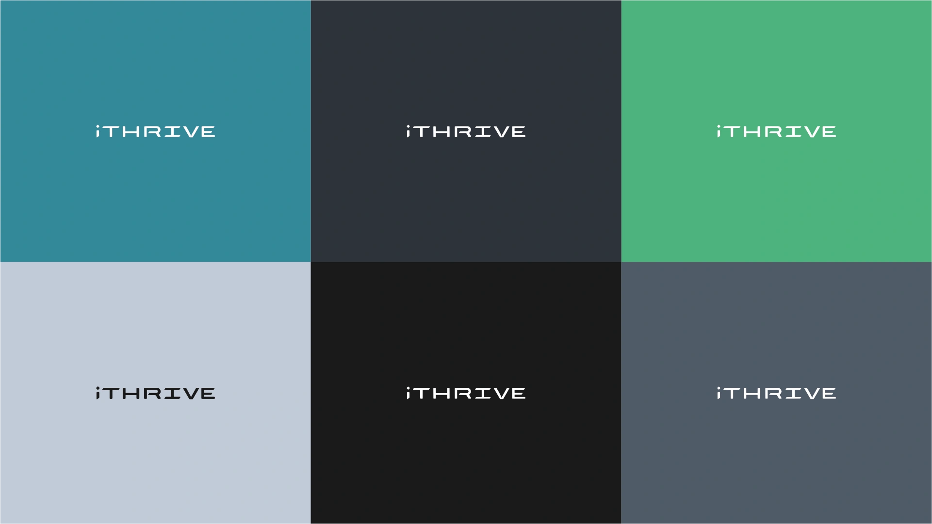
Thrive Teal
Teal represents clarity, calmness, and sophistication. It combines the calming properties of blue with the renewal of green, suggesting growth, emotional healing, and a sense of balance. It fosters open communication and introspection, aligning with well-being.
Summit Grey
Dark grey signifies strength, formality, and stability. It conveys a sense of reliability and professionalism, often associated with luxury and groundedness. This colour provides a solid foundation, reflecting serious commitment and a sophisticated approach.
Vitality Green
Green represents health, growth, and harmony. It evokes feelings of refreshment and renewal, symbolising nature, vitality, and well-being. This colour supports a sense of balance and prosperity, reinforcing the idea of thriving and natural transformation.
Clarity Mist
Light grey-blue suggests tranquility, clarity, and sophistication. It offers a sense of calm and openness, promoting peace and mental clarity. This neutral tone provides a subtle backdrop that enhances the perception of elegance and thoughtful design, fostering a serene environment.
Deep Obsidian
Very dark grey, almost black, embodies elegance, power, and depth. It conveys a sense of seriousness and authority, providing a strong, sophisticated foundation. This colour implies ultimate strength and transformation, aligning with the brand's promise of profound change.
Ink Slate
A refined dark grey signifies professionalism, intellect, and timelessness. It ensures readability while maintaining a sophisticated aesthetic. This colour communicates stability and competence, reinforcing the brand's formal and results-oriented approach.
Horizontal Colour
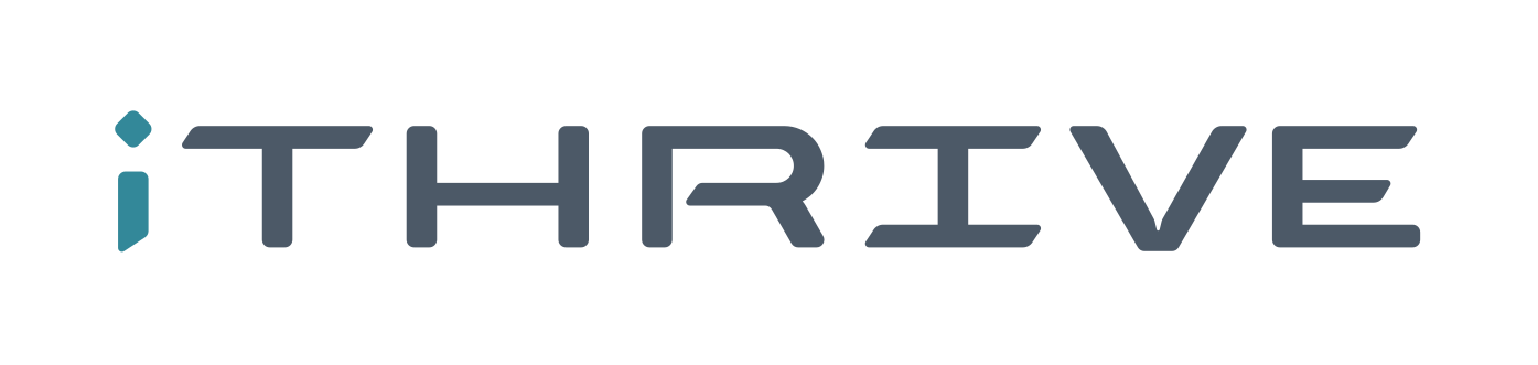
For wider applications like navigation bars, signage, and stationery, the horizontal colour variations ensure the brand remains legible and professional.
Typography
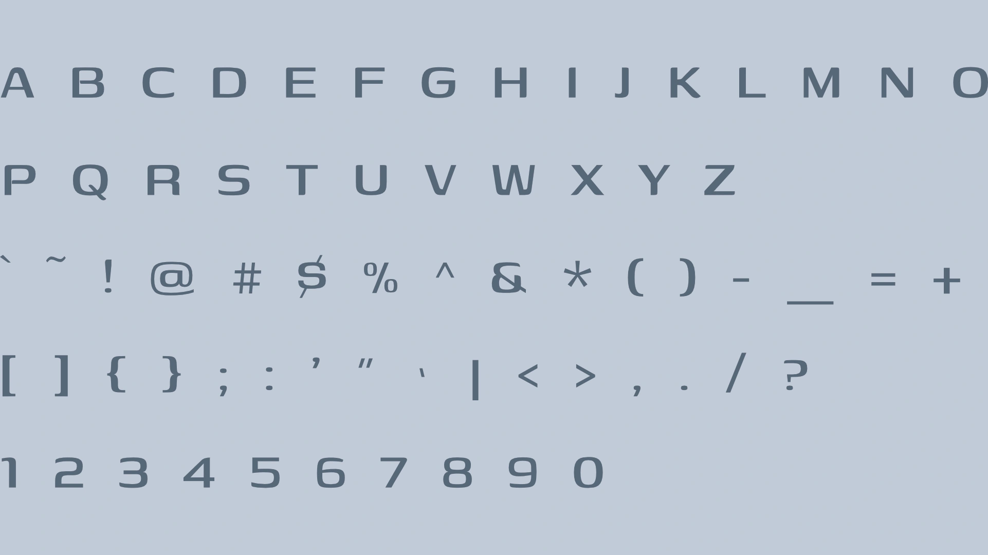
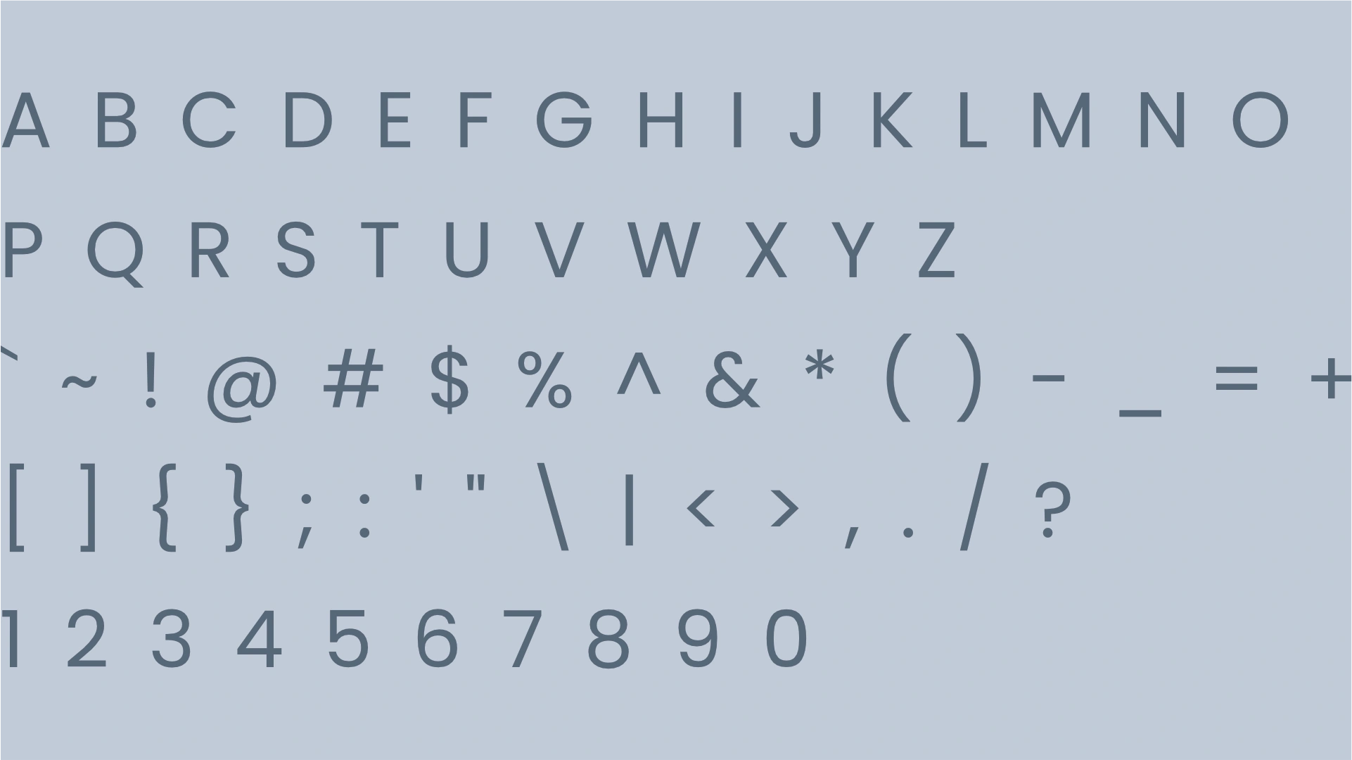
The selection of Genos as the primary typeface, a sleek and modern geometric sans-serif, reflects Ithrive's sophisticated, results-oriented approach. Its clean lines convey precision and high-end quality. Paired with Poppins, a balanced and highly readable geometric sans-serif, the combination achieves a harmonious balance. Poppins adds an approachable yet professional tone, ensuring clarity for guiding individuals. Together, they create an impression of trusted expertise and modern elegance, effectively supporting Ithrive's mission for optimal health and lasting transformation.
Primary Typeface
Genos
About the typeface
Genos, a contemporary geometric sans-serif, presents a clean, precise, and authoritative aesthetic. Its modern simplicity creates an impression of sophistication and cutting-edge methodology, perfectly aligning with Ithrive’s high-end, results-oriented approach. As a primary typeface for headings, Genos effectively conveys confidence, clarity, and the formal structure of a transformative journey. It projects a forward-thinking yet grounded image, reinforcing the brand's commitment to optimal health and lasting well-being.
Secondary Typeface
Poppins
About the typeface
Poppins, a clean geometric sans-serif, exudes a modern sophistication. Its clear, open forms foster approachability and trust, perfectly aligning with Ithrive's guiding mission. Highly legible, it excels for subheadings, enhancing clarity for results-oriented content. For paragraphs, its precise, modern aesthetic supports a formal yet accessible tone, ensuring sophisticated wellness information is absorbed with confidence, reflecting the brand's transformative journey.
Profile Images
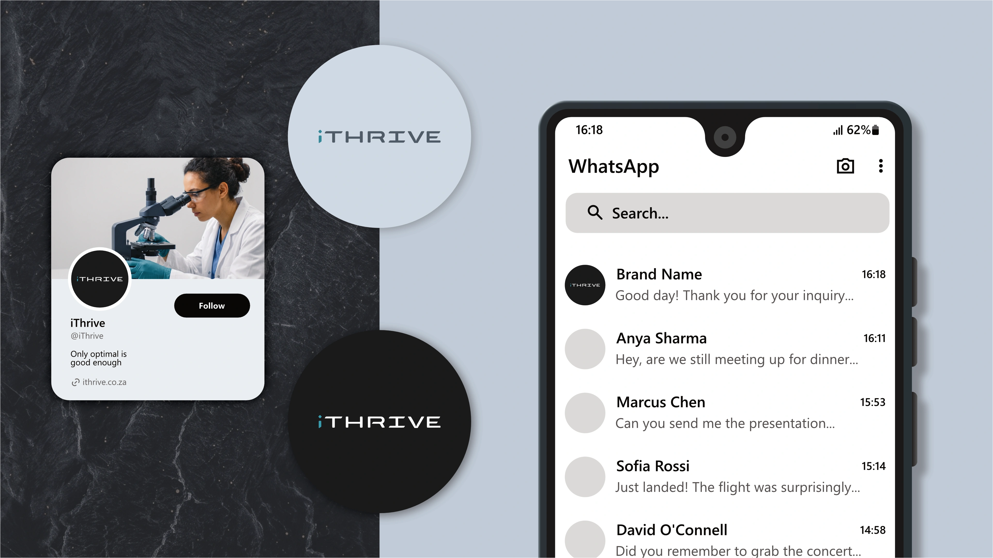
The logo is designed to fit inside a profile image that can typically be uploaded to social media platforms like Facebook, LinkedIn, and Instagram.

Favicons
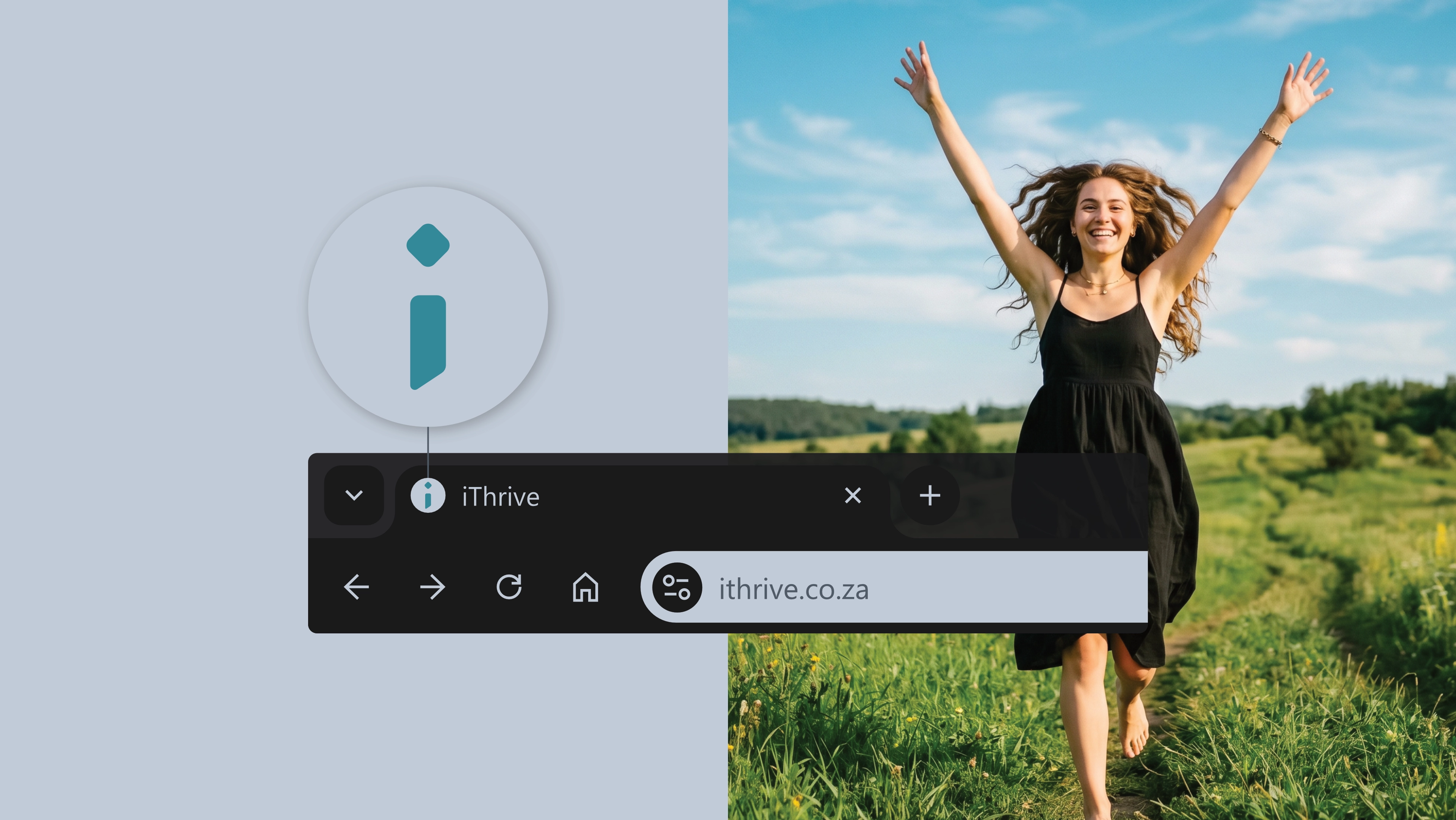
A favicon is a small icon that represents your website in browser tabs, bookmarks, and address bars, ensuring brand recognition at a glance.