Round 1 | Option 3
About the Brand
Golden Falls Mining is a premium, formal brand that is currently undergoing a rebranding initiative to establish a memorable and enduring identity within the diamond industry. Specializing in small-scale diamond mining, they offer their target audience a tangible investment through a meticulously formal buying process, facilitated by a single tender house. The brand's name, inherited and signifying an abundance of wealth, perfectly encapsulates their offering of truly unique stones, which are not only easier to sell but also serve to diversify their portfolio and provide crucial backup capital. Their distinctiveness lies in these exceptional stones and a strong commitment to community. They aim to modernize with newer technology in the coming years while maintaining their established, premium presence.
Target Audience
Their target audience is comprised of discerning individuals, both male and female, typically between 30 and 50 years old, belonging to the upper income class. These are people who have a love for acquiring expensive gifts and fine jewelry. Their engagement with the brand is often prompted when a tenderhouse identifies a potential buyer, signaling a considered and strategic acquisition process rather than casual purchasing. They seek a brand that they would describe as humane, making an impact, and community-driven. They desire to feel hope, trust, and honesty when interacting with it.
The Goal
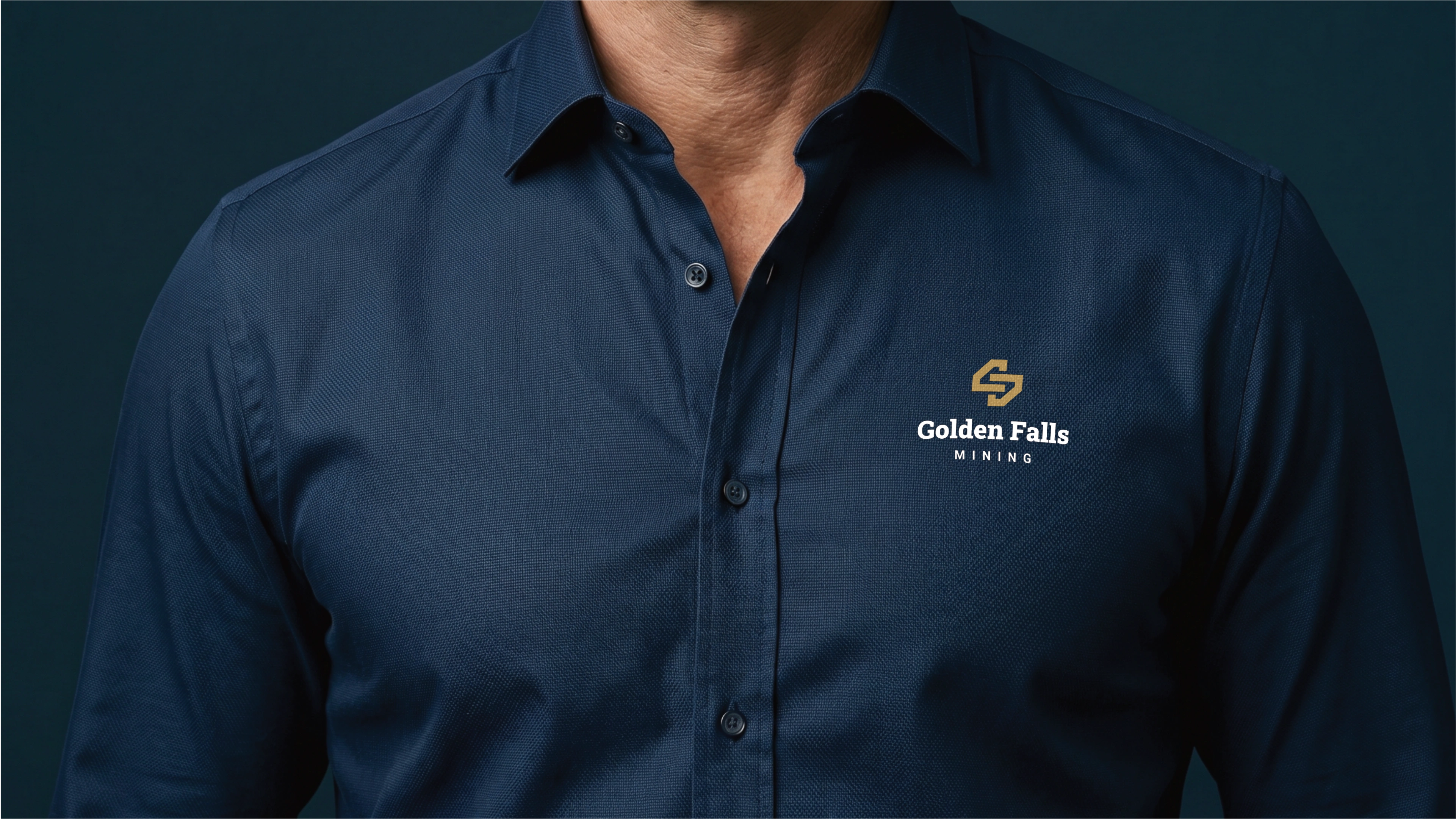
Their vision needs to be clearly reflected in the new emblem, which will be a central element of their refreshed identity. The logo must be highly versatile, as it will be prominently displayed across various touchpoints, including branding stationery, company apparel, and vehicle signage, necessitating excellent scalability and readability. While open to slogan suggestions, the core themes of hope, high value, and community are crucial to the brand's message. These values should be subtly echoed within the visual language of the logo.
Let's Break It Down
The Strategy
Monochrome Variations
Colour Palette
Colour Variations
Typography
Web & Social Icons
Strategy
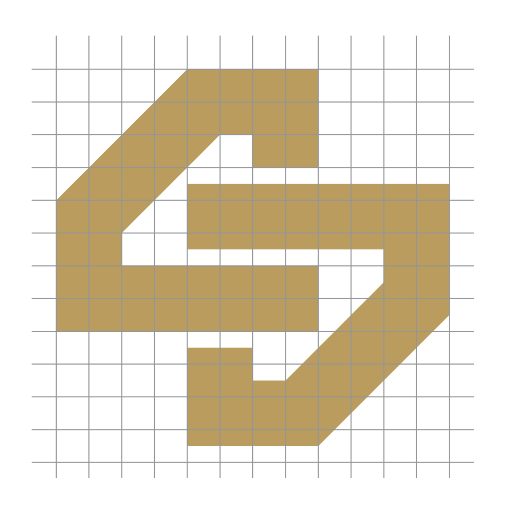
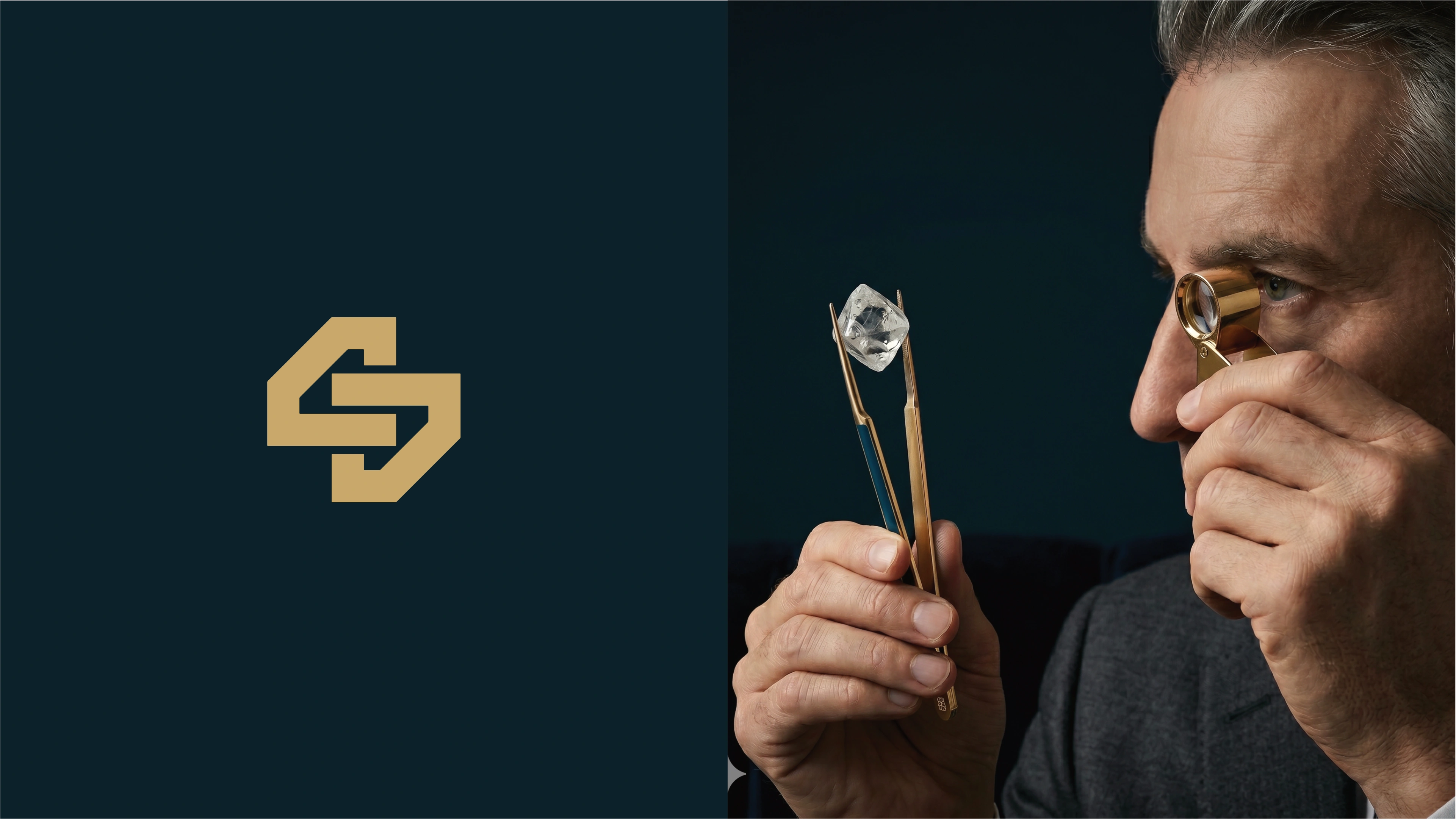
The logo features thick outlines of 2 interlocking diamonds. The interlocking characteristic of the diamonds is a subtle nod to how this brand works with sister brands to generate weatlh.
Vertical
The logo functions perfectly well in a vertical or stacked layout. This means that the logo will work well on vertical applications like smartphones, tablets and roll-up banners.
Horizontal
The logo is designed to be functional in a horizontal layout. This allows you to use the logo on horizontal applications like building signage, websites and stationery.
Colour Palette
The Veiled Abundance Palette embodies Golden Falls Mining's premium essence, blending earthy richness with profound depth. Its formal yet inviting tones reflect the brand's commitment to tangible investment and unique diamond offerings. This sophisticated selection, rooted in natural elegance, signifies the enduring value and exclusive beauty of their stones, while subtly hinting at future modernization. It perfectly balances a heritage of wealth with a forward-looking identity, resonating with trust and the discovery of extraordinary assets.
Golden Vein
This rich, earthy gold represents wealth, luxury, and prestige. It evokes a sense of opulence and high value, aligning with premium diamonds, tangible investments, and the brand's name 'Golden Falls'.
Deep Mineral
A deep, sophisticated blue-green, this color signifies stability, wisdom, and professionalism. It connects to the earth's depths where minerals are found, evoking trust, reliability, and an enduring sense of quality for the brand.
Aqueous Glimmer
This lighter, serene blue-green evokes clarity, freshness, and innovation. It suggests a progressive outlook and the brand's aim to modernize with new technology, while maintaining a calming and trustworthy presence.
Pristine Quartz
An elegant off-white, this color represents purity, simplicity, and refinement. It provides a clean, refined backdrop, signifying clarity, new beginnings, and the premium nature of the brand's exclusive diamond offerings.
Deep Bedrock
A very dark, almost black, shade that conveys power, authority, and sophistication. It aligns with the idea of hidden depths and enduring value, symbolizing the strength and formal aspect of Golden Falls Mining.
Lumina Ink
This deep charcoal provides exceptional readability and a sophisticated, understated elegance. It conveys professionalism and seriousness, ensuring the brand's formal communications are clear, trustworthy, and premium.
Vertical Colour
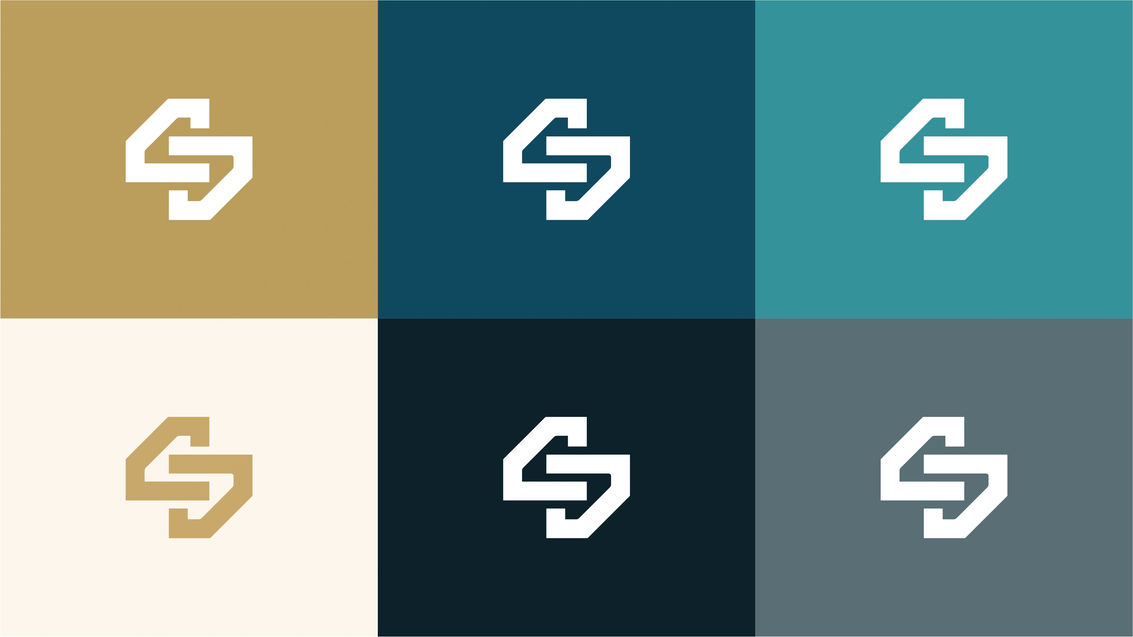
The primary colour version of the logo functions perfectly in a vertical layout, designed for maximum brand impact on light and dark digital surfaces.
Horizontal Colour
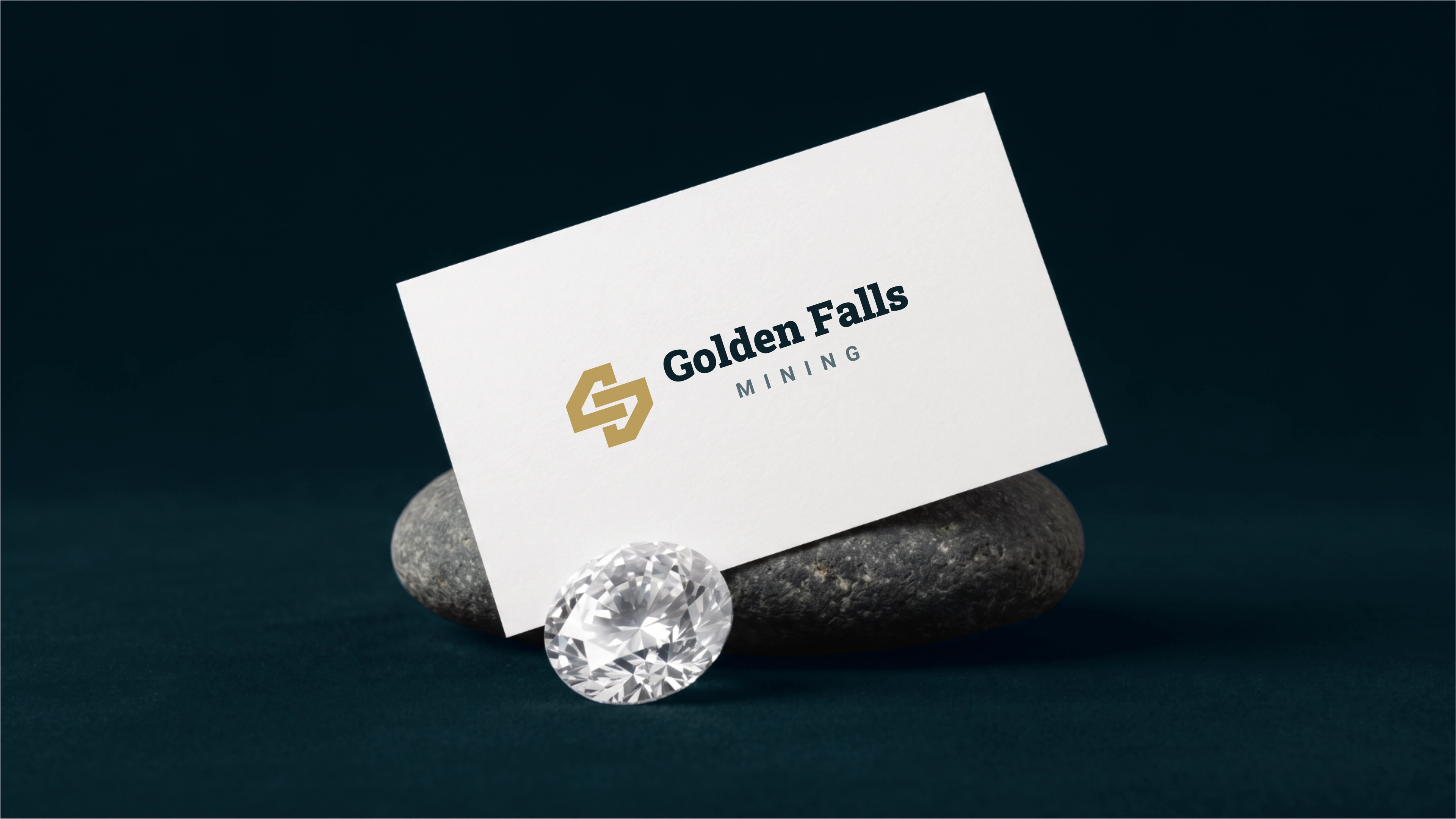
For wider applications like navigation bars, signage, and stationery, the horizontal colour variations ensure the brand remains legible and professional.
Typography
The robust Roboto Slab conveys a strong, premium, and reliable impression, perfectly suiting Golden Falls Mining's formal identity and tangible investments. Paired with Roboto, a clean, modern sans-serif, the combination achieves excellent readability and a balanced aesthetic. This duo effectively marries the brand's established, trustworthy heritage with its desire for modern technology. The shared geometric foundation ensures harmony, creating a cohesive and distinguished identity that resonates with both wealth and community values.
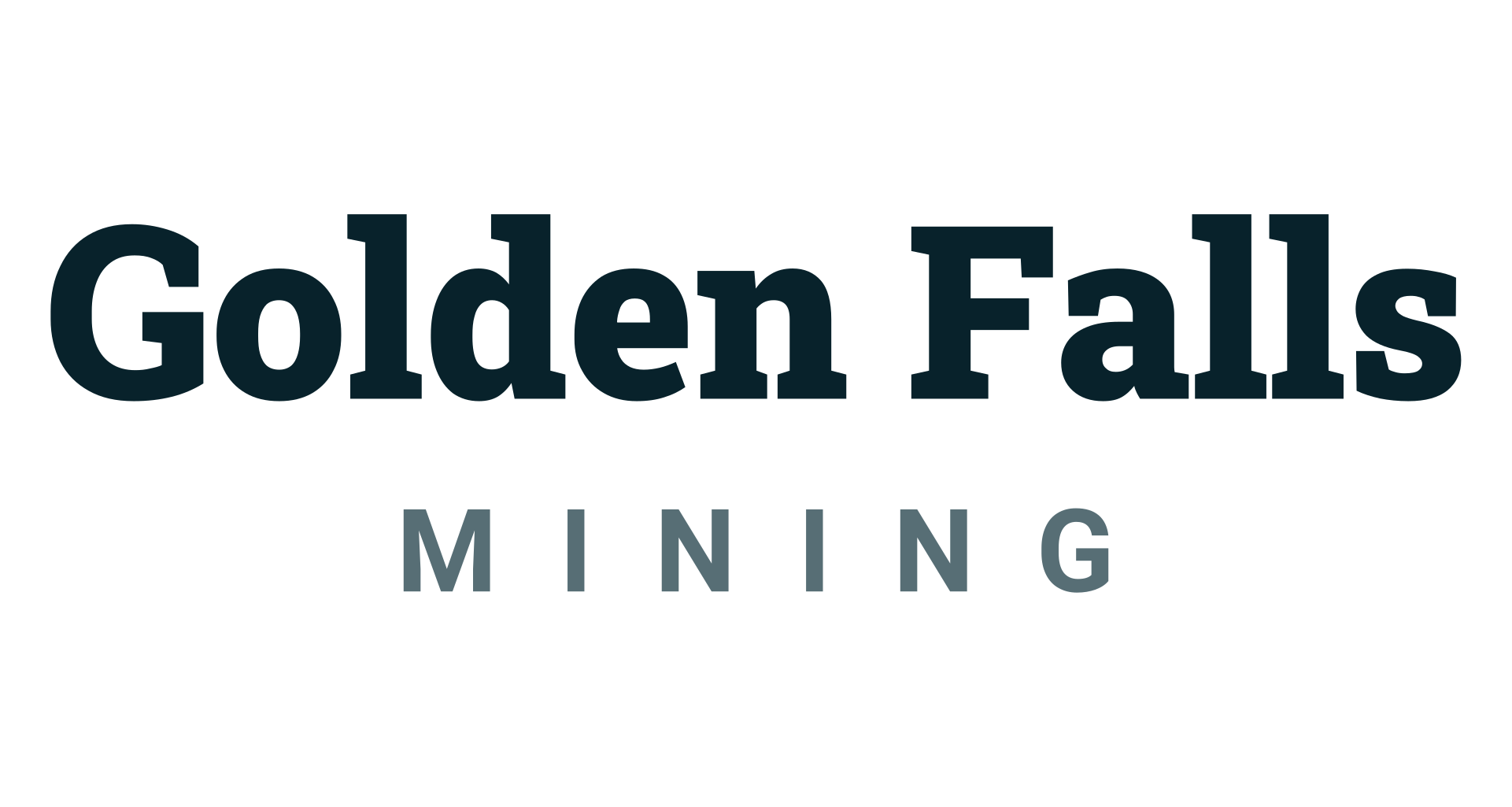
Primary Typeface
Roboto Slab
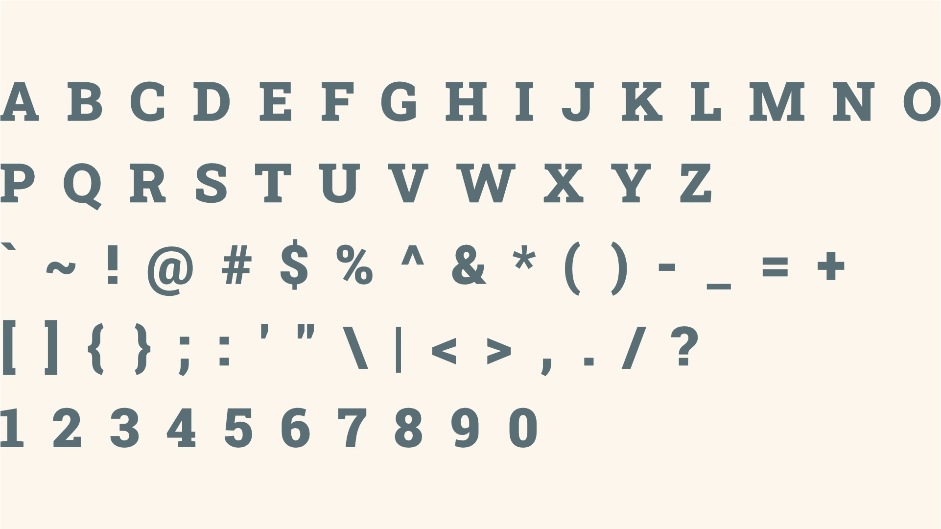
About the typeface
Roboto Slab, a geometric slab serif, projects a robust and modern yet enduring style. It creates an impression of grounded reliability and contemporary sophistication, aligning with Golden Falls Mining's premium, formal identity and future modernization. For headings, its substantial weight and clear structure effectively convey the brand's abundance of wealth and tangible investment. This typeface ensures headings are both memorable and authoritative, reinforcing a strong, enduring presence while subtly hinting at technological evolution.
Secondary Typeface
Roboto
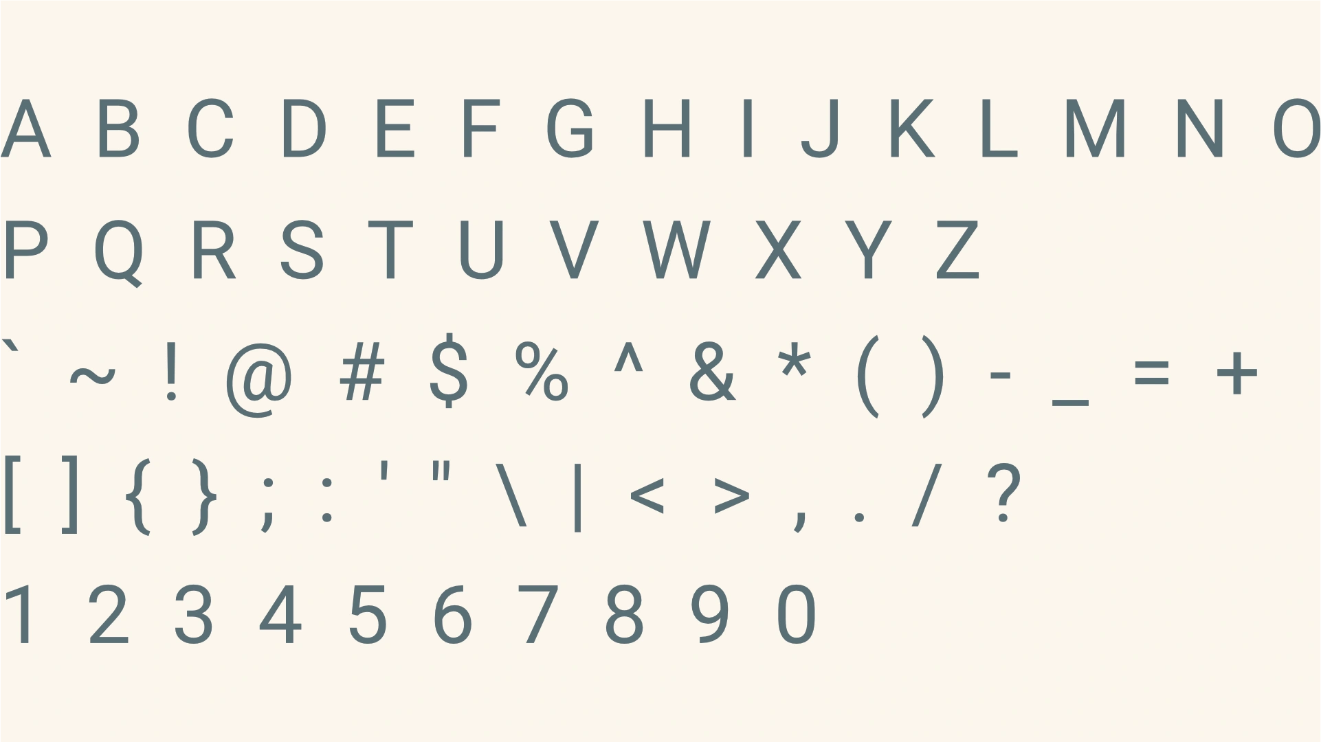
About the typeface
Roboto, a clean, modern geometric sans-serif, offers excellent legibility vital for subheadings and paragraphs. Its professional, straightforward style subtly reinforces Golden Falls Mining's aim to modernize with technology, while maintaining a premium feel. This secondary typeface ensures clear, accessible communication without detracting from the brand's formal identity, balancing contemporary efficiency with their established, high-value presence.
Profile Images
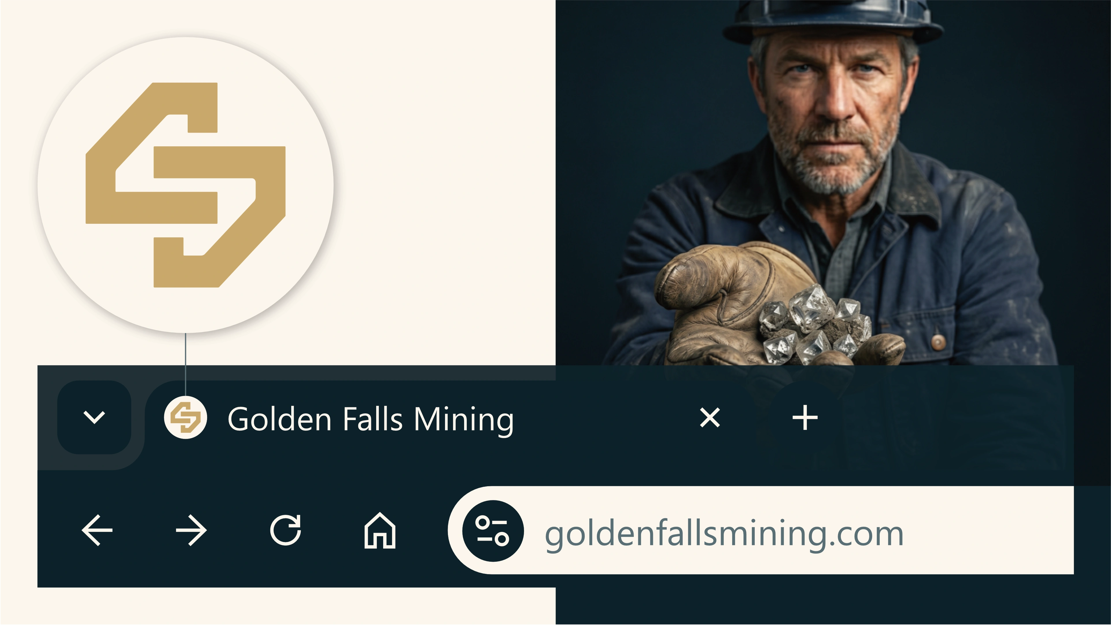
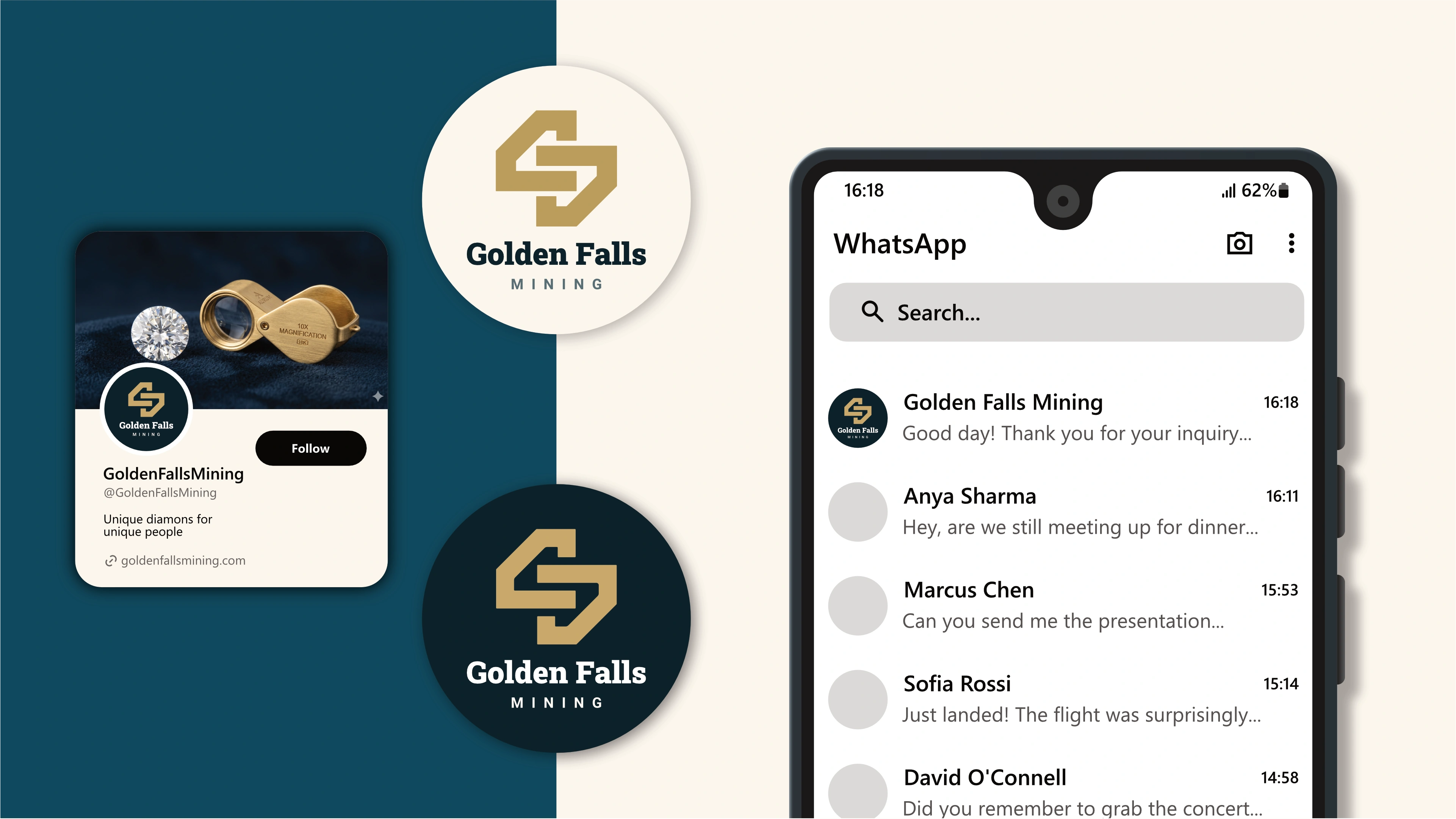
The logo is designed to fit inside a profile image that can typically be uploaded to social media platforms like Facebook, LinkedIn, and Instagram.
Favicons
A favicon is a small icon that represents your website in browser tabs, bookmarks, and address bars, ensuring brand recognition at a glance.