Round 1 | Option 2
About the Brand
Equinox Vector was established as a new brand to transform the legal landscape by providing regulated, expert-led mediation services. Symbolizing balance and progress, the company bridges the gap between costly litigation and unregulated alternatives. By consulting industry specialists for every conflict, Equinox Vector delivers faster, fair, and mutually beneficial resolutions for clients awaiting court dates, guiding them toward a purposeful new beginning.
Target Audience
their target audience is middle-to-upper-income individuals aged 28 to 60, as well as specialized attorneys seeking efficient mediation solutions. Exhausted by lengthy court delays, exorbitant legal fees, and systemic frustration, these clients desperately crave a fair, considerate, and understanding alternative. By choosing this brand, they transition from feeling resentful and stuck in legal limbo to experiencing genuine relief and peace of mind, empowering them to resolve disputes swiftly and confidently move on with their lives.
The Goal
The requirements for the logo design is to create a deeply meaningful, non-generic symbol that stands apart from automated, AI-generated aesthetics. The visual identity must seamlessly adapt across websites, stationery, apparel, and signage. Central to the design are themes of balance, transition, and equality, perfectly embodying their core vision. Furthermore, the design will integrate or complement their flexible brand slogan, Balance direction impact, creating a cohesive visual statement.
Let's Break It Down
The Strategy
Monochrome Variations
Colour Palette
Colour Variations
Typography
Web & Social Icons

Strategy
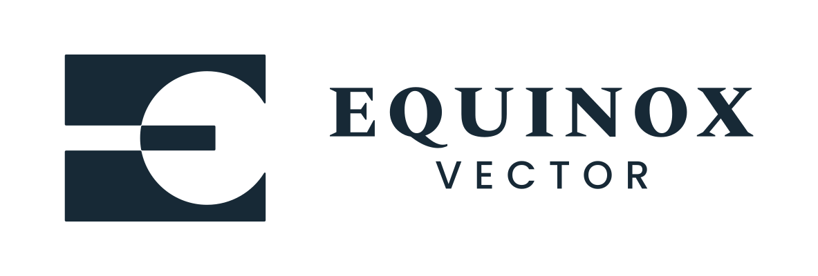
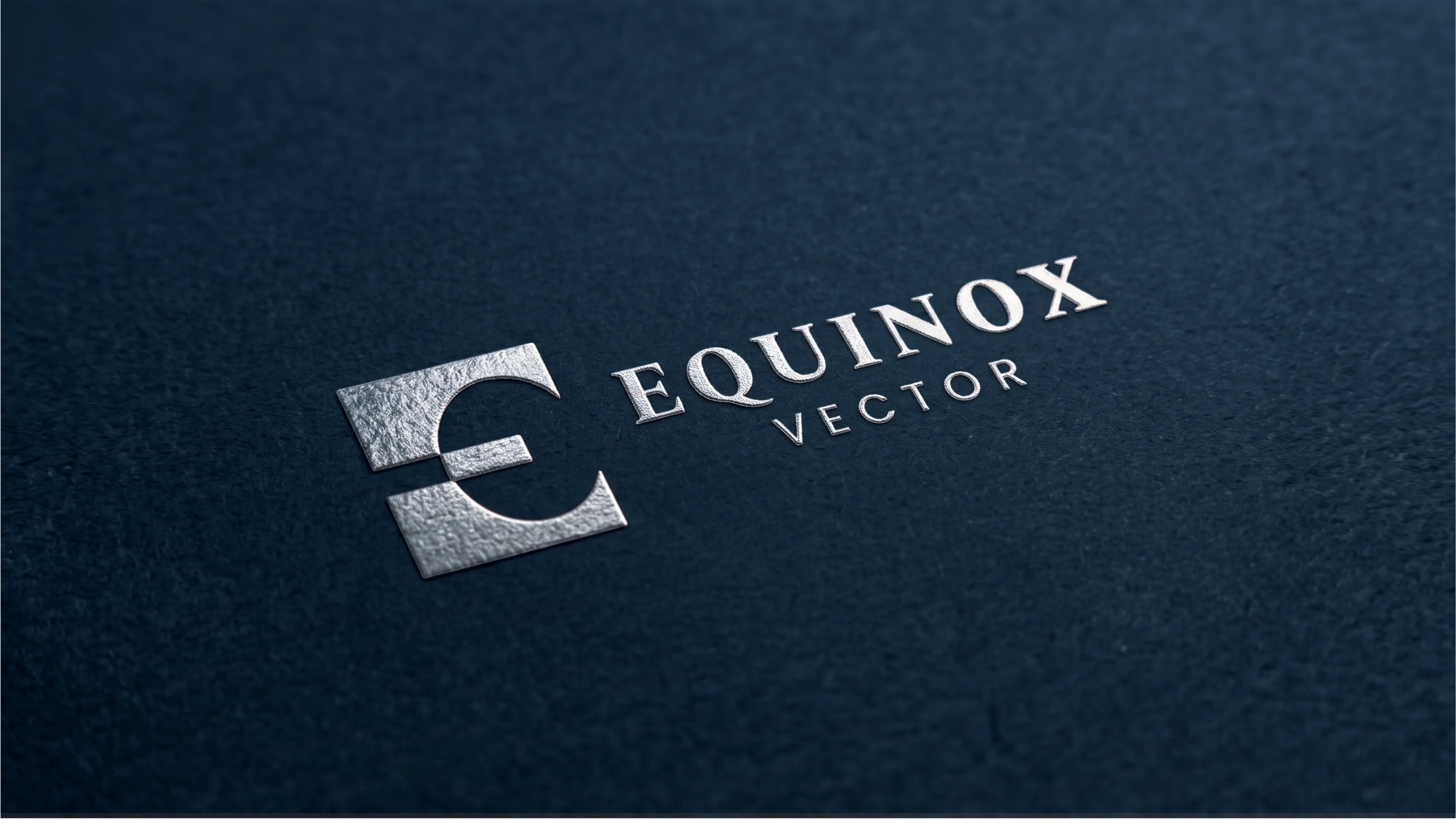
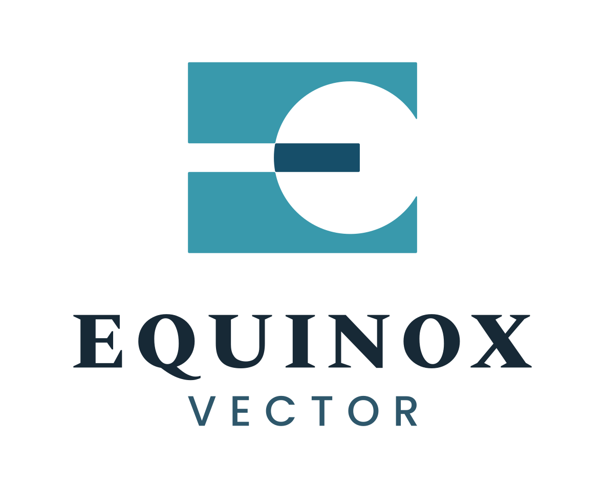
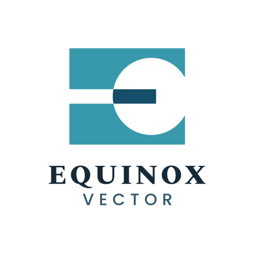
The logger features a rectangular block that symbolizes perspective. Inside the block is the negative space of a circle overlapping the right side, representing the sun. To the left of the circle and up to the mirror point of the circle is a horizontal line representing the horizon. Together, the circle and the line create the symbol of the equinox. These shapes, combined with the rectangular block, also create a capital letter E, the initial of the brand name. The circle was positioned carefully to create a sense of balance. One of the core characteristics of the brand.

Vertical
The logo functions perfectly well in a vertical or stacked layout. This means that the logo will work well on vertical applications like smartphones, tablets and roll-up banners.

Horizontal
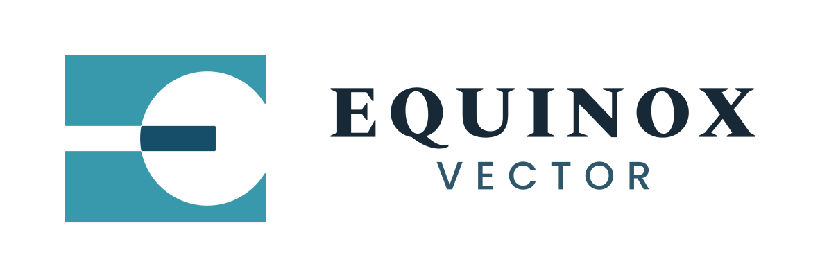
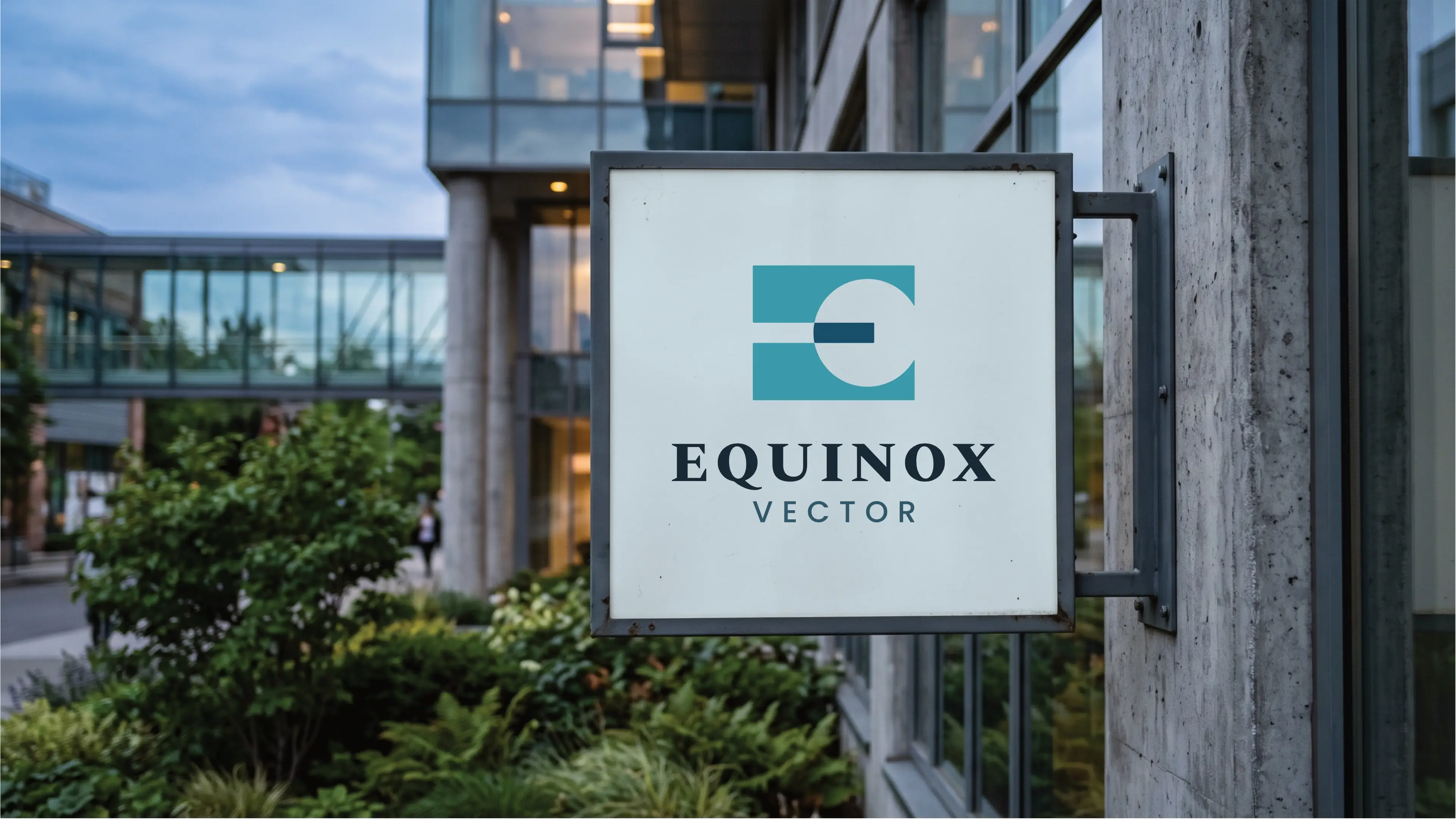
The logo is designed to be functional in a horizontal layout. This allows you to use the logo on horizontal applications like building signage, websites and stationery.

Colour Palette
The Harmonious Horizon palette perfectly reflects Equinox Vector’s commitment to balanced, expert-led mediation. Combining trustworthy oceanic blues with renewing teal accents and serene neutral tones, this color scheme embodies progress, stability, and peaceful resolution. The deep grounding shades instill confidence in structured legal processes, while softer tints foster open communication and hope. Together, these colors bridge conflict and resolution, symbolizing a purposeful new beginning for clients seeking fair, efficient, and harmonious outcomes.
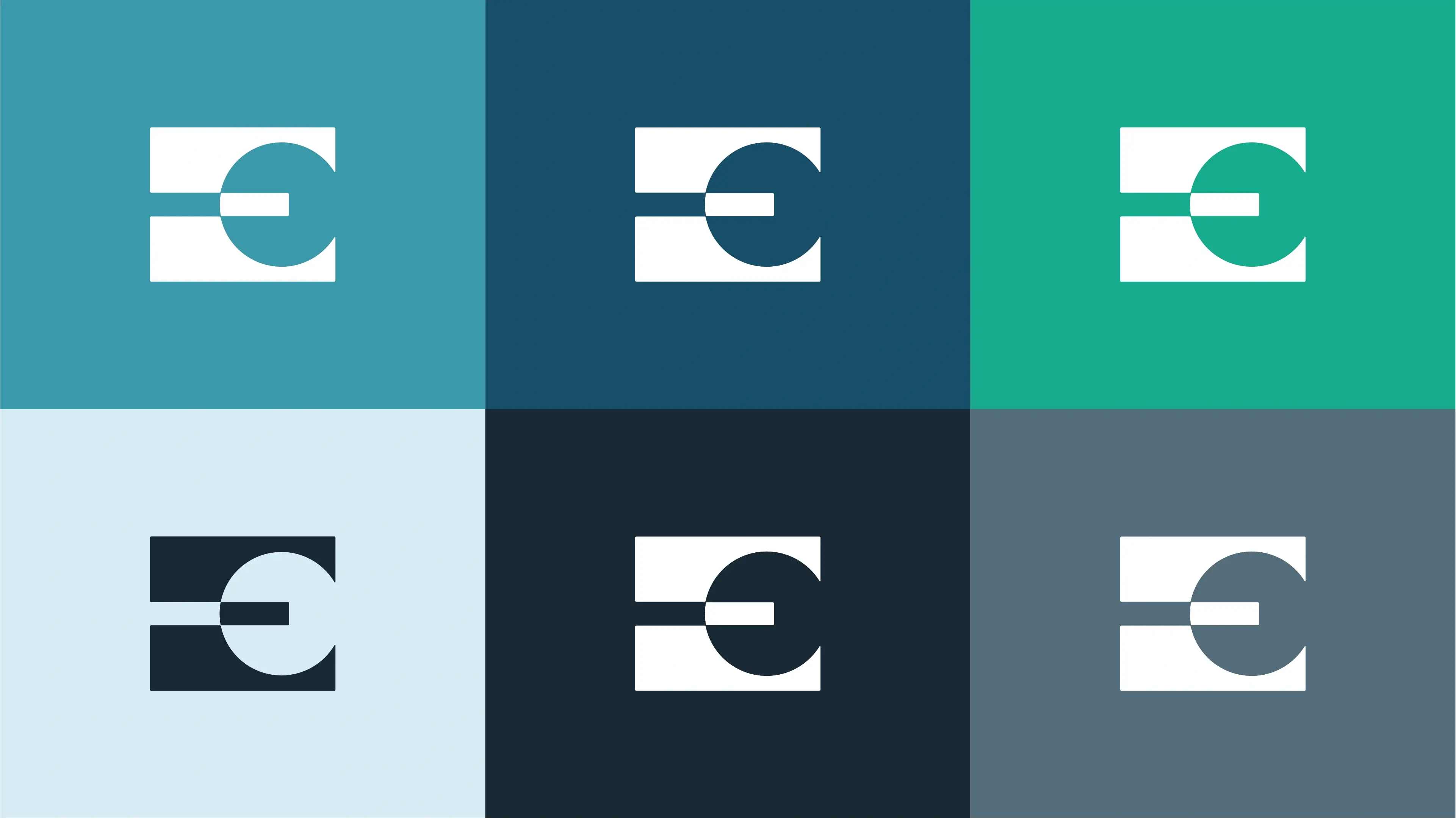
Meridian Blue
Reflects trust, clarity, and balanced diplomacy, inspiring calm confidence in dispute resolution.
Deep Vector Blue
Evokes authority, stability, and deep expertise, reassuring clients seeking legal guidance and structure.
Equinox Teal
Represents renewal, forward progress, and harmony, emphasizing constructive pathways to resolution.
Resolution Ice
Promotes openness, tranquility, and unbiased perspective, creating a peaceful environment for dialogue.
Slate Obsidian
Represents strength, grounding, and serious commitment, establishing a strong foundation for legal integrity.
Balanced Slate
Delivers clear, thoughtful communication and understated professionalism, ensuring legibility and calm focus.
Vertical Colour
The primary colour version of the logo functions perfectly in a vertical layout, designed for maximum brand impact on light and dark digital surfaces.
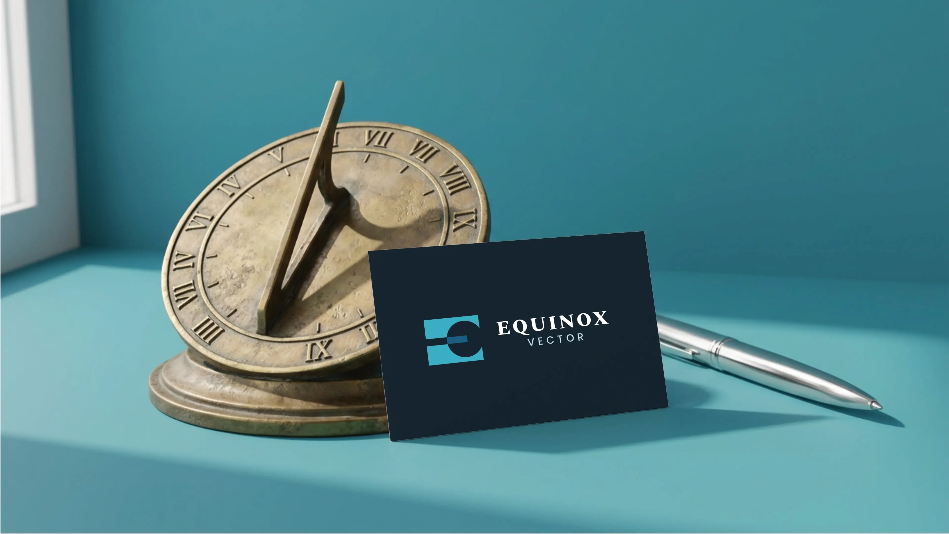
Horizontal Colour
For wider applications like navigation bars, signage, and stationery, the horizontal colour variations ensure the brand remains legible and professional.
Typography
Together, Spectral SC and Poppins Regular establish a harmonious typographical system that embodies both legal authority and modern innovation. The classic serif structure of the primary font conveys trust and prestige, while the geometric simplicity of the secondary font ensures clarity and warm accessibility. This effective font pair visually represents the balance and progress central to Equinox Vector, delivering a seamless hierarchy that elevates the brand as a dependable, expert-led mediation service.
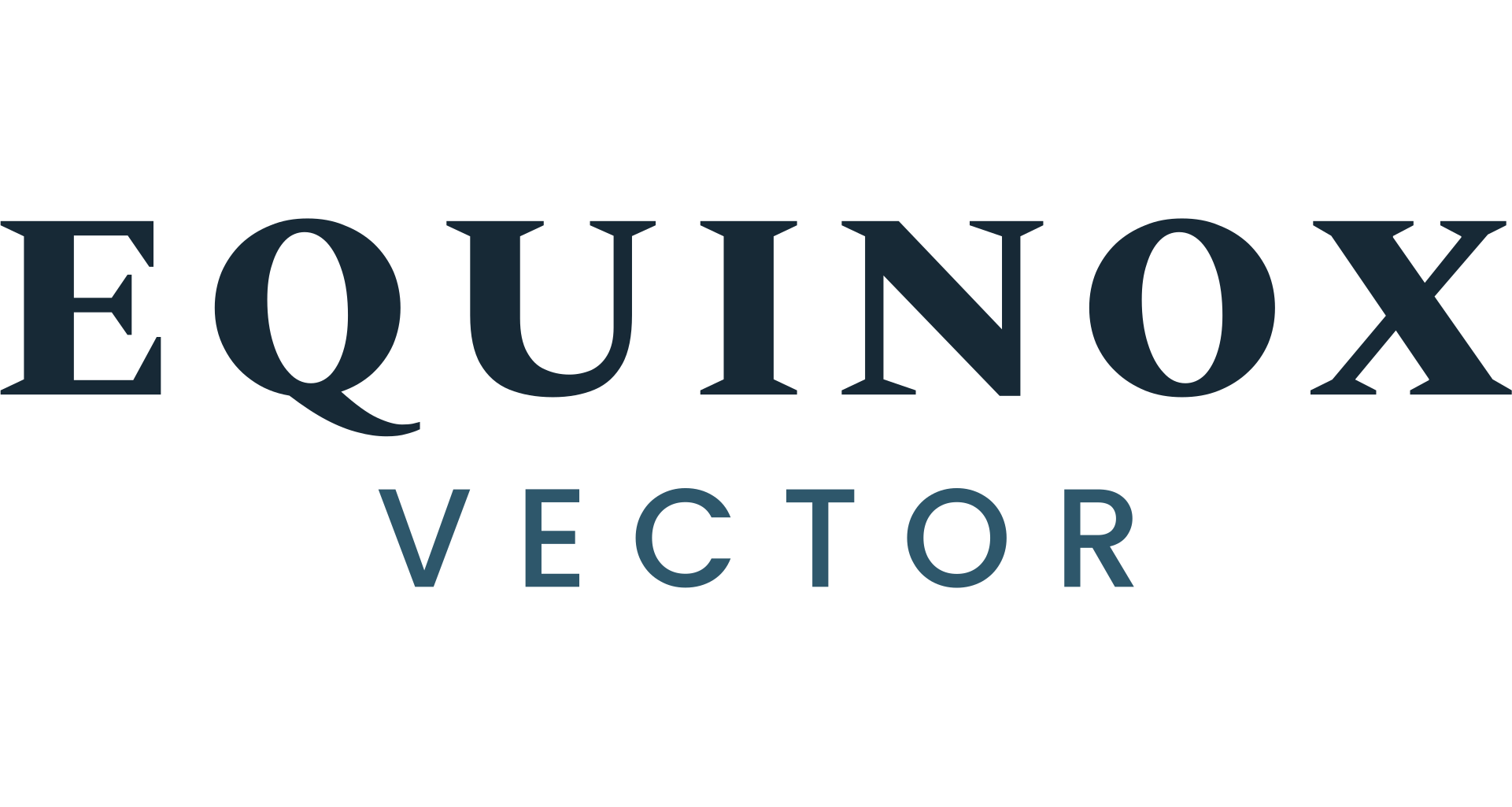
Primary Typeface
Spectral SC
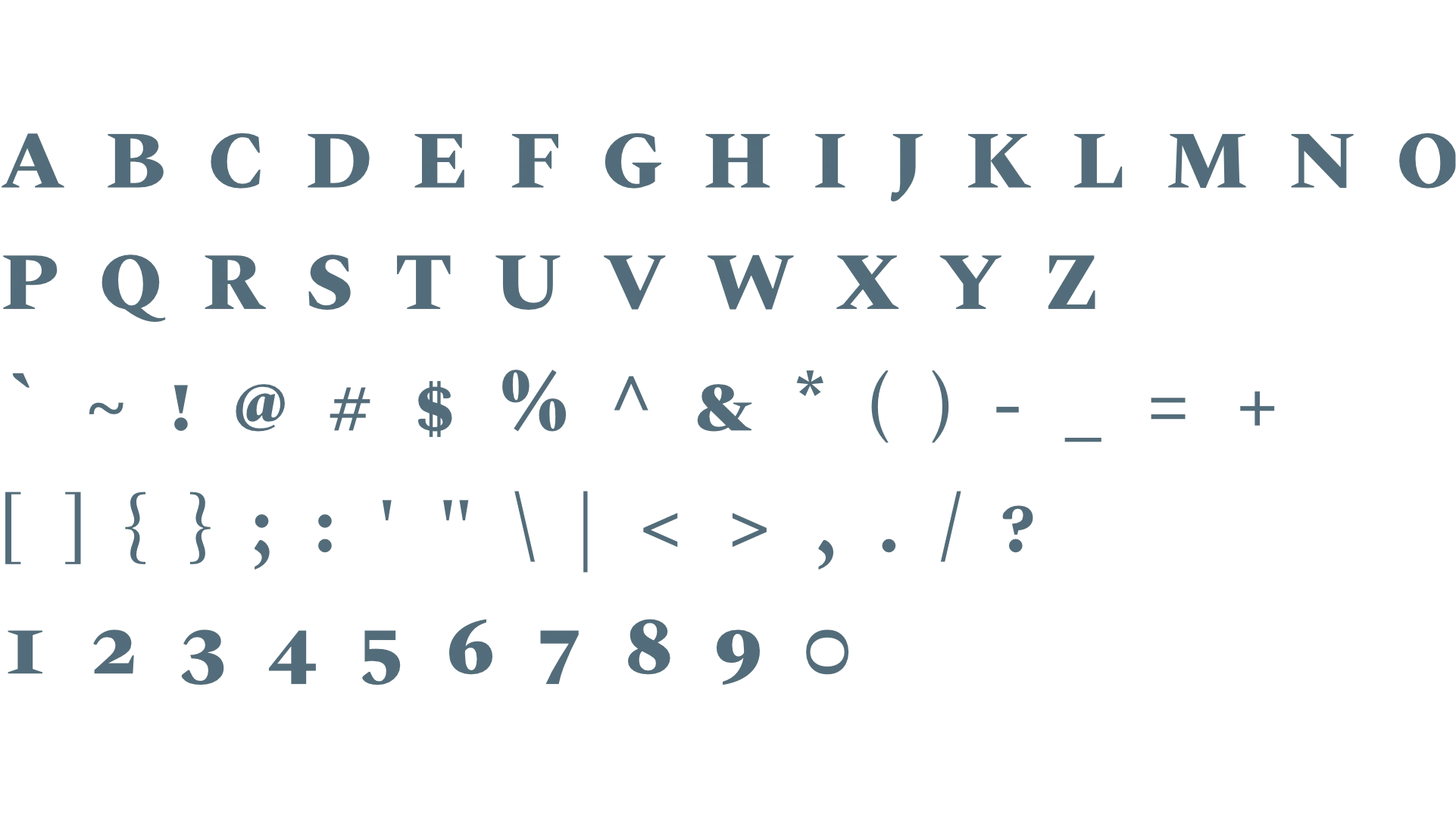
About the typeface
Spectral SC offers a refined serif style with elegant small caps, ideal for establishing authority and prestige. Its structured yet graceful letterforms create a sophisticated, trustworthy impression that aligns perfectly with the expert-led legal mediation services of Equinox Vector. As a typeface for primary headings, Spectral SC commands attention with dignified strength, ensuring that the brand exudes legal rigor, balance, and professionalism while maintaining clear legibility across print and digital media formats.
Secondary Typeface
Poppins Regular
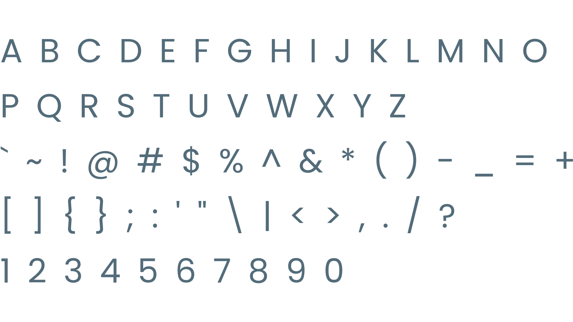
About the typeface
Poppins Regular is a clean, geometric sans-serif typeface characterized by open curves and balanced proportions. It creates a modern, accessible, and progressive impression, reflecting the brand's mission to simplify complex legal processes. For subheadings and body paragraphs, Poppins Regular provides exceptional legibility and visual clarity. Its approachable tone softens technical legal information, ensuring clients feel guided, informed, and confident as they navigate mediation toward a fair and progressive resolution.
Profile Images
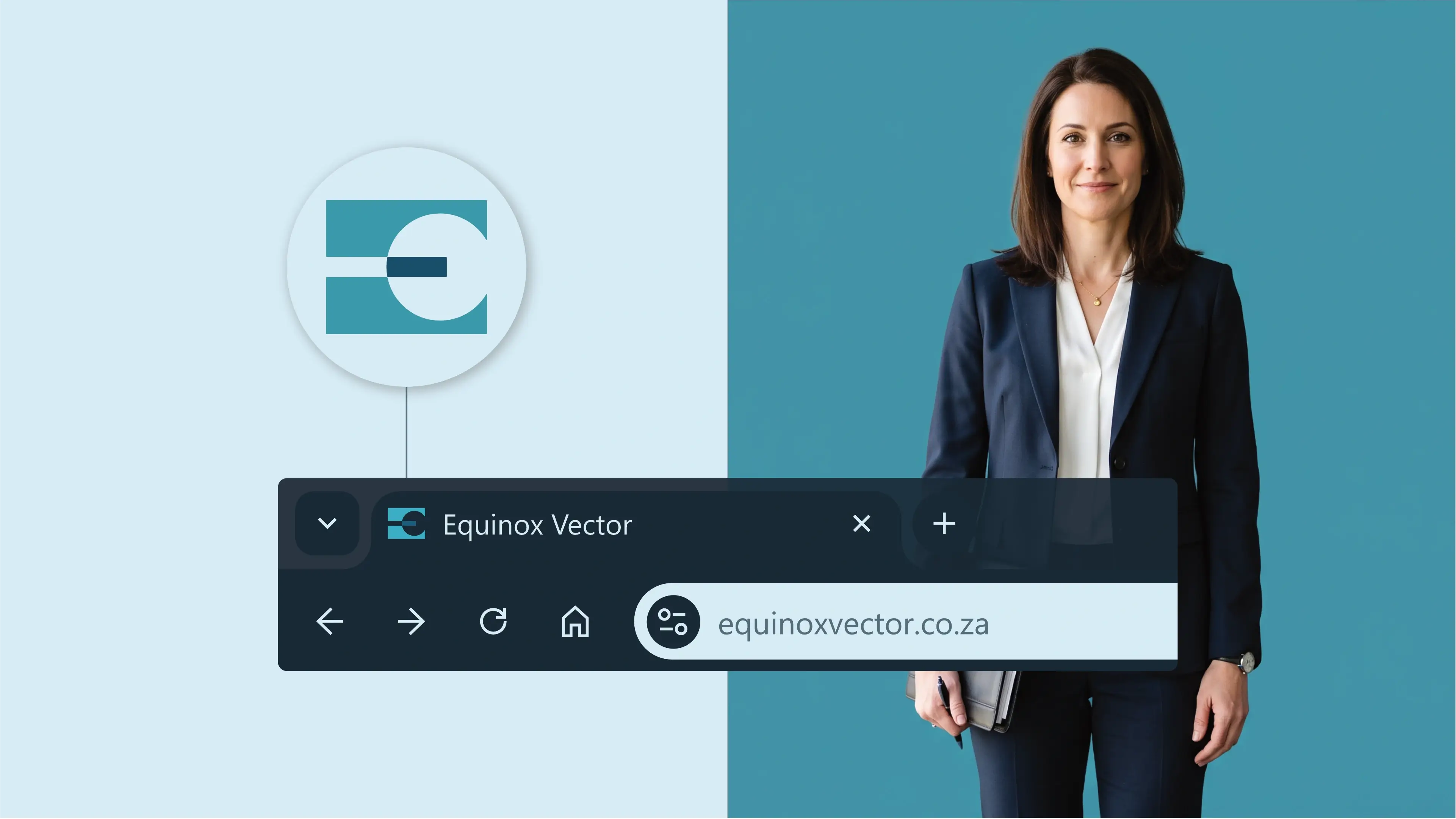
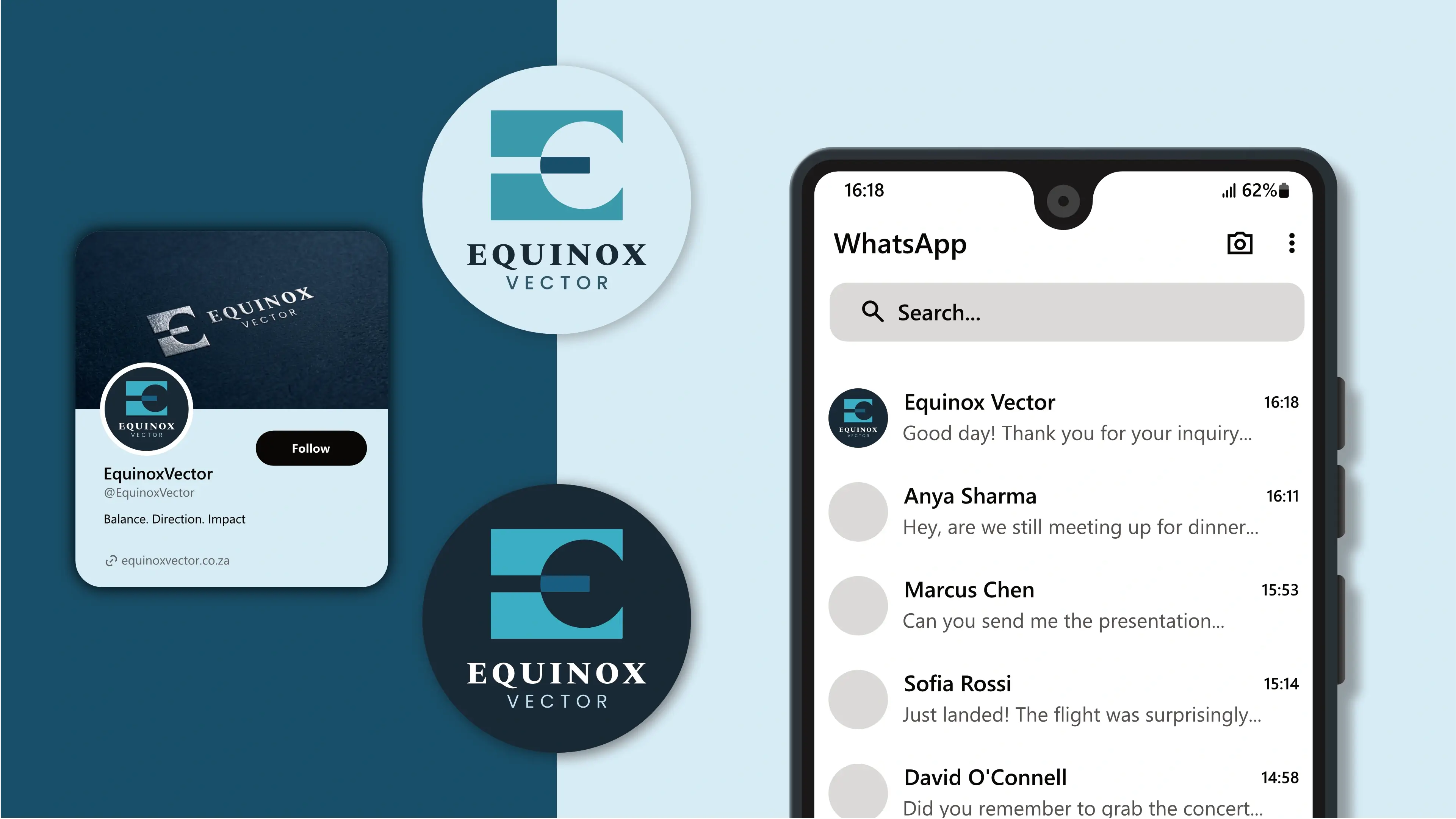
The logo is designed to fit inside a profile image that can typically be uploaded to social media platforms like Facebook, LinkedIn, and Instagram.
Favicons
A favicon is a small icon that represents your website in browser tabs, bookmarks, and address bars, ensuring brand recognition at a glance.