Round 1 | Option 3
About the Brand
Di Menyatsoe was established as a new brand to make legal justice accessible and empowering for underserved communities. Competing in the legal sector with a refined, professional approach, the firm offers expert guidance across administrative, family, and immigration law. By embedding themselves directly within local communities, they deliver clear, compassionate, and human-centered counsel. Di Menyatsoe aims to expand into smaller provinces, cementing its reputation as an impactful leader in legal education and client advocacy.
Target Audience
Their target audience is middle-income men and women aged 25 to 60 who have experienced unfortunate events and need accessible legal guidance. Often frustrated by expensive, distant firms that fail to communicate, these community-centered individuals value clear, efficient, and impactful support. Whether at home, church, or local gyms, they seek a reliable partner to guide them from anxiety to confidence, fear to hope, and conflict to lasting peace.
The Goal
The requirements for the logo design is focused on creating a modern, minimalistic monogram that embeds the brand identity while effortlessly attracting the target audience. Intended for use across branding stationery, social media platforms, and the official website, the concept must steer clear of common legal cliches and typical navy and gold palettes. Furthermore, the visual direction should harmoniously align with the core slogan, Justice without Barriers.

Let's Break It Down
The Strategy
Monochrome Variations
Colour Palette
Colour Variations
Typography
Web & Social Icons

Strategy
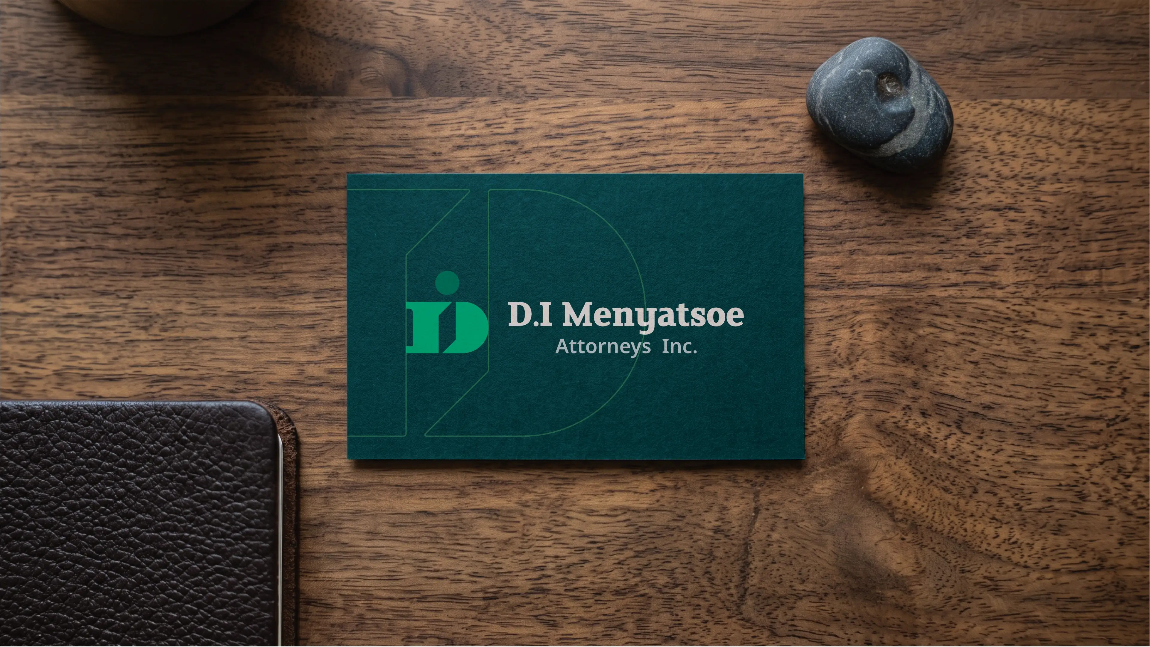
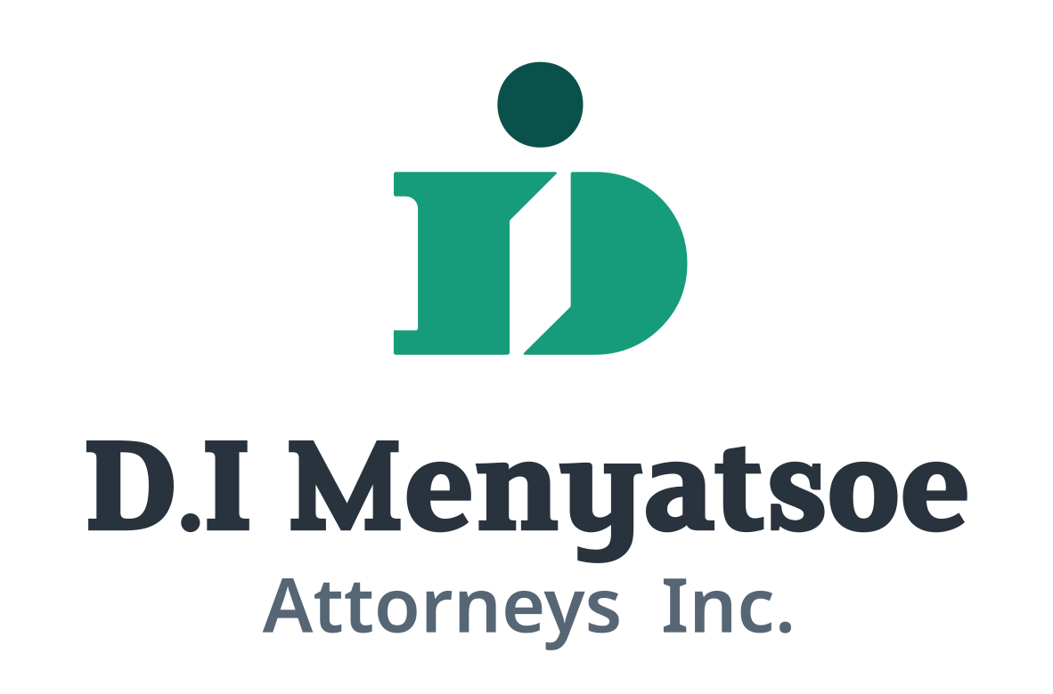
The logo showcases a serif-style capital letter D with a parallelogram inside the negative space. Above the parallelogram is a dot, that doubles as the dot of the i. The serifs of the D are reminiscent of the shape of coluns, commonly found in law imagery. The parallelogram doubles as a door, which symbolises access. The dot also symbolises the community. The combined logo symbolises access for the community to law.

Vertical
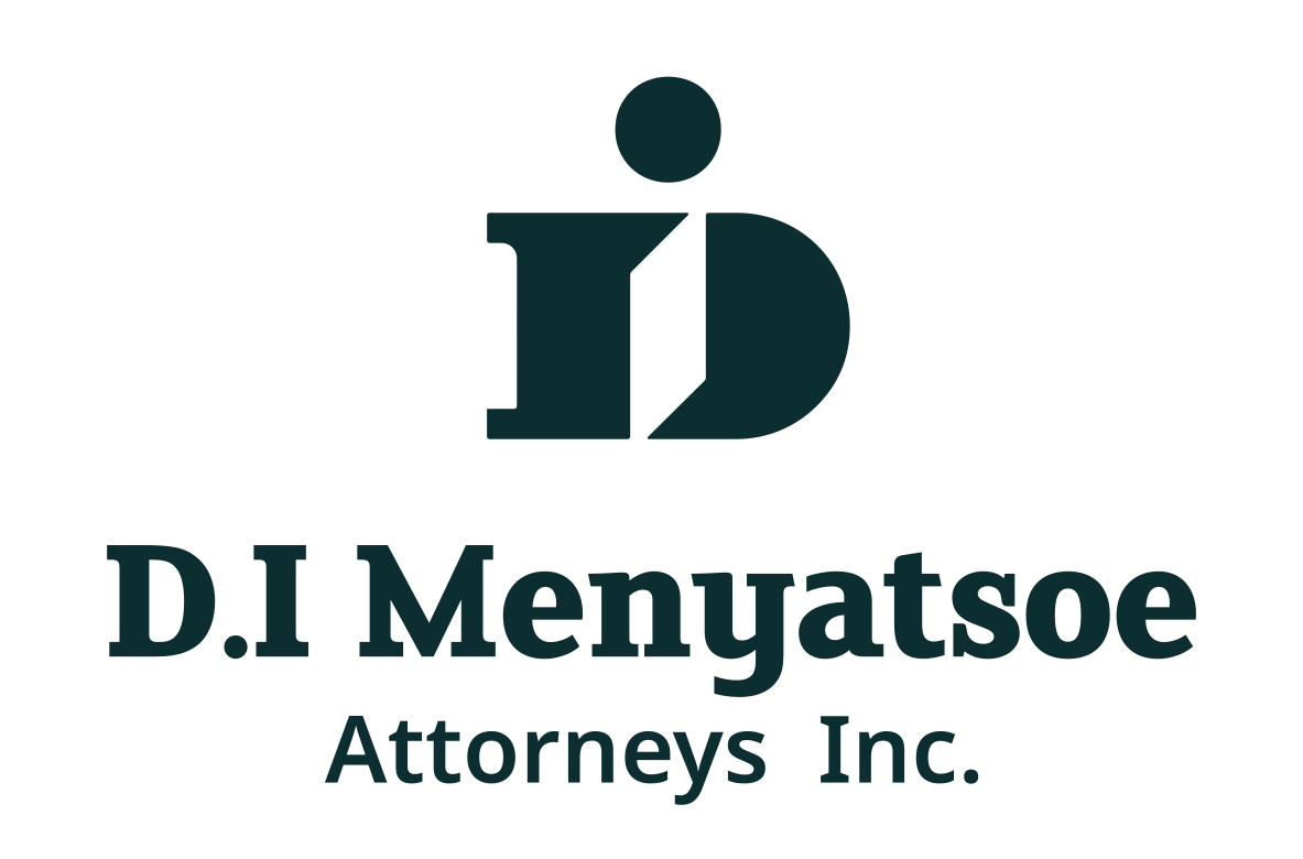
The logo functions perfectly well in a vertical or stacked layout. This means that the logo will work well on vertical applications like smartphones, tablets and roll-up banners.

Horizontal
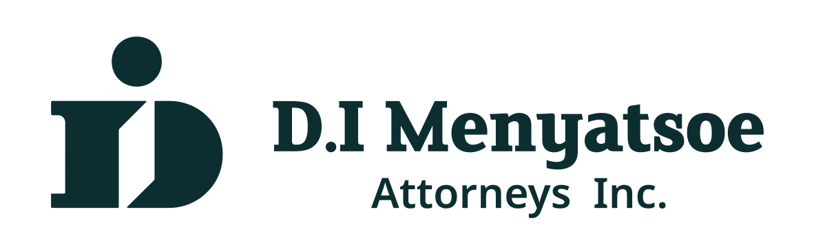
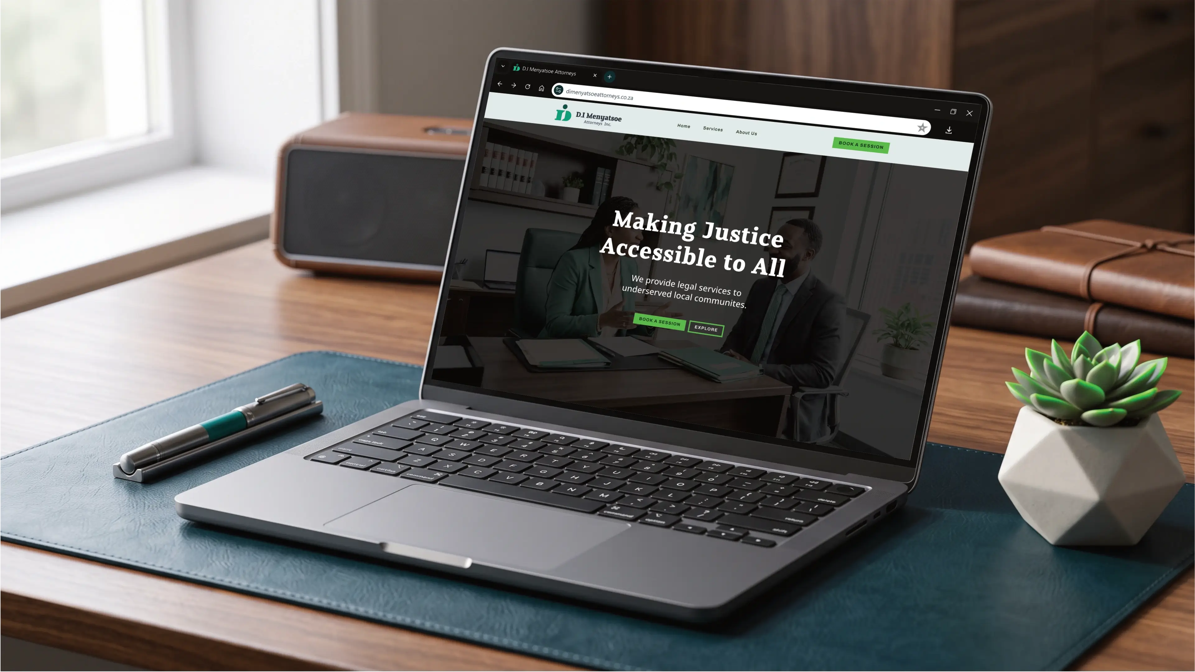
The logo is designed to be functional in a horizontal layout. This allows you to use the logo on horizontal applications like building signage, websites and stationery.

Colour Palette
The Community Justice palette reflects Di Menyatsoe's mission to make legal advocacy accessible, compassionate, and deeply rooted in local communities. Grounded in restorative deep teal and obsidian tones, the scheme conveys authority, stability, and trust. Vibrant emerald accents embody growth, empowerment, and hope for underserved populations seeking justice. Balanced by clean neutral backgrounds and professional Slate Text, this collection fosters clarity, warmth, and approachable authority in family, administrative, and immigration legal services.
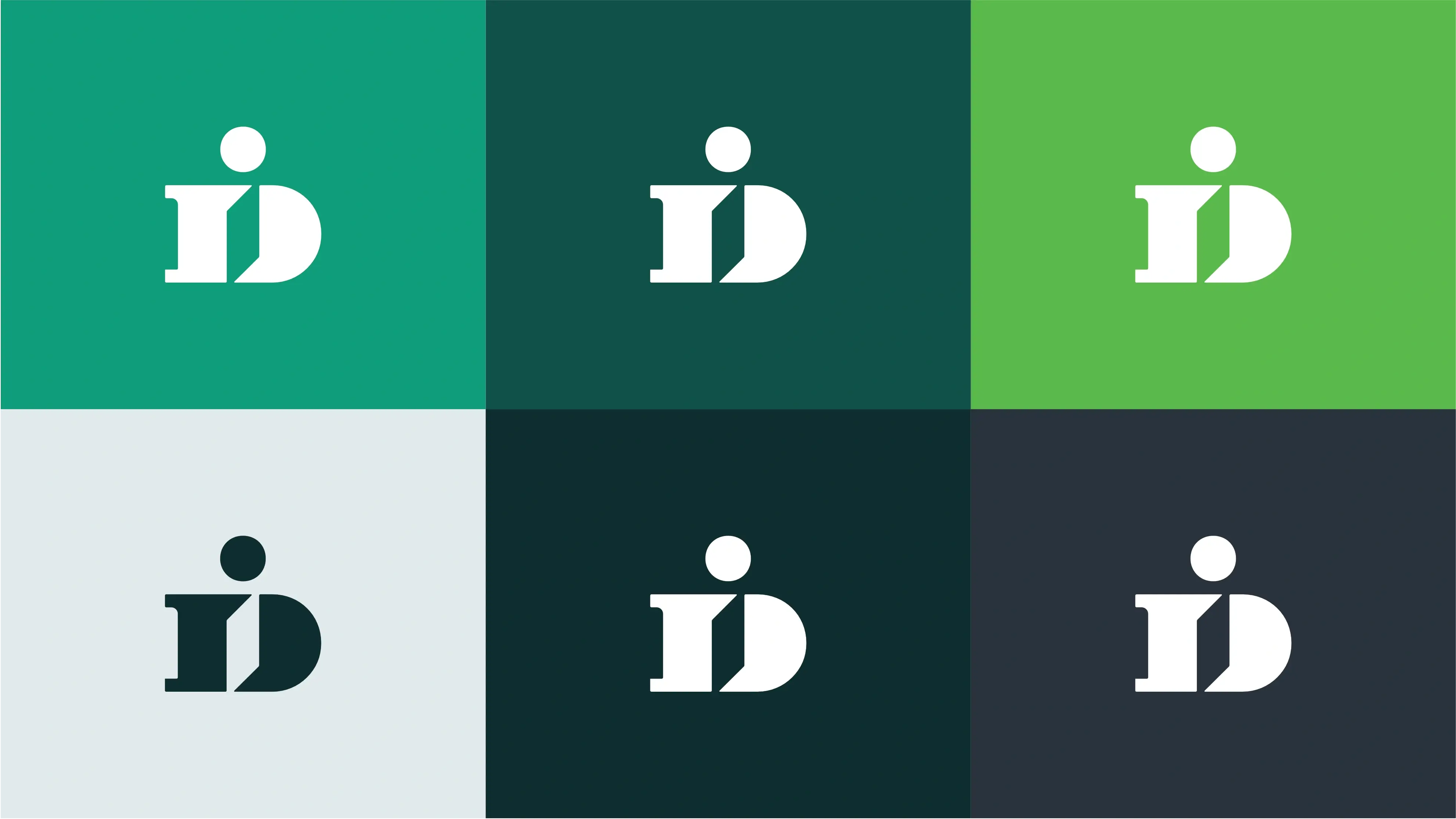
Horizon Teal
Teal promotes balance, clarity, and compassionate communication, building trust and calm reassurance in client advocacy.
Deep Forest Teal
Deep teal signifies stability, authority, and deep wisdom, instilling confidence in legal expertise and security.
Vibrant Spring Green
Energetic green symbolizes growth, renewal, and fresh hope, inspiring empowerment for underserved communities.
Soft Mist Teal
Soft neutral teal evokes openness, peace, and clean accessibility, facilitating clear communication.
Midnight Obsidian
Dark obsidian represents strength, formality, and grounded integrity, serving as a solid foundation for justice.
Slate Charcoal
Dark slate charcoal represents professional clarity, readability, and serious, thoughtful composure.
Vertical Colour
The primary colour version of the logo functions perfectly in a vertical layout, designed for maximum brand impact on light and dark digital surfaces.
Horizontal Colour
For wider applications like navigation bars, signage, and stationery, the horizontal colour variations ensure the brand remains legible and professional.


Typography
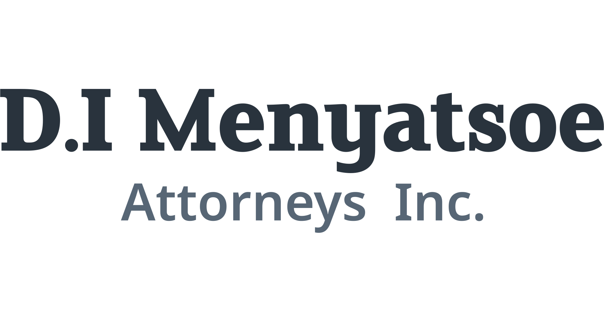
Together, FS Clerkenwell and Noto Sans establish a balanced typography system that merges distinct personality with functional clarity. This pairing creates a powerful impression of empathetic authority and modern professionalism, balancing approachable character with supreme readability. FS Clerkenwell anchors key messages with commanding warmth, while Noto Sans delivers clear, structured detail. As a font pair, they effectively position Di Menyatsoe as an impactful, human-centered legal leader dedicated to accessible justice for underserved communities.
Primary Typeface
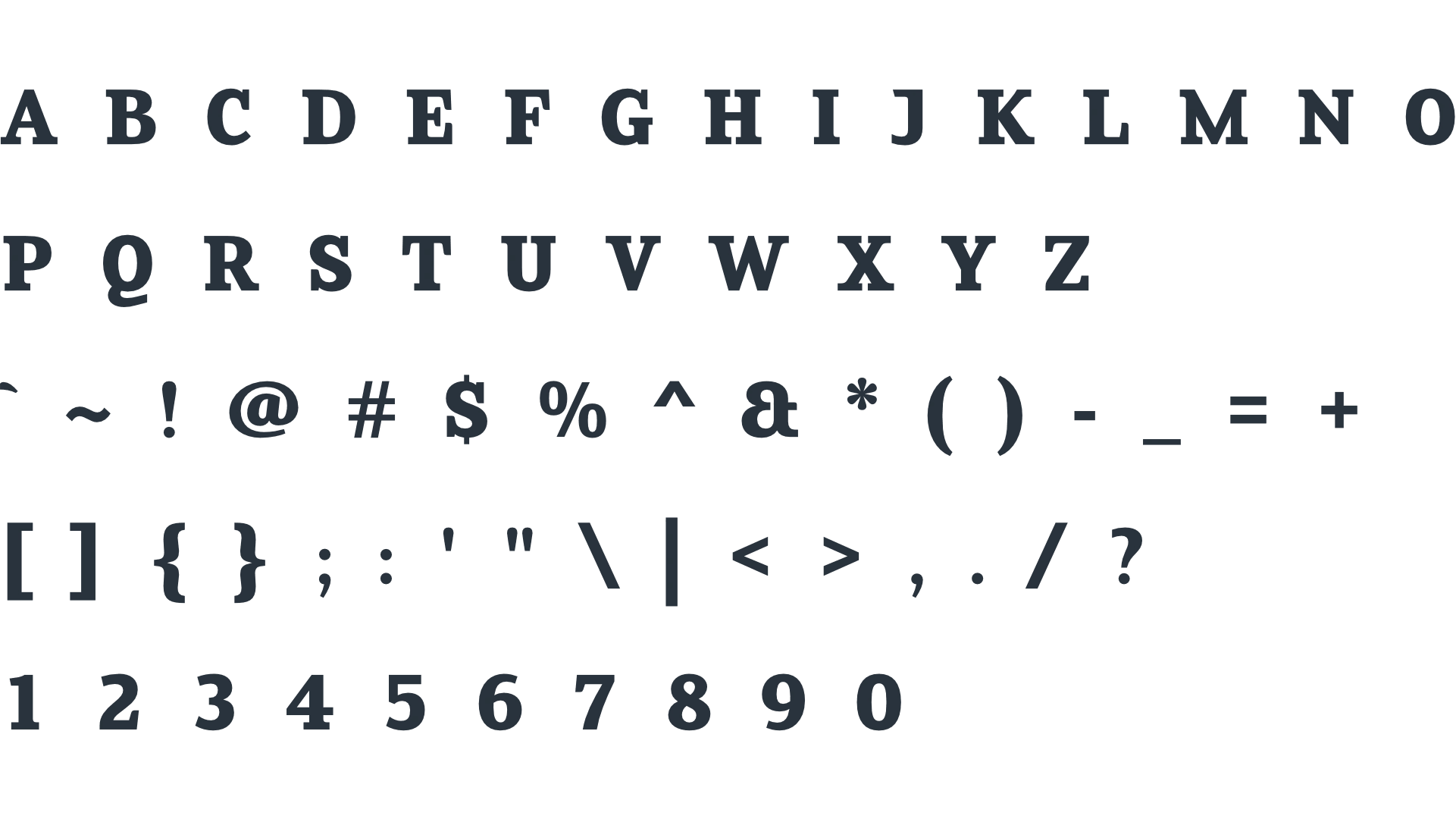
FS Clerkenwell
About the typeface
FS Clerkenwell is a contemporary, characterful serif typeface featuring distinctive, warm proportions and sturdy slab-like characteristics. It creates an impression of grounded authority, modern sophistication, and human-centered warmth, perfectly reflecting the mission of Di Menyatsoe to make legal justice accessible. As a heading font, its confident letterforms command attention while remaining thoroughly welcoming and approachable. This unique visual identity ensures that legal communications feel empowering, professional, and deeply rooted in community advocacy.
Secondary Typeface
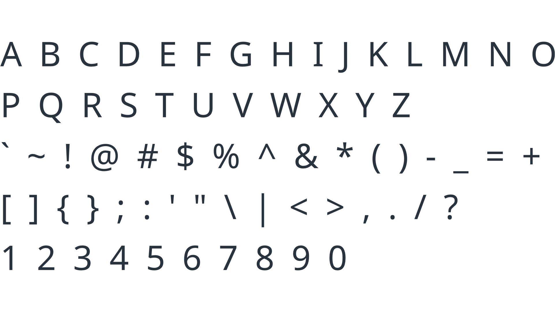
Noto Sans
About the typeface
Noto Sans is a clean, highly legible humanist sans-serif typeface designed for universal accessibility across diverse languages and platforms. It conveys an impression of clarity, transparency, and dependable professionalism, aligning seamlessly with the firm's focus on compassionate, straightforward guidance. Highly effective for subheadings and body paragraphs, its open letterforms ensure complex legal information remains effortless to read. This functional elegance guarantees that every client feels understood and fully informed throughout their legal journey.
Profile Images
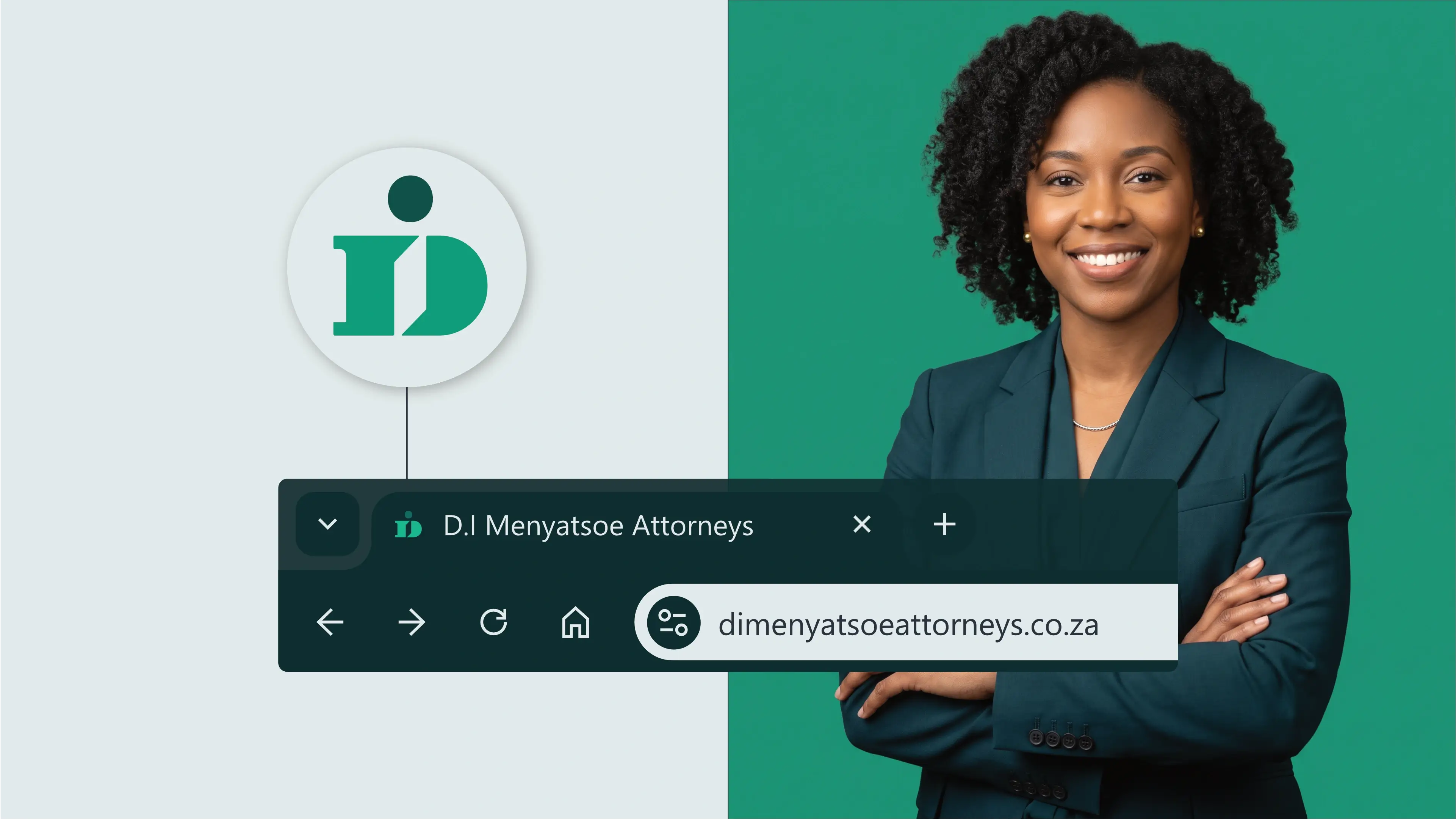
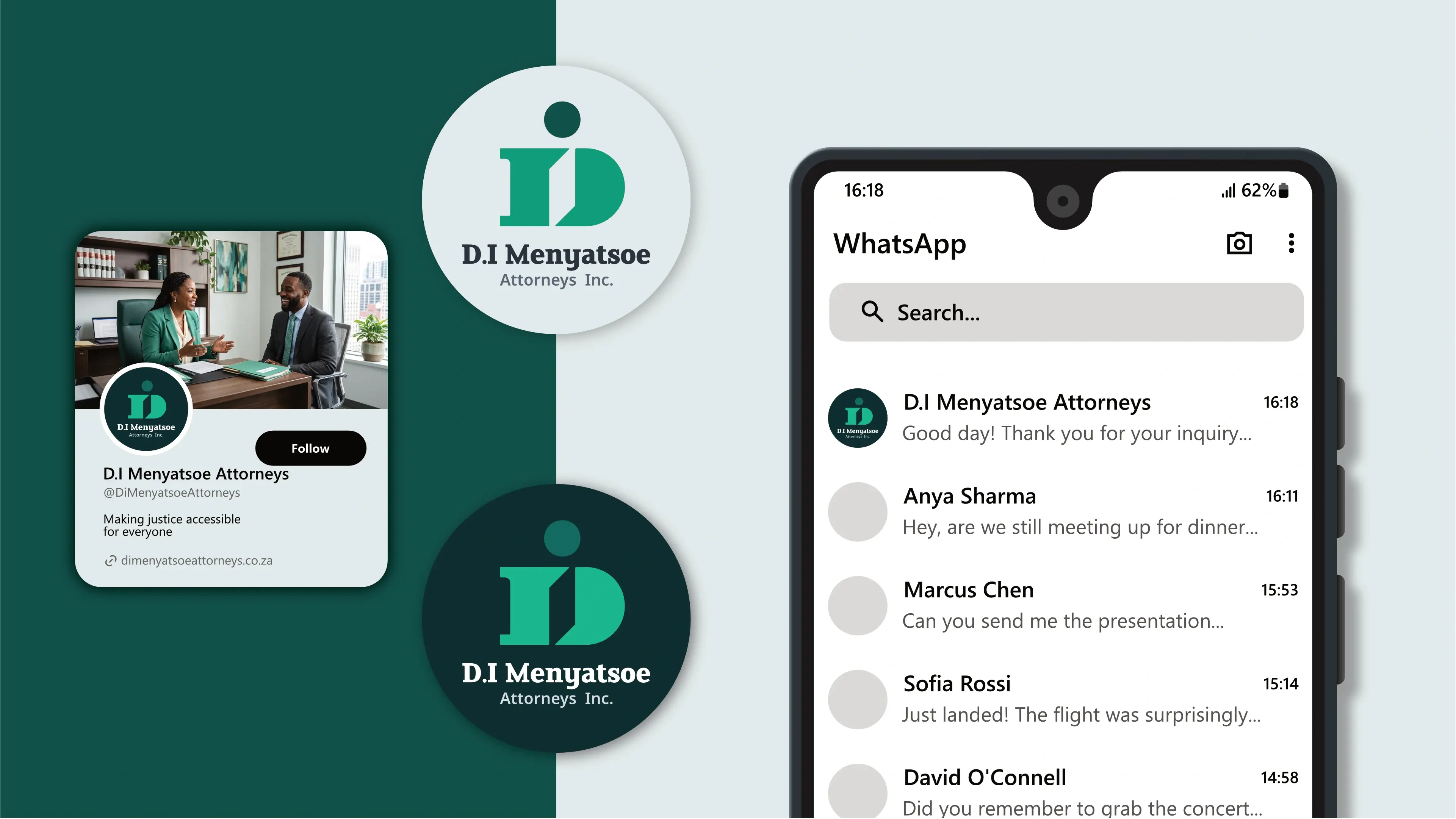
The logo is designed to fit inside a profile image that can typically be uploaded to social media platforms like Facebook, LinkedIn, and Instagram.


Favicons
A favicon is a small icon that represents your website in browser tabs, bookmarks, and address bars, ensuring brand recognition at a glance.