Round 1 | Option 2
About the Brand
CB Advisory is a newly established HR services brand, born from a passion for people and effective problem-solving. Catering to businesses seeking efficient HR solutions, CB Advisory provides high-end, formal, yet deeply personal guidance. Their distinct advantage lies in extensive international and corporate experience, offering a refined, empathetic approach that transcends typical corporate rigidity. Clients are truly buying efficiency and expert results, guided by a proven system. CB Advisory aims to become the go-to HR firm, recognized for unparalleled service.
Target Audience
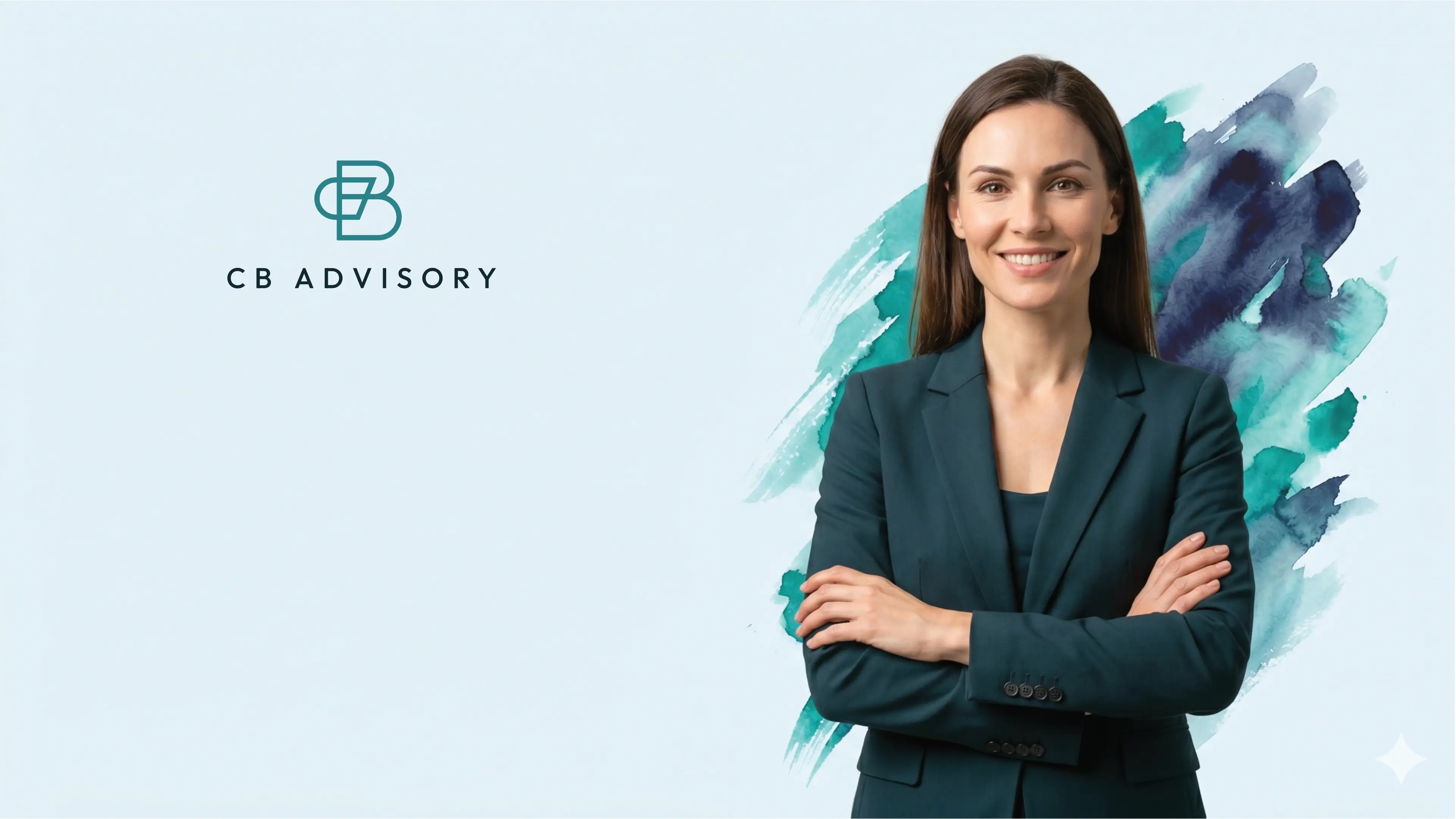
Their target audience is the CEO predominantly men, aged 35-70, typically from an upper-income class. However, he usually has a female assistant who will look for someone to help them overcome critical HR challenges like legal liability, potential staff mutiny, or administrative chaos that hinder their business's performance. Our goal is to provide her with peace of mind and relief, ensuring she describes our brand as effective, having gotten the job done, and eliminating chaos. We understand her fears of wasted time, money, and workplace stagnation.
The Goal
The requirements for the logo design is for CB Advisory, an emerging corporate brand aiming to project legitimacy and a larger-than-life presence. The logo must be versatile, appearing seamlessly across websites, apparel, vehicle signage, branding stationery, and social media. Key creative directives include steering clear of legal clichés and human figures. Instead, the design should incorporate a subtle, sophisticated feminine touch, metaphorically described as "a piece of silk on concrete," ensuring a unique and impactful brand identity.
Let's Break It Down
The Strategy
Monochrome Variations
Colour Palette
Colour Variations
Typography
Web & Social Icons

Strategy
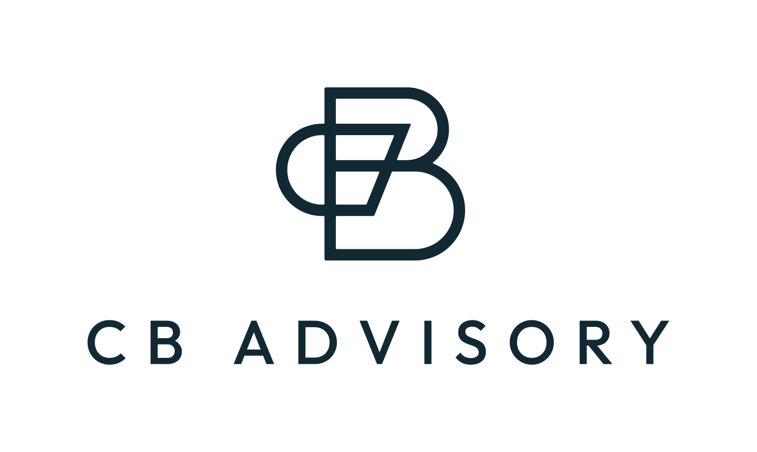
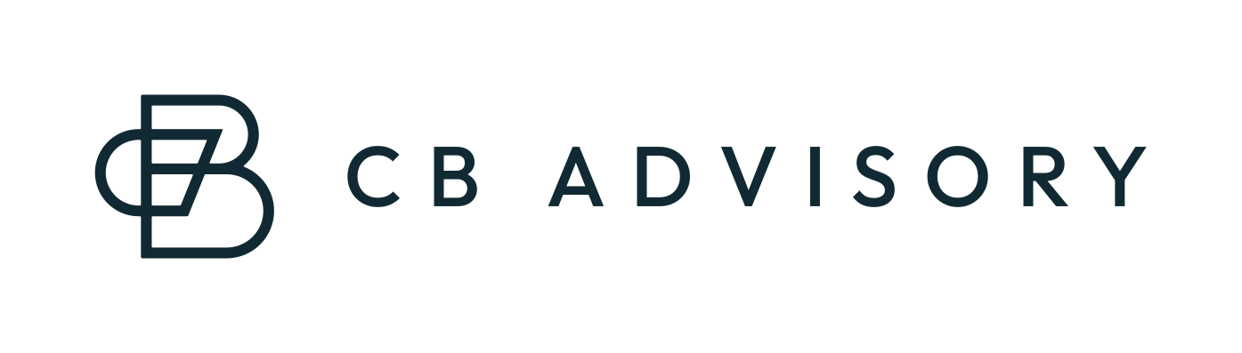
The logo features 3 rectangular shapes: one on the left and 2 on the right. The one on the left overlaps with the 2 on the right and has a rounded edge on the left side to form the letter C. The 2 on the right are stacked and have rounded edges on the right to form the letter B. The straight edge of the C is diagonal to create a sense of movement and growth. The symbols use outlines to add elegance and sophistication to the design.
Vertical
The logo functions perfectly well in a vertical or stacked layout. This means that the logo will work well on vertical applications like smartphones, tablets and roll-up banners.

Horizontal
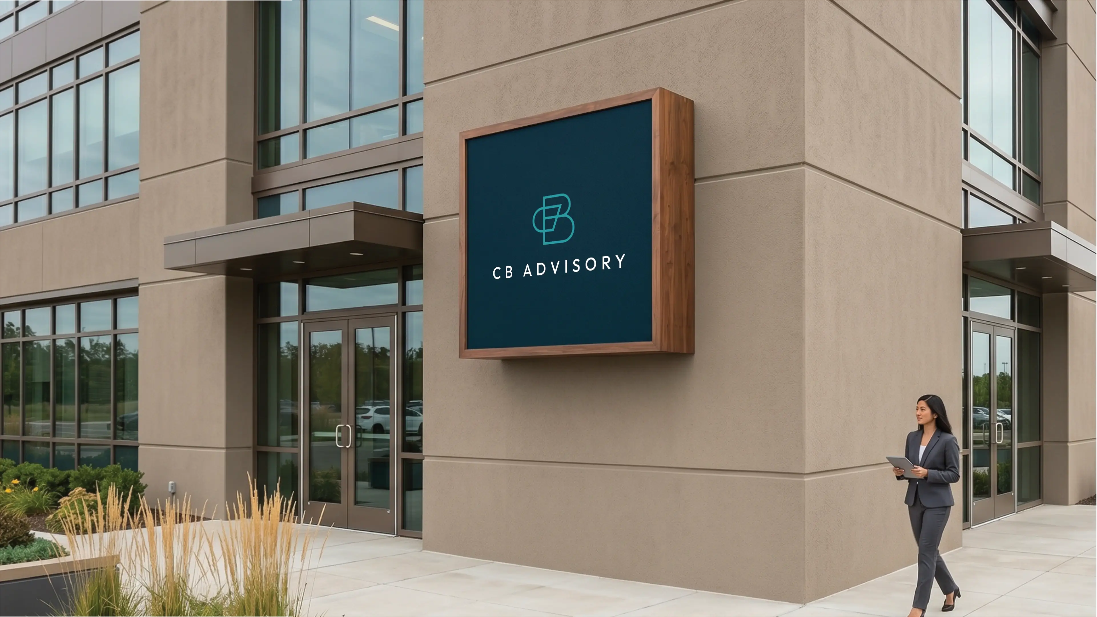
The logo is designed to be functional in a horizontal layout. This allows you to use the logo on horizontal applications like building signage, websites and stationery.
Colour Palette
This palette perfectly encapsulates CB Advisory's essence, blending high-end professionalism with a deeply personal touch. The deep blues convey trust, authority, and strategic depth, reflecting the brand's expert results and proven systems. The earthy tertiary adds warmth and empathy, highlighting their refined, personal guidance. Lighter tones offer clarity and approachability, reinforcing their commitment to efficient solutions. This sophisticated selection positions CB Advisory as the go-to HR firm, recognized for unparalleled service and a balanced, trustworthy approach.
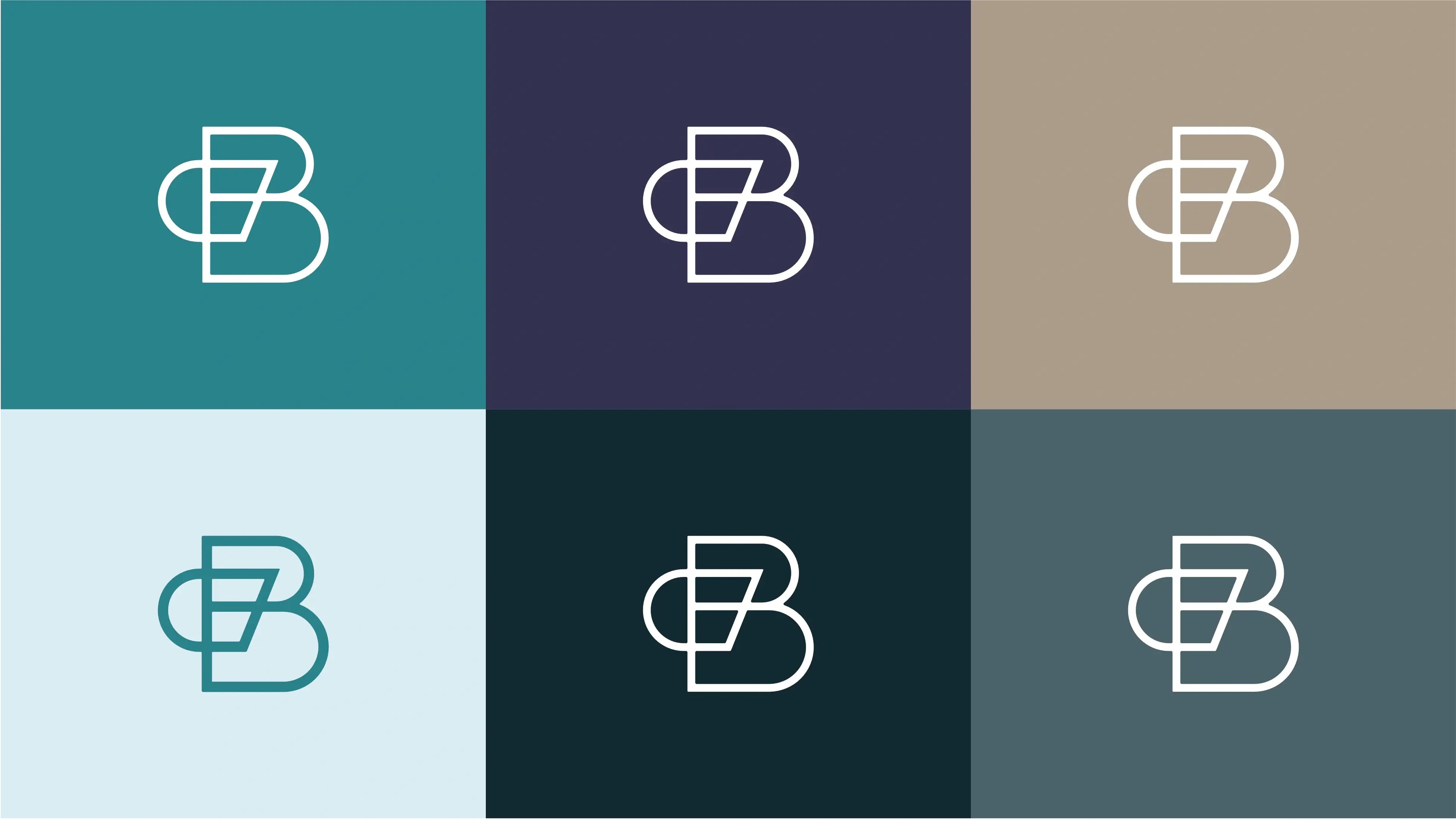
Strategic Teal
Represents professionalism, trust, and efficiency, fostering a sense of calm and clarity essential for problem-solving.
Midnight Accord
Symbolizes authority, sophistication, and reliability, reflecting CB Advisory's extensive corporate experience and stable guidance.
Grounded Wisdom
Evokes stability, warmth, and authenticity, emphasizing the brand's empathetic approach and grounded, experienced advice.
Clarity Mist
Suggests purity, cleanliness, and new beginnings, reflecting the brand's fresh, efficient solutions and clear communication.
Deep Resonance
Conveys strength, depth, and sophistication, providing a solid foundation that underscores the brand's authoritative expertise and reliability.
Insight Grey
Represents reliability, professionalism, and balance, ensuring legibility while maintaining a sophisticated and trustworthy brand presence.
Vertical Colour
The primary colour version of the logo functions perfectly in a vertical layout, designed for maximum brand impact on light and dark digital surfaces.
Horizontal Colour
For wider applications like navigation bars, signage, and stationery, the horizontal colour variations ensure the brand remains legible and professional.

Typography
The consistent application of Outfit as both primary and secondary typeface creates a unified, highly professional brand identity for CB Advisory. This singular sans-serif choice projects efficiency, expertise, and a refined yet approachable formality. It ensures seamless readability and a cohesive visual experience, reinforcing the brand's promise of clear, high-end HR solutions. This pairing effectively communicates trustworthiness and a systematic approach.

Primary Typeface
Outfit
About the typeface
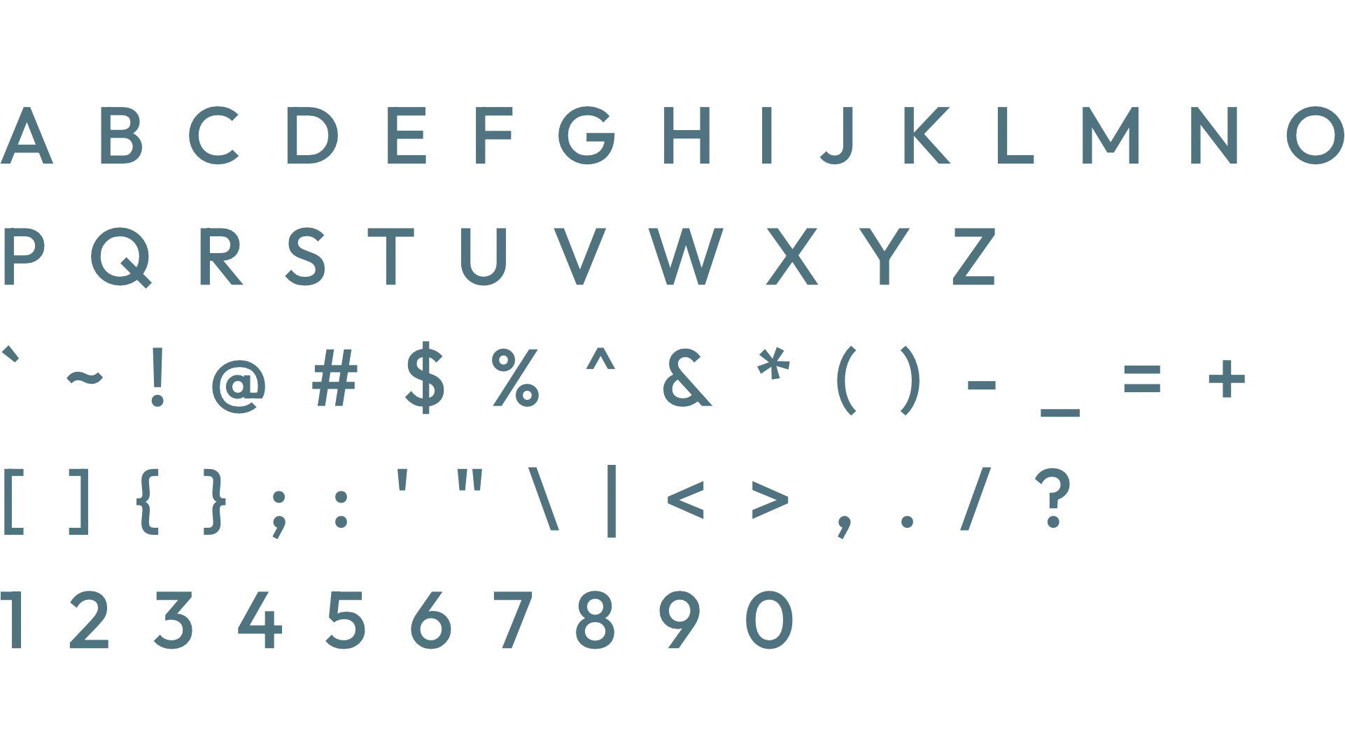
Outfit, a modern sans-serif, projects a professional and efficient image, perfectly suiting CB Advisory's high-end HR services. Its clean, geometric style conveys trustworthiness and clarity, making it highly effective for headings. It establishes a strong, refined presence that aligns with the brand's expert results and formal yet personal guidance, ensuring key information stands out with a sophisticated touch.
Secondary Typeface
Outfit
About the typeface
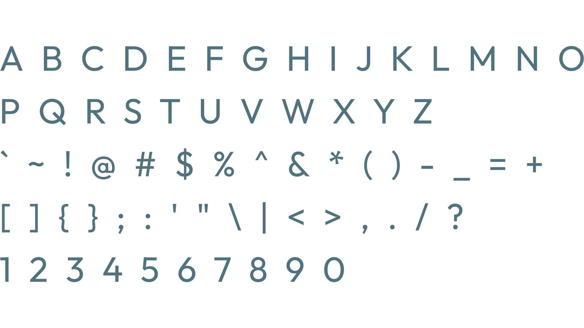
Outfit serves as an excellent secondary typeface, maintaining the brand's professional and efficient aesthetic. Its clear legibility is ideal for subheadings and paragraphs, ensuring detailed HR guidance is easily digestible. This consistent sans-serif choice reinforces CB Advisory's commitment to clarity and expert results, providing a reliable and approachable tone without sacrificing the high-end, formal impression across all textual content.
Profile Images
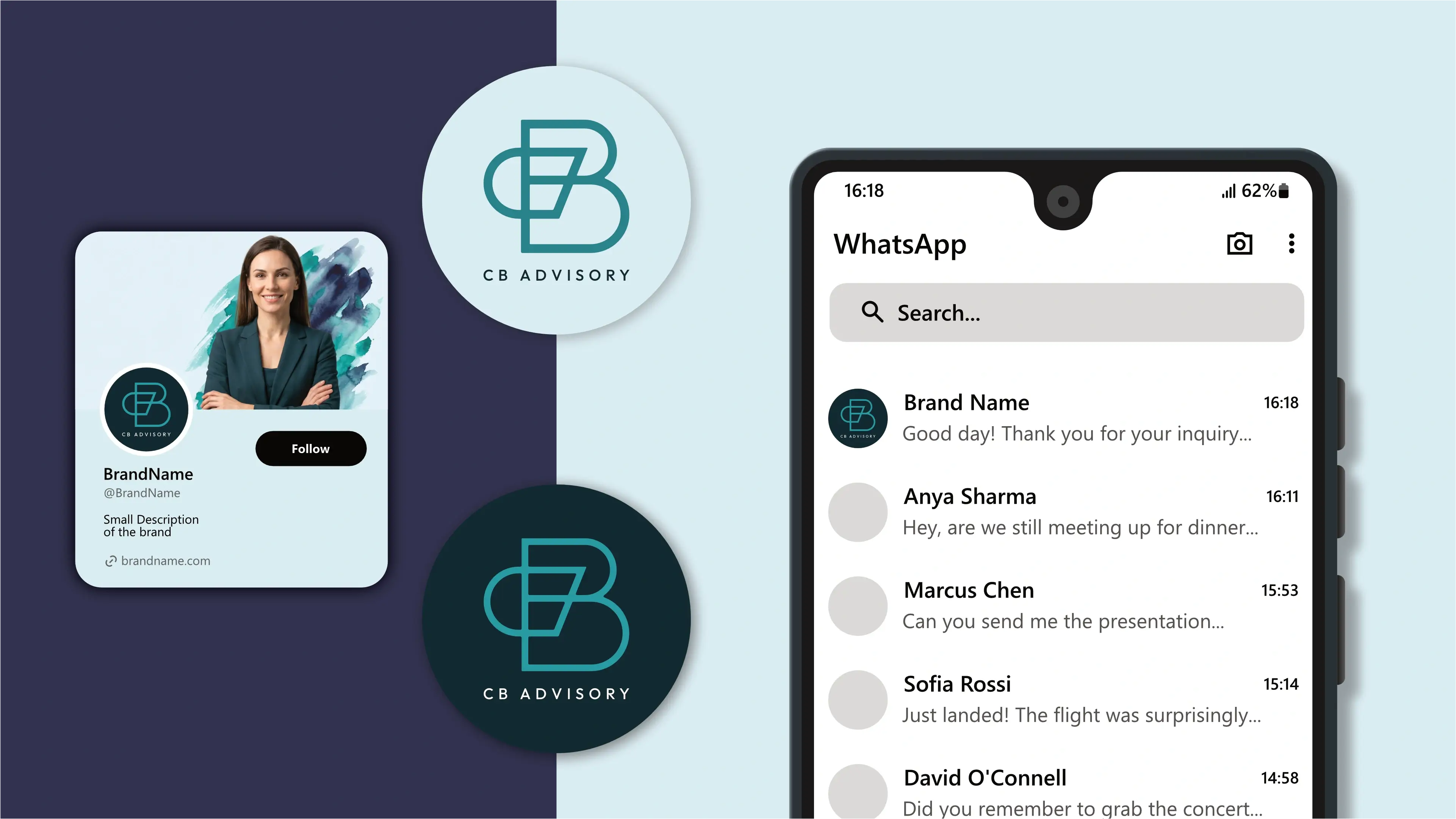
The logo is designed to fit inside a profile image that can typically be uploaded to social media platforms like Facebook, LinkedIn, and Instagram.


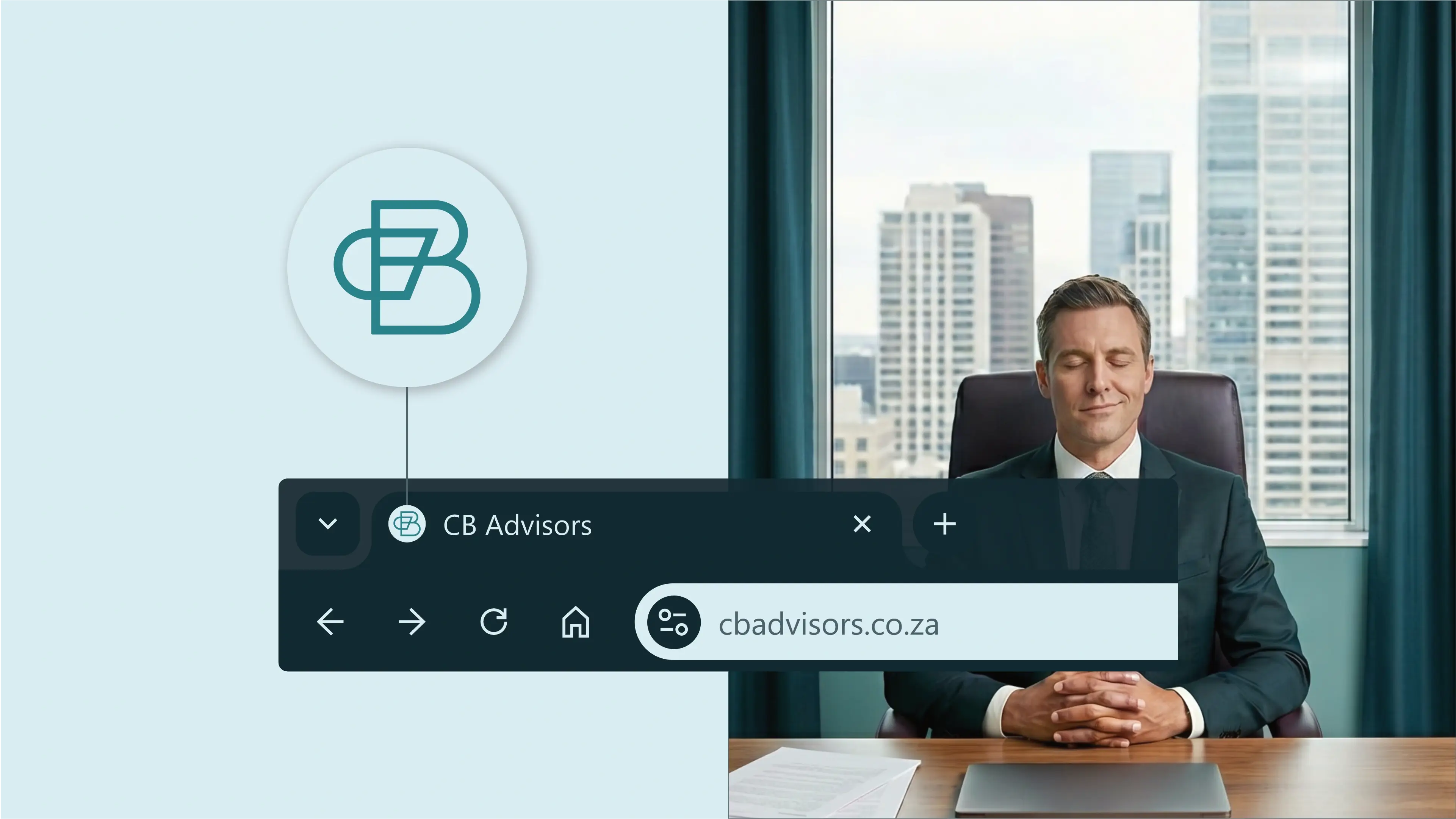
Favicons
A favicon is a small icon that represents your website in browser tabs, bookmarks, and address bars, ensuring brand recognition at a glance.